Published on
December 30, 2019
Category
Features
Every month, graphic designer and writer John Foster unpacks the making of a new album cover, discussing the finer details of the design, and the processes behind it. This time, it’s Ghostly International’s Thousands of Eyes in the Dark compilation.
Various Artists
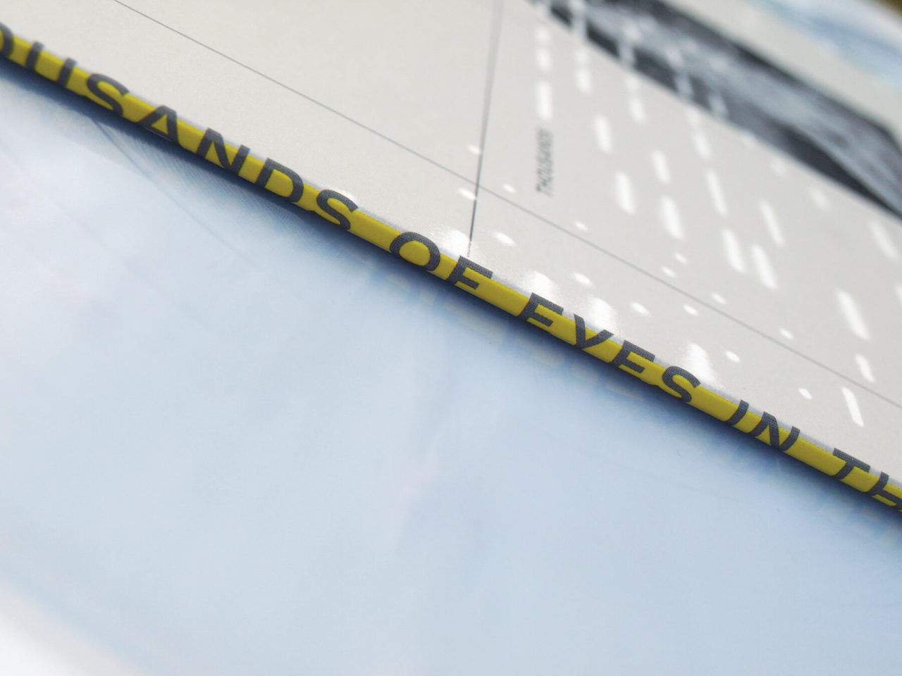
Thousands Of Eyes In The Dark
(Ghostly International)
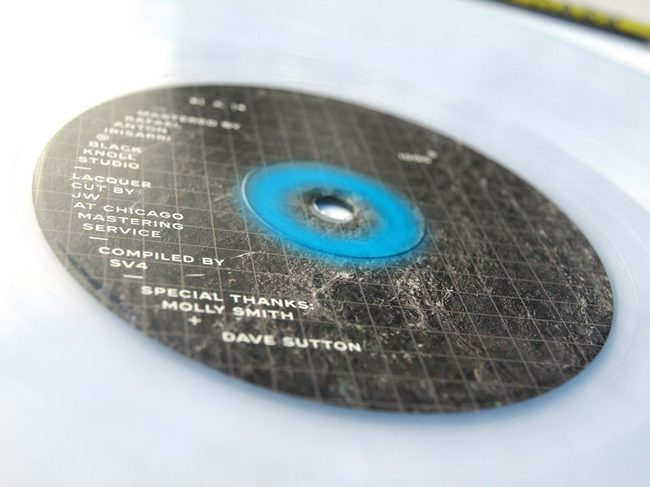
Design: Michael Cina
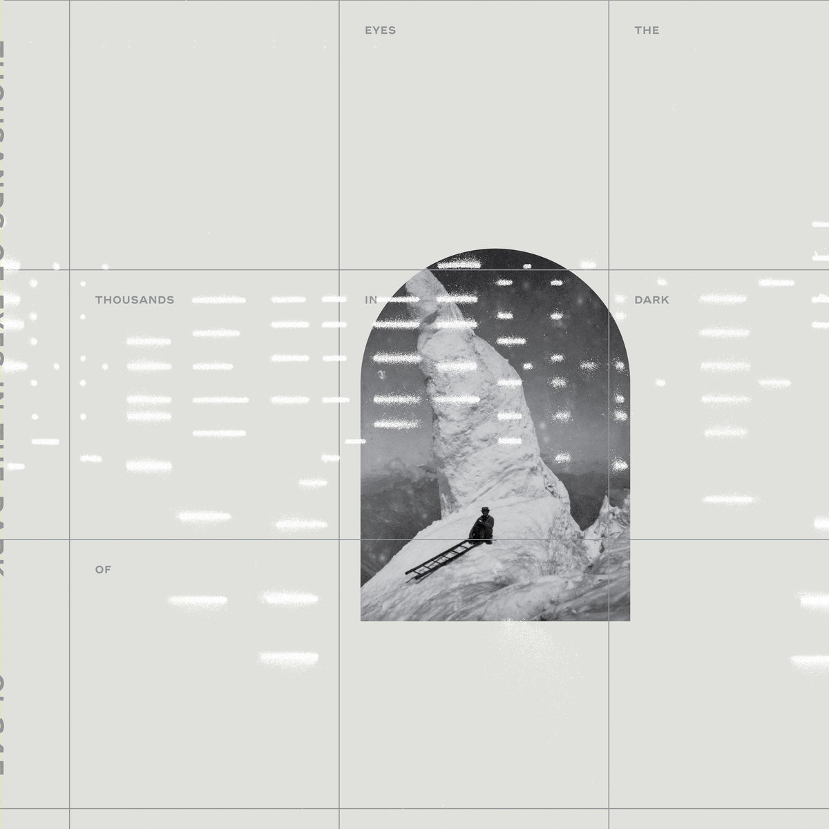
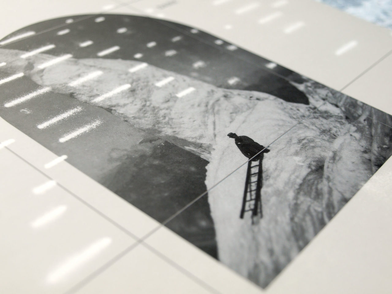
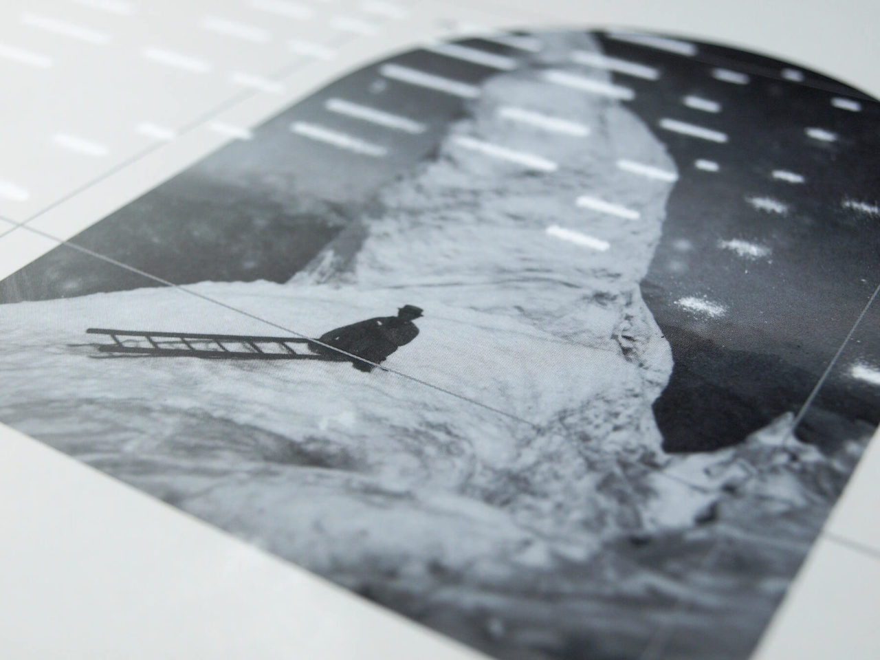
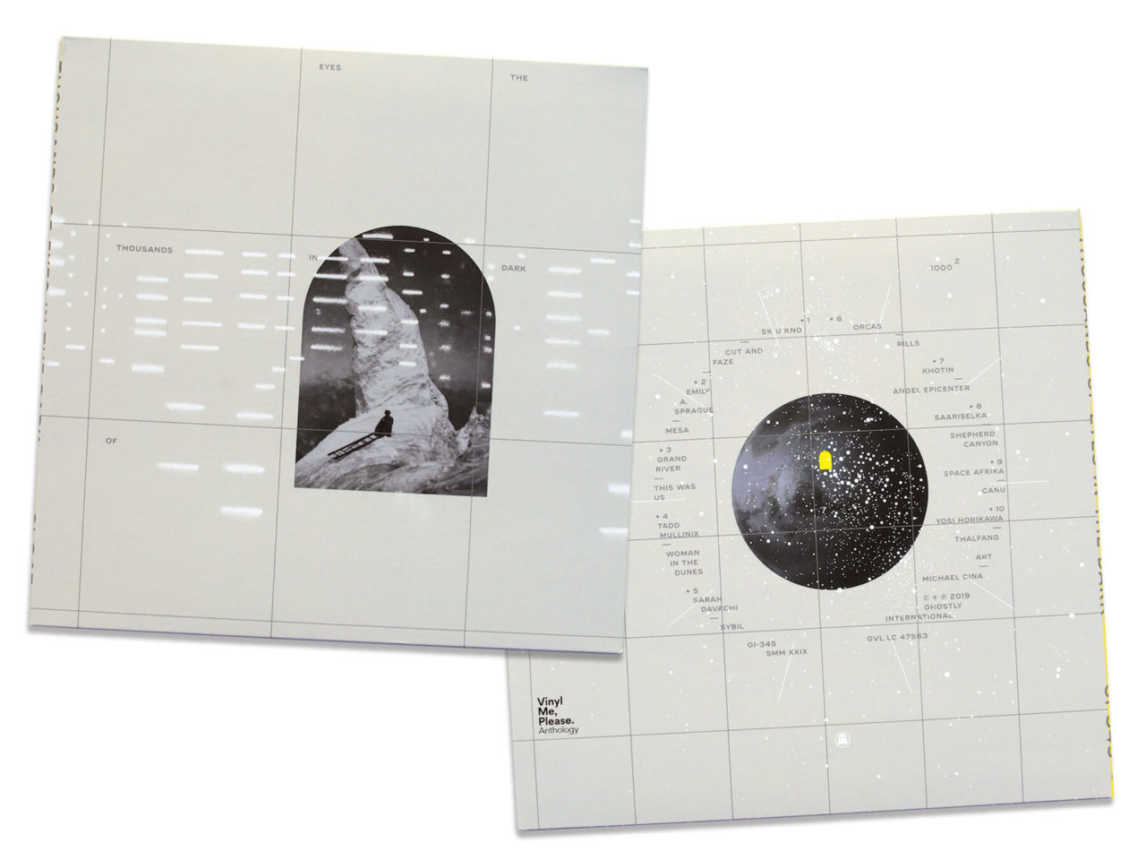
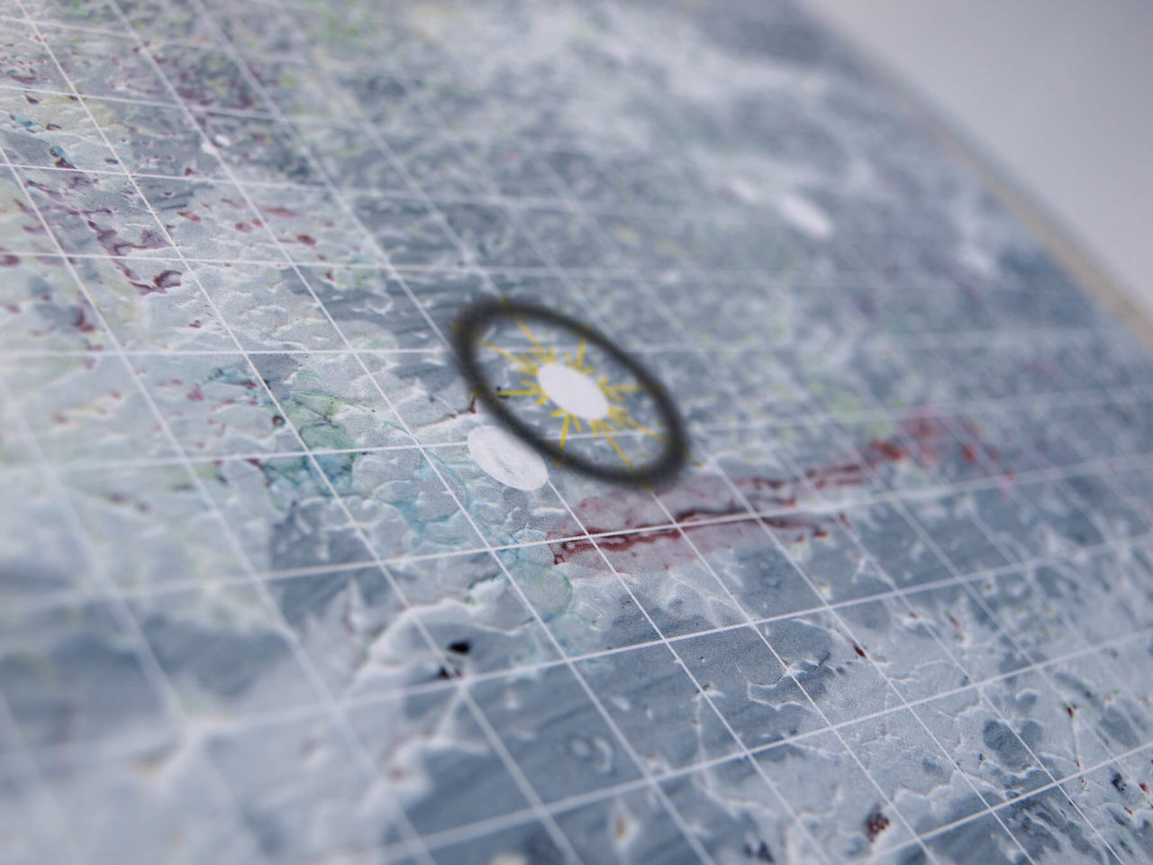
While putting together the catalogue-spanning compilation Thousands of Eyes in the Dark for his label, Ghostly International’s Sam Valenti IV came upon an image that he wanted to enter into the conversation. Valenti was working with longtime collaborator Michael Cina, whose disctinctive designs have been wrapped around many Ghostly releases. Although it now features on the front of the album, Valenti left the image to be included at Cina’s discretion, who found inspiration in pushing the parameters of Valenti’s direction.
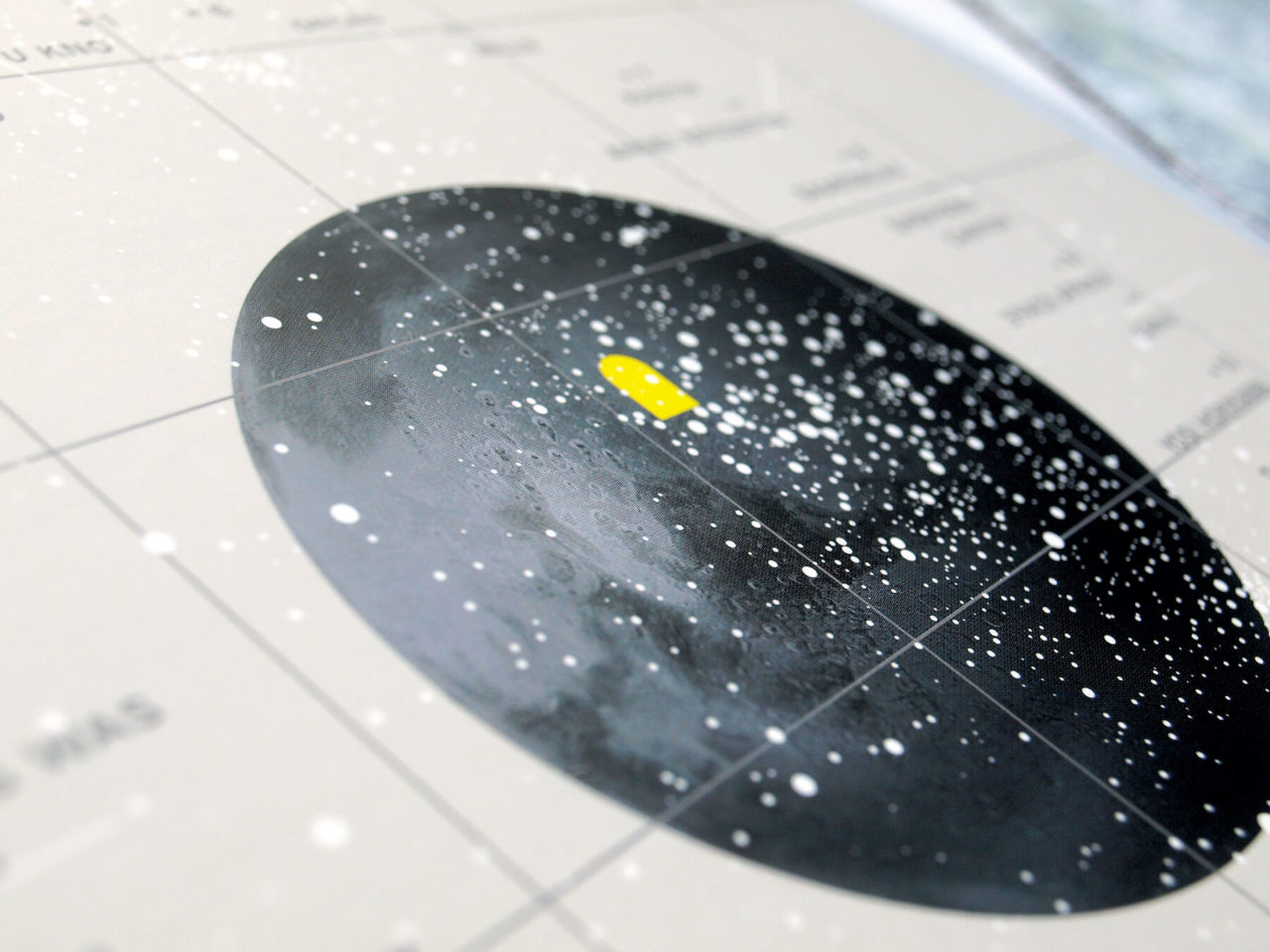
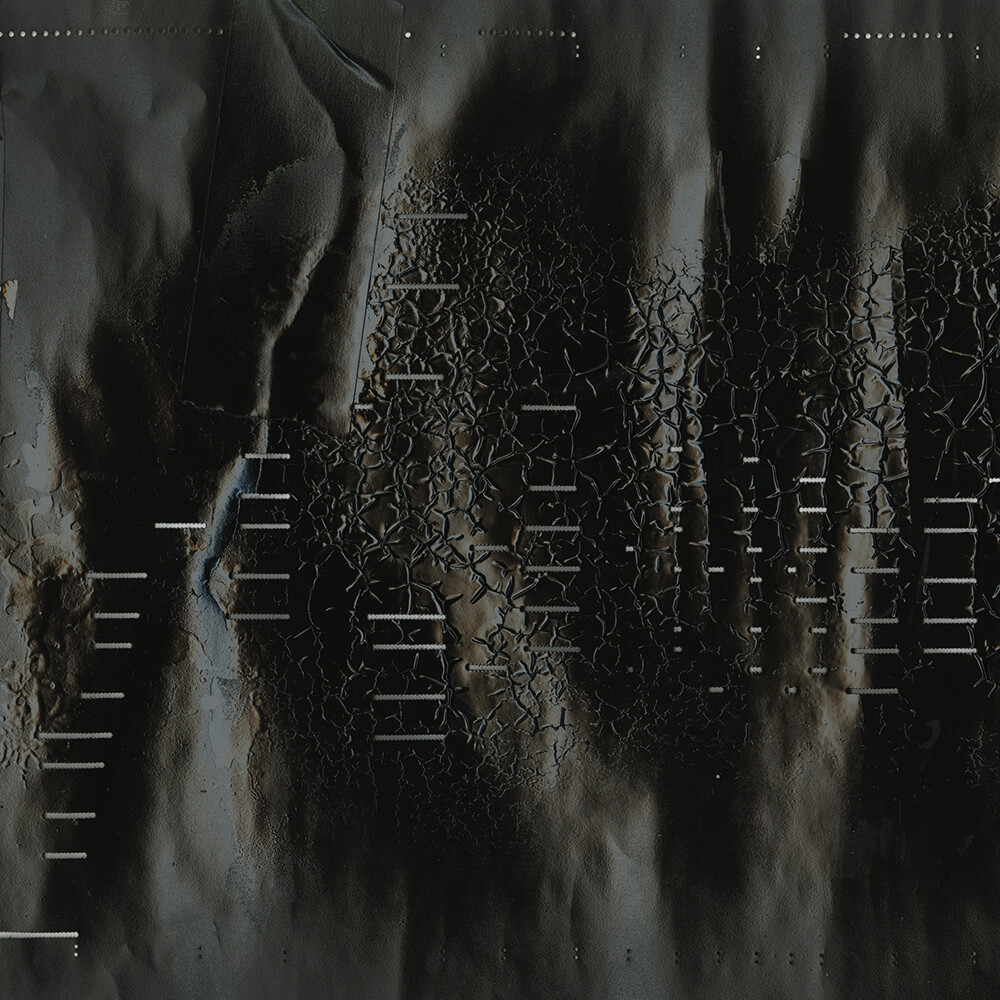
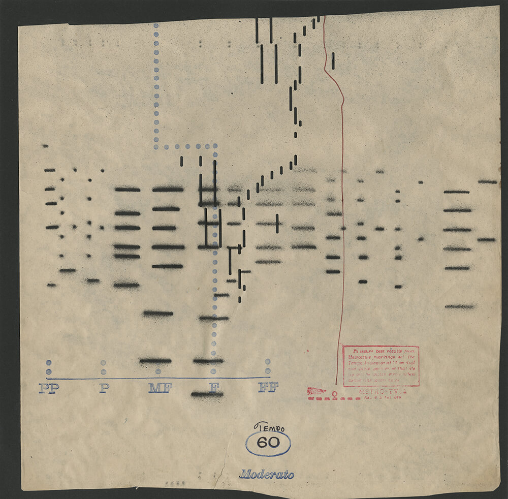
“I liked the photo, but had no idea how to use it,” Cina admits. “It took me a long time to figure out what the narrative would look like working from that image. I believed this photo was essentially about isolation and I placed myself deep within there. Imagining that the person in the image used a ladder to go to another planet, I started to think about what that new world was like.” Addressing the title, Cina wondered, “what were the eyes in this scenario, what were their roles, and how did they apply to this artwork and music?” His mind quickly went to old player piano rolls. “They are little eyes that sequence music,” he explains.
“I love how the holes in the player could be seen as eyes, and that is how I approached them,” Cina adds. “It’s very similar to how people use midi today. It’s all about gathering themes and ideas, and seeing what works. I felt this was a perfect abstract/literal metaphor.” Few designers toe the line between the abstract and the literal as artfully as Cina.


Building out this new world saw Cina embark on path of extensive experimentation. Famously prolific in his approach, in the past he has created over 200 pieces in the pursuit of a single record cover. For this project, he riffed on several different visuals, creating fifty 12″x12″ pieces that would form the basis of his final construction. The shadowed figure now had a landscape awaiting them on the other side of the portal in the photo on the cover.
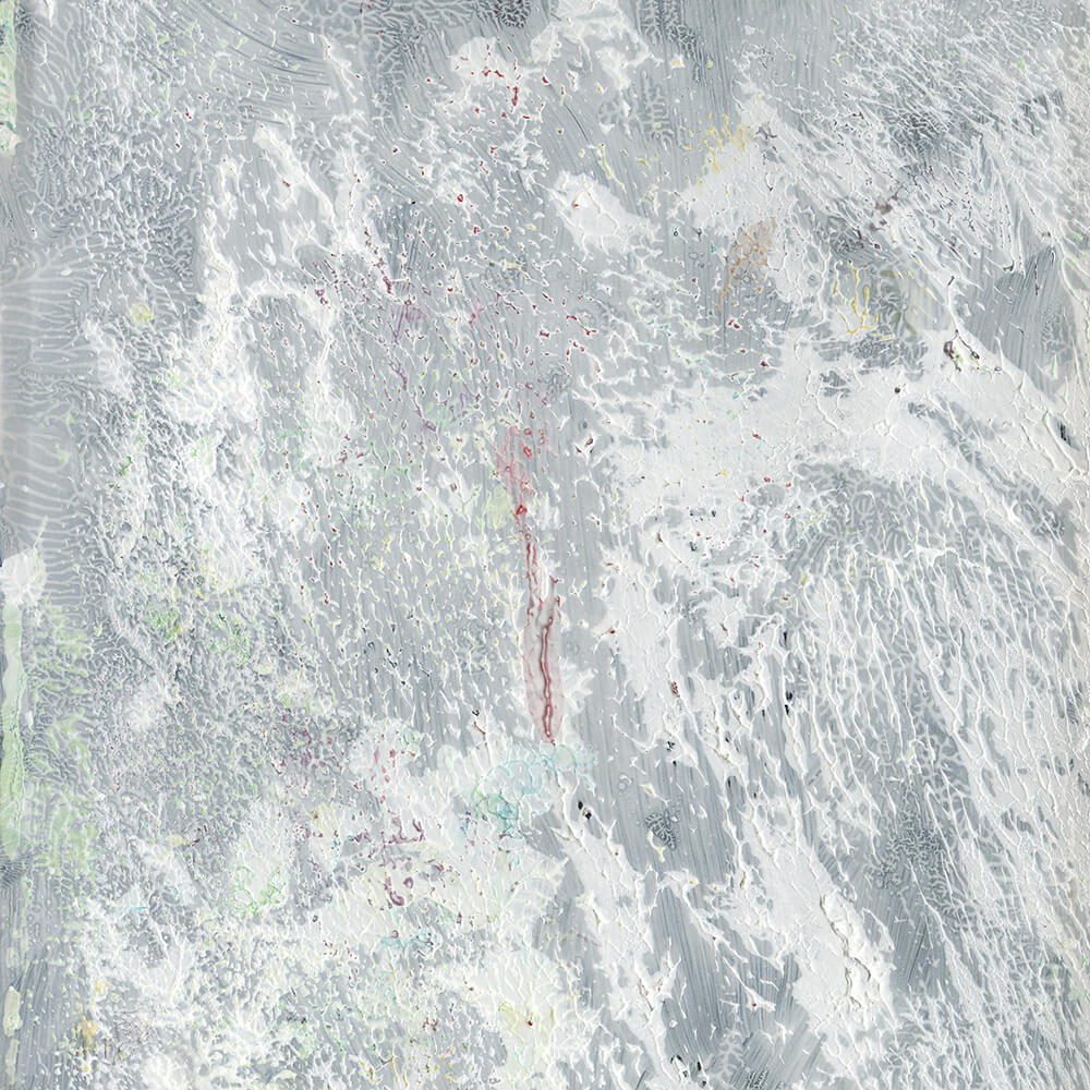
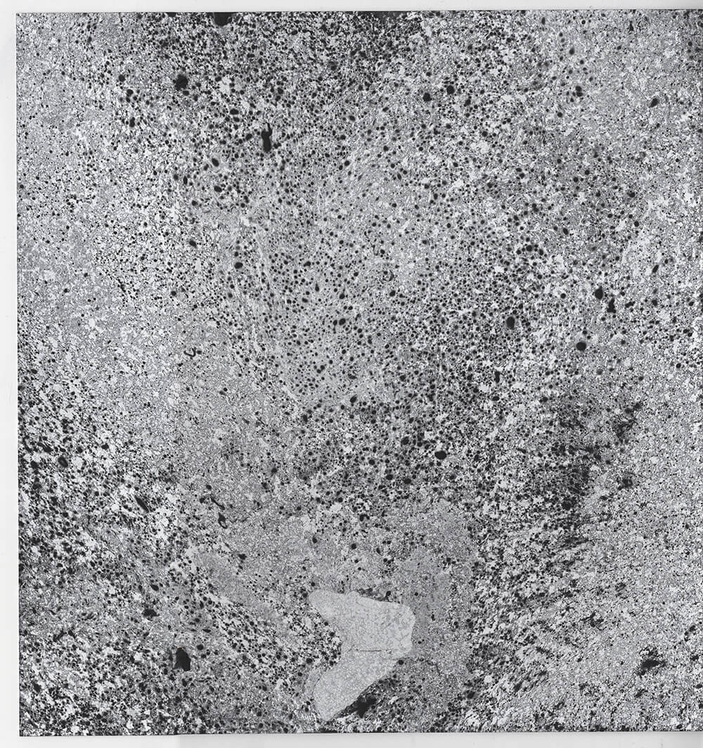

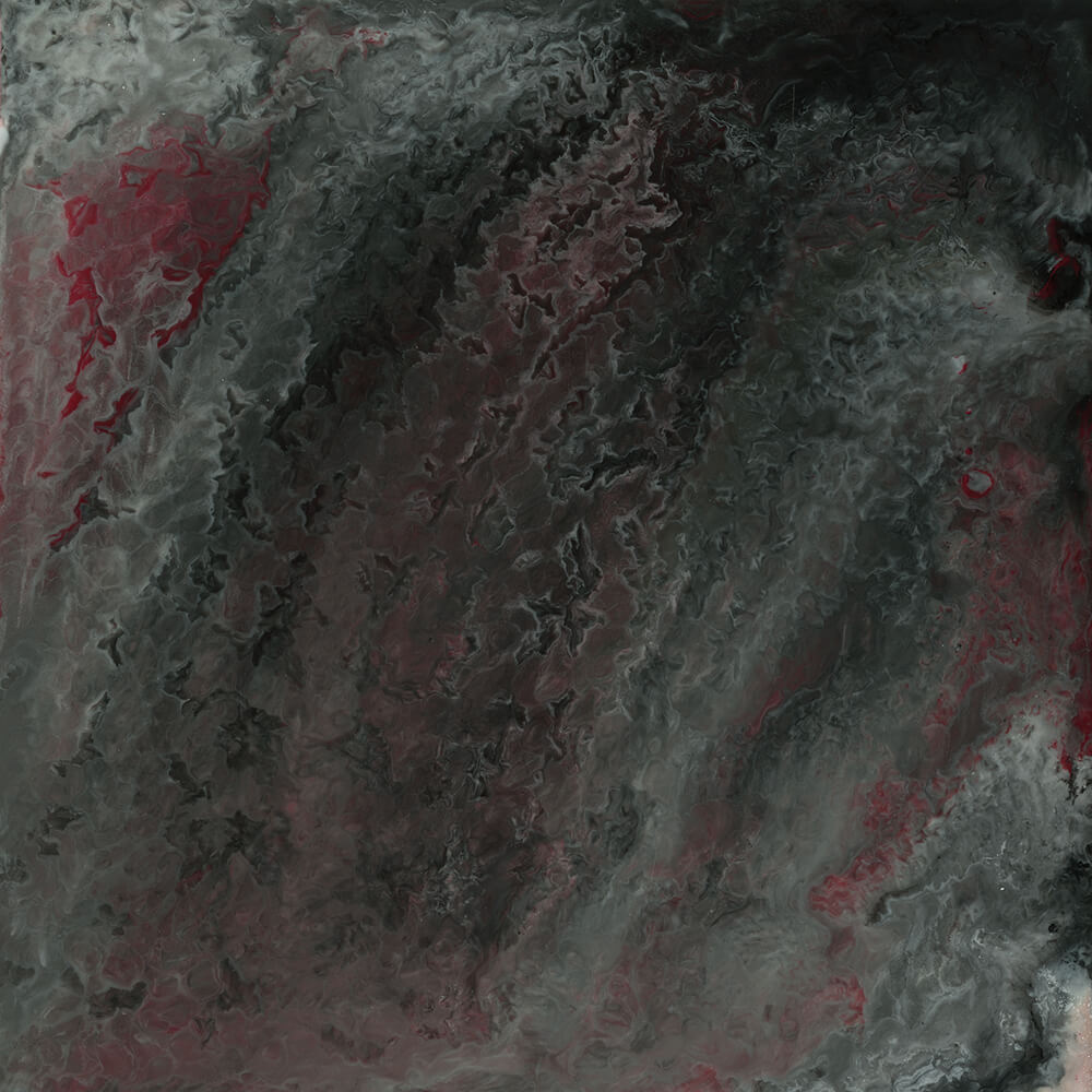
That sense of transporting to a new reality was important. “Space is also represented through the panels in the design, but I wanted it to be hidden,” he explains. Working in subtle hints via his use of colour, he battled between making sure that the viewer gets the proper effect and keeping it from hitting them over the head. The final feeling is of traveling through this foreign, yet familiar cosmos, with the player piano holes serving as an eerie pathway between the two. “For me, it is a lot of eyes, looking at a moment of time, from a distant location,” he explains, leaving what exactly they see to the viewer to decide.

John Foster is the author of Album Art: New Music Graphics (Thames & Hudson), New Masters of Poster Design (Rockport) and numerous other books. As principal of his design firm Bad People Good Things, he has designed hundreds of record sleeves for everyone from Teenbeat to Warner Bros.

Sign up to our weekly newsletter
Never miss a thing


