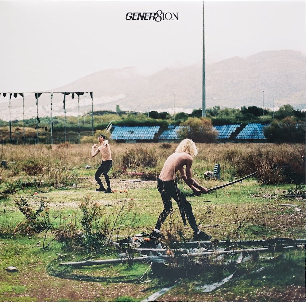


Unpacking the playful collage of Bon Iver’s i,i album artwork
Every month, graphic designer and writer John Foster unpacks the making of a new album cover, discussing the finer details of the design, and the processes behind it. This time, it’s Bon Iver’s i,i.

Bon Iver
i,i
(Jagjaguwar)
Art / Direction: Eric Timothy Carlson and Aaron Anderson
Photography: Graham Tolbert
Justin Vernon’s visual collaborator Eric Timothy Carlson described Bon Iver’s previous album 22, A Million as “an opportunity to play with the assumptions of Bon Iver’s audience, and the established aesthetic.” For i,i, he would be looking to both build on that new aesthetic, while also turning it on it’s head.
After spending weeks at Vernon’s April Base studio to work on 22, Carlson went one better for i,i and was on site creating artwork as the team made individualised videos with Aaron Anderson for every track on the album. He now serves as an art director for the Bon Iver collective, involved in the design and visual aspect of all parts of the what they do.


As a result, he was so embedded in the project for nearly two years that he amassed a wealth of imagery to sort through, and enough materials to make both a dense packaging design, as well as pick out serene and simple areas within. It’s hard to think of another instance when the designer has been such an integral part of the creation of an album. “It’s a powerful opportunity to just really make it a comprehensive body of work, especially with an artist and a group of artists who are really capable of thinking about projects at that scale and intricacy,” he underlines.


Not only is it an organic process, it is an organic design. The very carrier for the packaging reveals the layers that went into creating it. Using a clear sleeve, the front features a collage of incense smoke over a photo of the team out in the desert, while the back continues the iconography and typography that had defined 22, a million. Both allow you to see what amounts to the “next” covers, showing the handmade title on the front, and a giant still of one of the dancers from their video footage on the back.
Carlson had always had collage as part of his work process, and now he was literally using it to make sense of everything they were compiling. As he was sharing the results Vernon texted him, “so, collage is the thing.” Collage definitely is the thing. So much so that Carlson created an entire book compiling them to insert in the gatefold.


A large focus for Bon Iver has been the transformation from a solo project to a true collective of talent. That is showcased on the inside of the sleeve with a grid of portraits thanks to photographer Graham Tolbert. Normally, this type of presentation could feel perfunctory and forced, but here it is enhanced by Carlson drawing and collaging all over them.
Ensuring that the final product is something to be cherished and sought out, Carlson holds nothing back on the bells and whistles. Some of the moves are expensive techniques, while others are subtle and enlightening. Having an extra sleeve made of clear plastic blows any budget out of the water, but it is essential to the enjoyment here. It can be difficult to have a single screen-printed ink react on this material in the way that you want it to, but pulling off CMYK full colour process can be impossible. To help control that, Carlson puts down a spot white first, making it a five colour job. He also uses it to apply things like the copyright info and barcode in inventive fashion.


As well as the wonderful spot varnish on the gatefold, Carlson also adds in a ton of fun typographic quirks and the credits in the booklet. They are displayed in both a contrasting green on orange that prints “hot” as we say in the business, and makes for a unique visual stimulation, while others are in an orange that is perhaps 5% darker than the page it is printed on. All of it rewards interaction and investigation, just like the music within, as all aspects of the project unfold before our eyes and ears.
John Foster is the author of Album Art: New Music Graphics (Thames & Hudson), New Masters of Poster Design (Rockport) and numerous other books. As principal of his design firm Bad People Good Things, he has designed hundreds of record sleeves for everyone from Teenbeat to Warner Bros.