Published on
April 29, 2016
Category
Features
Designer Paul Pensom scribes a symbolic alphabet for the LP.
Words: Emma Tucker
Originally published on The Spaces.
Bauhaus is one of the unexpected influences behind musician Kate Simko’s eponymous debut album.
The record blends orchestral arrangements – a product of her classical training – with electronic elements borrowed from her time as a house DJ. Its artwork, created by graphic designer Paul Pensom, references the geometric patterns of the German design school.
‘The main thing that influenced me about Bauhaus was the cleanliness of the design, combining different artistic mediums – which I’m trying to do with London Electronic Orchestra,’ says Simko.
In design terms, the Bauhaus school gave birth to bold, geometric motifs and functionalist forms. Architecturally, this translated as streamline Modernist buildings free of flourishes and honed for purpose.

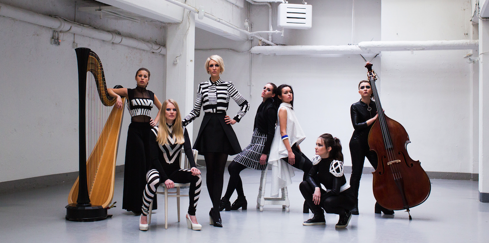
Photography: Dan Wilton with styling by Hayley Nunn and makeup by Anna Wild
These influences are apparent in an early promo portrait of Simko showing the musician seated sideways on a metal chair – a reference to a 1926 photograph by Erich Consemüller, showing a masked woman in a chair by Marcel Breuer.
Simko’s album artwork follows a long history of Modernist classical sleeves, but with an underlying process that takes the artwork beyond simply Bauhaus-inspired aesthetics.
‘It had to conceptually work with the music from start to finish,’ says Pensom, who also art directs Creative Review. ‘You don’t ever want this to be an exercise in pastiche, you want to see if you can use the language in some way.’
Artwork by StudioPensom
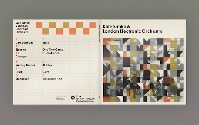
The cover’s irregular pattern is based on sheet music of the album, which the designer used to translate musical notation into a symbolic alphabet of blocky letters.
‘I like the way that it’s actually converted into a different language, more like a code than an alphabet,’ he says.
The sleeve’s colour scheme references a wall hanging created by textile designer Anni Albers in 1926, and Pensom selected contemporary sans-serif typeface Erbar to accompany the image, also designed in the 1920s by Jakob Erbar.
‘It’s about approaching it with a Bauhaus ethos, and thinking of it as a complete structural problem,’ says Pensom. ‘That’s the best way to fully interpret the music visually.’
Bauhaus can also be read in the sleeve’s black and white photography, which captures the band wearing patterned garments inspired by the school’s lavish costume parties and ballets. According to Simko, the work of British vorticist Edward Wadsworth – who designed dazzle patterns to camouflage ships during World War I – also provided a reference point for the group’s outfits.
‘When you’re composing for classical instruments, there are so many layers,’ says Simko. ‘The artwork is representative of that.’
‘It’s about using classical instruments and carrying on tradition, so the project’s not meant to be rebellious,’ she adds. ‘The artwork shows a nod of appreciation to tradition, but re-works it in a modern way.’
Kate Simko & London Electronic Orchestra is out on 6 May via The Vinyl Factory
Cover image: Kate Simko & London Electronic Orchestra. Photography: Dan Wilton with styling by Hayley Nunn and makeup by Anna Wild
Sign up to our weekly newsletter
Never miss a thing


