


Our 12 favourite record sleeves of 2018
Stunning artwork, ambitious box sets and audacious typography.
The culmination of our monthly column Judging A Cover By Its Cover, which surveys some of the most visually interesting and creatively problem-solving music packaging being produced today, John Foster takes the reigns once more to present some favourites from the last 12 months.
In short, 2018 was a refreshing year in record sleeve design. While no style dominated, many designers with unique aesthetics found themselves hitting their prime in unconventional ways.
Whether that was in celebrated illustrator Robert Beatty’s collaboration with U.S. Girls’ Meg Remy, or designer David Carson eschewing screens for collages on John Coltrane’s lost album Both Directions At Once, we saw artwork and packaging that delighted and surprised in equal measure. In wrapping type, using foils or creating pop-ups, more and more work this year seemed to be assembled by hand, emphasising the tactility of the format and the desire to create objects that straddle form, function and artistic merit.
The following twelve sleeves are included for their imagery, typography, layout and finishing techniques, and include new interviews with the designers involved to give you a personal insight into pinnacle of record sleeve design and music packaging in 2018.
Explore the rest of VF’s end of year round-ups below:
Our 50 favourite albums of 2018
Our 20 favourite 12″s and EPs of 2018
Our 10 favourite 7″s and 10″s of 2018
The 15 best turntables of 2018
Our 12 favourite reissue singles of 2018
Our 30 favourite reissues of 2018
The best amplifiers of 2018
The best speakers of 2018
The best headphones of 2018
A guide to the best Japanese reissues of 2018
A guide to UK jazz in 2018
A guide to adventurous sounds in 2018


Róisín Murphy
4×12″ Singles
(The Vinyl Factory)
Design: Braulio Amado
Working with Róisín Murphy on her 4×12” series with Maurice Fulton, designer Braulio Amado wanted to make a cover for each song, so that the back and front of each of the four 12″s looked totally different. As he describes, “I tried to use a different style for each, because I get bored when working on series that have to all look the same.” He continues: “Each song has a different vibe, so it made sense to do that.” The results represent a barrage of my favourite record covers of the year. His digital reinvention of the airbrush creates incredible illustrations with a surrealist bent, as he elongates letterforms and re-imagines ‘80s graphics, right down to updated dance labels and graffiti-inspired, hand-drawn type.


Beach House
7
(Sub Pop)
Design and Illustration: Nolen Strals, Kacie Mills, Bruce Willen at Post Typography
Following conversations with Post Typography, in which Beach House’s Victoria and Alex showed them sketches of visual ideas, vintage photography and played them rough cuts of songs, the studio was asked to deliver something with a strictly black and white collage-based approach. As Post Typography’s Nolen Strals explains, “We discussed the mood of the album as well as the influence of the greater cultural moment on making an album looking at the future.” Ultimately, Beach House wanted the sleeve to “reflect discordance, altered reality or dream-like surreality.”
“The punk look of the collage fit the generally dark or dystopian feel of the record,” Strals continues. “Having worked with a foil like this before, we knew that at some angles it only appears gray or silver, which fit the black and white guideline. At other angles the foil reflects these wild unpredictable colour spectrums, giving us the nod to the future or science fiction that the band was looking for.”


The Decemberists
I’ll Be Your Girl box set
(Capitol Records)
Art Direction, Design, Illustration, Lettering: Carson Ellis
Art Direction, Design: Glen Nakasako, Jeri Heiden
Decemberists frontman Colin Meloy and his wife, illustrator Carson Ellis have been crafting lovely packaging for some time, but with I’ll Be Your Girl they have outdone themselves. In creating the illustrations, Ellis worked with mechanical pencils, with the finished artwork made in gouache and ink on cold press watercolour paper. A unique part of her process is her hand-lettering. “I have tons of books full of old alphabets and fonts that I draw inspiration from. It’s been a thread that’s run through everything I’ve done since the beginning,” she explains. Those images and type have been paired with some of the very best designers in the industry, but rarely has she exhibited the full range of her playfulness, or been bathed in such bold bursts of colour. Working with Smog Design’s Glen Nakasako and Jeri Heiden, they force her work to live in a world that is full of loose lines and funky beasts, but also very much defined by design and shape.
The final product includes eight 7” vinyl records, each of a different colour, nine sleeve pin-wheeling, a heavy duty card stock book with slide-out record jacket pockets, full-colour art and paper engineered pop-up elements which all live tidily inside a hefty chipboard slipcase. “The deluxe 7” book was quite challenging — lots of moving parts and surfaces,” admits Heiden. “It took a great deal of effort, testing and pre-visualisation to find the right combination of design elements. The printers were also extremely collaborative and helpful on this one, fine-tuning the specs and paper engineering, down to every last detail.”


Various Artists
1+1=X
(Erased Tapes)
Art Direction: Robert Raths
Design: Torsten Posselt at FELD
Photography: Claudia Godke
Torsten Posselt of FELD has had a long and productive relationship designing for Erased Tapes and founder Robert Raths. Together, they have done nothing less than reinvent the X as a shape, and the slipcase as a form of packaging here. Celebrating ten years of the label (hence the X) with a carefully curated collection of songs, Raths clearly wanted to wrap it all together in something special.
While Posselt has designed stacks of wonderful record sleeves, he also tackles wildly different projects as part of Berlin-based FELD. The studio creates unique installations and has an inherent desire to experiment with construction and structural aspects of everything it builds. Always problem solving, Posselt relishes the kind of challenge this three LP and 72-page book box set presented. Sliding the box together to create the X die cut, the result embodies the music contained within, as the 20 tracks are collaborations bringing together various artists from the label’s roster, combining their talents to make something whole from the different individual visions. A strong yet delicate touch is applied to all components, as the design and construction of the X feels sturdy while leaving a tight and clean form behind.


Wayne Shorter
Emanon
(Blue Note)
Art Direction, Producer: Don Was
Art Direction and Design: Todd Gallopo
Design Producer: Tory Davis
Illustrations: Randy Duburke
Photography: Dorsay Alavi
Cover Portrait: Tomo Muscionico
Wayne Shorter had been working on the idea of bringing together a graphic novel with this release for years. Speaking of the project’s beginnings, designer Todd Gallopo from Meat and Potatoes explains that Blue Note boss Don Was didn’t see this as an “ordinary” release and promptly took him on a walk through Hennessey + Ingalls bookstore in Los Angeles. “We are both inspired by the deconstruction of an art book, and we both love the idea of showing some of that process,” Gallopo explains.
Showing that process is what takes the Emanon packaging to the next level. The printing on the board, the weight of the paper, the mix of soft and rough textures, the way that the spine is bound “or unbound”; all of it pushes the limits of what can normally be done in music design. This is an incredibly tactile package, mixed with nine die-cuts, and housing that 84-page graphic novel. The hand work alone required to match the foil stamping on the cloth spine tape with the foil stamping on the paper below, and the perfect nesting of the tip on sheet, while also having the type show through the giant centre die-cut, makes my head spin.
As Gallopo says: “One of my favourite multi-dimensional parts was set out in the production credit inside where we listed – ‘The packaging is intentionally designed to reveal its dormant possibilities as it travels between alternative realities of the multi-verse’ – which essentially means that this thing is going to wear and it’s going to tear, and it is going to get more and more beautiful with every interaction.”


John Coltrane
1963: New Directions
(Impulse! Records)
Creative Director: Josh Cheuse
Design: Dan Ichimoto
Illustration: David Carson
If the name David Carson sounds familiar, it is because he is one of the most celebrated designers of the modern age. That is why I found it so interesting to see him occupying the role of illustrator on this project. “Just this past spring, I started getting into doing collages. I started in my garage in Manhattan Beach, and it’s something I had never really done before, though in some ways my editorial design was a kind of collaging with type and image on the screen,” he explains. Carson found the process particularly rewarding. “It has been great to get out from behind the screen, use your hands, the ground, the walls, and found materials.” As these collages started to pop up on Carson’s social media, many took note, and Creative Director Josh Cheuse took action.
The illustrations create a wildly unexpected connection to the music and are miles away from what one would expect for a historical jazz release such as this. The packaging allows for the collage to do double up as type via a die cut, but it is the freshness of the images that carry the day. Music has been a huge part of Carson’s career, and while he has done sleeves for the likes of Prince and Nine Inch Nails, the amount of music packaging he has been involved with has been relatively small. “Music is a part of me and I can’t work without music on,” he adds. “Plus, what an honour for me to be associated with some of Coltrane’s work.”


Jeff Parker
The New Breed (Deluxe Edition)
(International Anthem Recording Company)
Artwork and Design: Nick Butcher and Nadine Nakanishi
In one of those crazy projects that could only come from the hands of Chicago’s Sonnenzimmer, duo Nick Butcher and Nadine Nakanishi managed to completely reinvent a record, while losing none of its personal connection. Asked by International Anthem to create a deluxe edition of Jeff Parker’s album The New Breed, the studio started by breaking down the original photo for the screen printing process, and interjecting some abstract line work to give the image a more surreal look. They then inserted the original cover image as a sort of ‘meta’ window into the design. As they explain, “We used the artwork for the original cover as the dust jacket, and played around with further colour separation experiments, mixing offset printing and screen printing.” Butcher continues, “For us, the project was a one of reverence and playful experimentation, sentiments that Nadine and I are both drawn to in Parker’s music.”


U.S. Girls
In A Poem, Unlimited
(4AD)
Design: Robert Beatty
Illustration: Meg Remy
Meg Remy has evolved her U.S. Girls project into a pop juggernaut, rolling together decades of melodies and hooks into an alternative universe where the show biz glitz pulls back to reveal the hard work that takes place in crafting these gems. It is a raw and emotional process, so it hits even harder to have her hand-coloured portrait tightly cropped around her tears on the cover of In A Poem, Unlimited. The image is filled with detail and texture, and speaks volumes to what crafting songs can take out of you, as well as what you have to put in to make it truly connect.
In a funny twist, Remy has Robert Beatty on hand to handle the design and layout. Beatty’s illustration work was everywhere this year, as he has slowly built up one of the most distinctive portfolios in the business. Yet, it is Remy’s illustration that takes centre stage, with Beatty in charge of surrounding it with a classic layout that he has roughed up in all the right places. After working on the design of David Hollander’s book Unusual Sounds: The Hidden History of Library Music, it is probably to be expected that Beatty would let various library label designs seep into his work. Oddly enough though, the inspiration came from Remy. As Beatty explains, “Meg showed me a reference to an Italian library music sleeve, which I basically interpreted for the framing and design.” That interpretation pays direct homage to EMG’s later period sleeves which themselves reference old generic dime store candy packaging.


Dabrye
Three/Three
(Ghostly International)
Artwork: Michael Cina
Michael Cina is one of those designers that never ceases to surprise me. As soon as I feel like I know what to expect from him, he turns it all on its head. Celebrated for his experimental paintings that have been bridging his fine art and design work, Cina eschewed all of that, and even leaves colour behind, as he tackled the packaging design for Dabrye’s Three/Three album.
The double LP set is housed in a matte sleeve with black foil accents and includes a 24-page 11” x 11” zine where each page corresponds to a different track on the record. Every page is filled with gritty little bits of material interaction, showing cut lines, crumples and the kind of magic that only an old Xerox machine can provide. Cina also fills each page with incredible layouts, imagery and rough typography – all assembled and manipulated by hand. That style of working also closely relates to the intricate, yet organic process that electronic hip-hop producer Tadd Mullinix used to finally complete his trilogy of albums.


Oneohtrix Point Never
Age Of
(Warp Records)
Art Direction and Design: David Rudnick, Oneohtrix Point Never
I have been fascinated by David Rudnick’s wild typography, and his application of those letterforms, which often feel equal parts hopeless adoration and delicious subversion. My favourite part of Rudnick’s work is the restless nature that spurs on his desire to experiment, and also allows him to push a concept straight through the wall. All of those qualities are more than evident on his work for Oneohtrix Point Never, with the winking imagery in Jim Shaw’s painting (when could you ever been able to say that a Jim Shaw image was the least interesting part of a piece?) and the heavy application of an eclectic mix of typefaces.
It is undeniably bold and points to a brand of retro-futurism that could only exist in the mind meld of Rudnick and OPN’s Daniel Lopatin. It could be argued that the CD packaging is the ultimate application of all of this madness (somehow perfectly apt) and the final product was something Lopatin glowingly referred to as “the most OPN thing ever, and something I’ll never be able to top.” That is crazy praise from an artist with a deep catalogue of wonderful packaging. But you know what? He might be right.


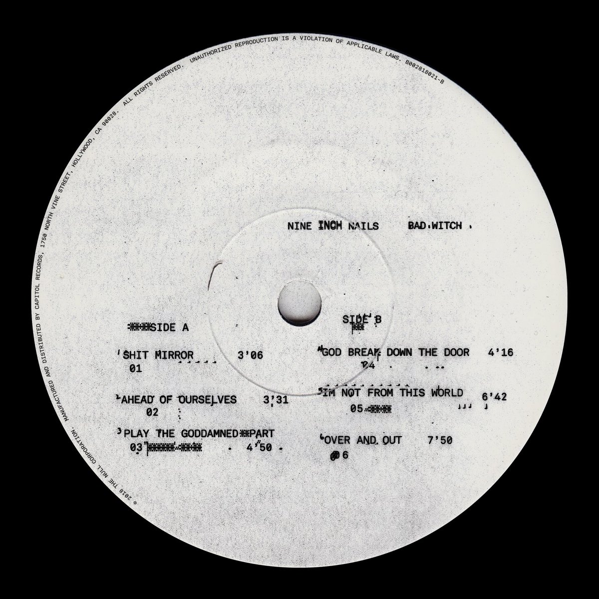


Nine Inch Nails
Bad Witch
(The Null Corporation / Capitol Records)
Art Direction: 12:01- Office of Hassan Rahim
Nine Inch Nails’ Trent Reznor has a long history of working with some of the most innovative designers in the world, while still managing to envelope everything in his aesthetic. Paired with the brilliant 12:01, Hassan Rahim, along with designers J.S. Aurelius and Travis Brothers, brought about a creation of degraded visuals and smudged type that all went through the Xerox machine to produce something that is both wildly intriguing, and yet also pushes you away at the same time.
It is a testament to how cohesive the visual brew of Bad Witch truly is, that computer chips and skeletons dug up from a shallow grave manage to carry the same weight and impact. What I think are portraits of Reznor and Atticus Ross with their faces blotted out are copied so many times at such high contrast that they seem to barely exist at all, as if they were a faint, grimy apparition from another universe. “When initiating this project, Trent provided demos of the songs with two key words: Primitive Spirituality,” explains Rahim. “Sonically, Bad Witch shows Nine Inch Nails at their most raw in decades.”
As Rahim describes, the final cover artwork “is a puzzle of images more cryptic than explanatory, alluding to themes of mass unidentified aerial phenomena, fear, superstition, extinction, and ultimately, rebirth.” He captures this effect via gritty textures produced through low-fidelity equipment that initiate a departure from the band’s glossier, high-definition aesthetic of recent past releases. The final, crucial touch is what he describes as “chemical processing spills on the photography, that form a seamless kinship to the feedback error loops that define the typography.”


Mouse On Mars
Dimensional People
(Thrill Jockey)
Art Direction: Azar Kazimir
The final entry in this list was tightly contested. There were so many sleeves that I loved this year, but I ultimately was hard pressed to think of one that delighted me in such a whimsical way – while still being as artful and sophisticated – as Azar Kazimir’s work for Mouse On Mars. It’s just a black and white type cover, you might say? But, oh what a wonderful black and white type cover it is. Playing off the Dimensional People title for the album, Kazimir winds the letterforms around, creating a tiny visual funnel to escape through in the centre. His “sculptural” take on the letters forces them into shapes to suit the concept, where odd angles and quirky little interactions abound, especially in the rounded curves on the corners as they wrap around. Hardly any of the letters make sense alone, yet the whole is unique and playful.
Kazimir continues this playfulness throughout the packaging, whether looping the sperm on the back cover or circling the hole on the LP labels. Once inside, all of the credits and information find themselves being manipulated as wraps around invisible shapes. Kazimir never lets the concept rest, yet he also never lets it get tired. A fresh voice, Kazimir has had a bit of a breakout year in the music industry and I hope that continues in 2019.
John Foster is the author of Album Art: New Music Graphics (Thames & Hudson), New Masters of Poster Design (Rockport) and numerous other books. As principal of his design firm Bad People Good Things he has designed hundreds of record sleeves for everyone from Teenbeat to Warner Bros.
Illustration by Daniel Prothero