This year’s artwork and packaging award goes to…
It’s no secret that the size and tactile experience of the artwork is one of the reasons why vinyl records remain the most enjoyable way to listen to music.
Whether it’s in the hand made or the mass-produced, the meticulously set-up or the spontaneously created, the sleeve artwork adds a (literal) dimension to the music that a digital thumbnail simply cannot replicate.
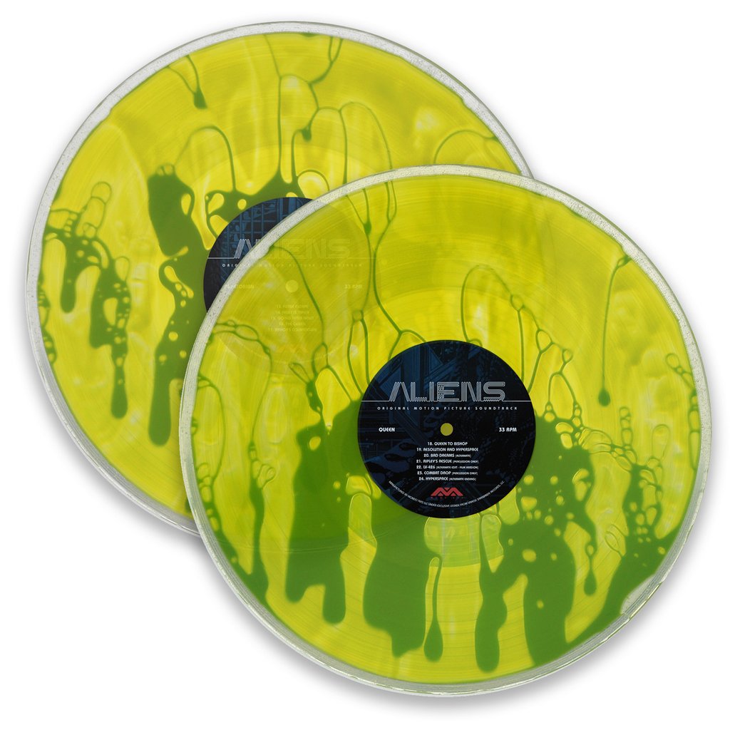
This year, more than ever, we saw artists and labels push the boundaries of what could be done with the packaging of a record, from interactive experiences like Mondo’s liquid-filled Aliens OST to the lavish Mala box set that included a piece of restorative Peruvian “healing wood”.
Drawing a fine line between the sublime and the ridiculous, it’s not just the ambition of the package we’re judging here but the aesthetic quality of the imagery itself, the nature of its production and its relationship to the music on the record.
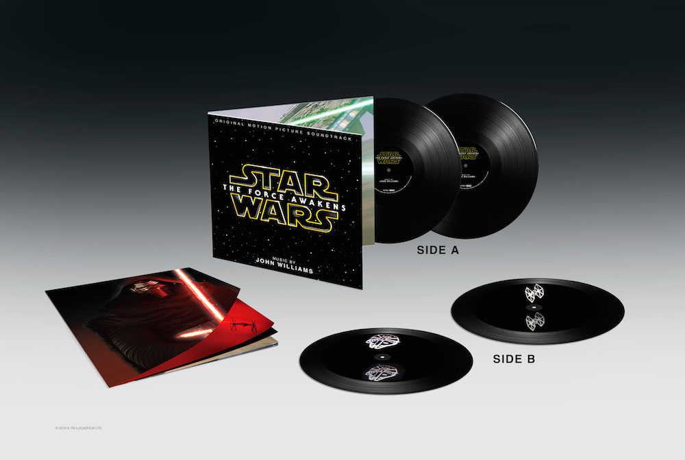
20. John Williams
Star Wars: The Force Awakens – Etched Holograms
(Walt Disney Records)
Artist: Tristan Duke
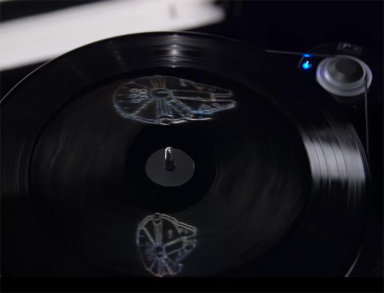
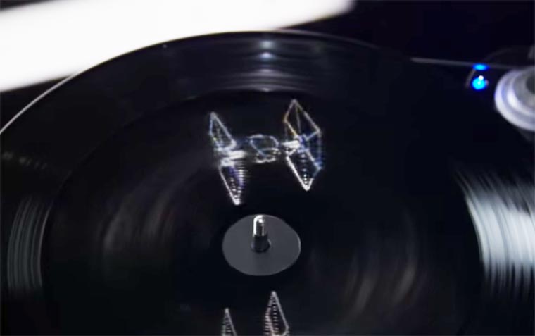
Although there have been many advances in the field of vinyl etching of late (many of them found on Third Man releases), most collectors will tell you that they’d rather have an extra side of music than an intricately carved bluebird. This Star Wars release bucks the trend though, offering fans of the sci-fi odyssey their own slice of light and magic via Tristan Duke’s mind-blowing holograms. As you shine a torch (camera phone) on the etched centre of side B and D, you’ll be met by a 3D hologram of a Tie Fighter or Millennium Falcon, floating some 8 inches above your turntable – cue the main theme!
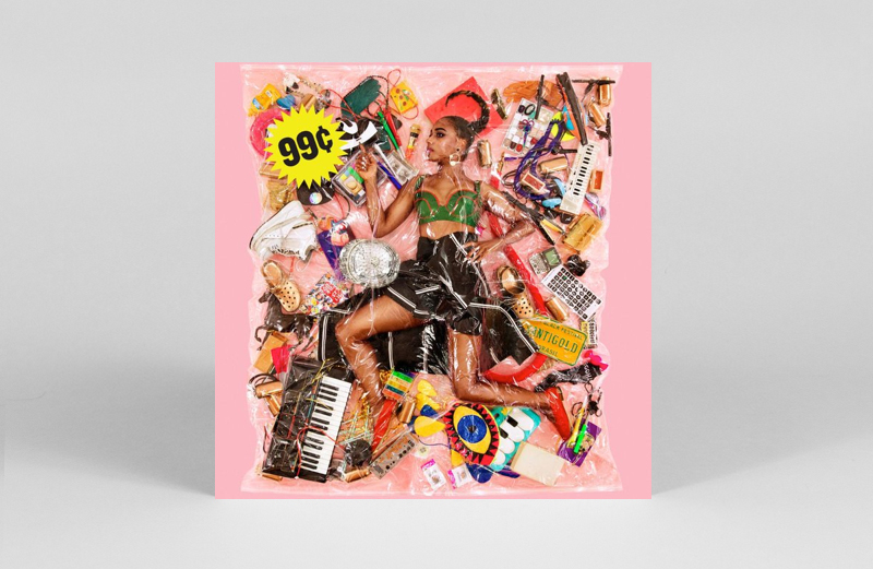
19. Santigold
¢99
(Atlantic)
Artist: Haruhiko Kawaguchi
There are not many other musicians that can translate social commentary in such a stupidly catchy pop way that it takes a moment to sink in and realise what that melody you’re humming along to actually means. But what really grabs us about Santigold’s third album is the sleeve – a photo of her and an colourful array of personal possessions tightly vacuum-packed and stickered with ¢99. The image and concept is unmistakably the work of Haruhiko Kawaguchi, who made a name for himself convincing stranger couples to let him shrink wrap them in the name of art.
18. Playgroup
EPs 1-9
(Yes Wave)
Artist: Trevor Jackson / Bill Bernstein
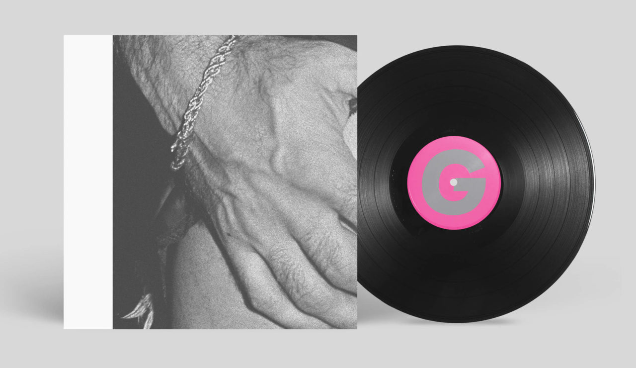
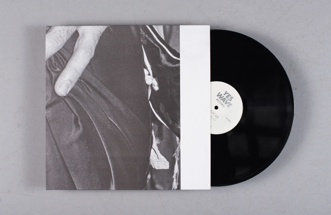
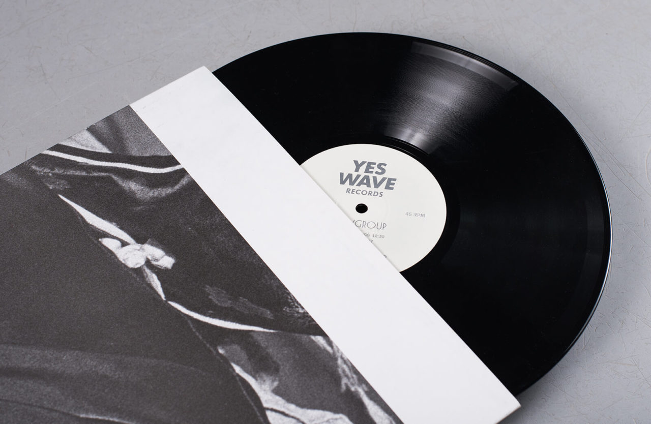
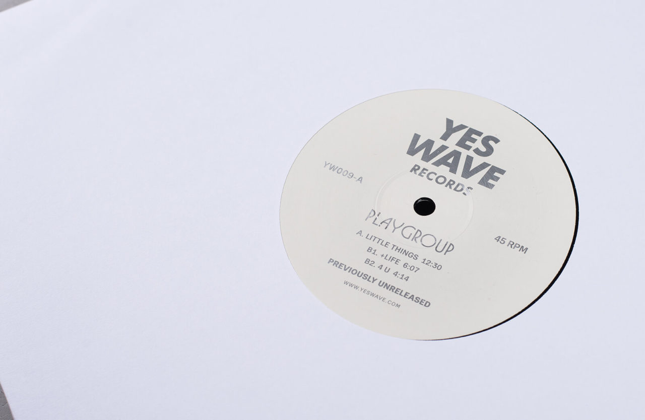
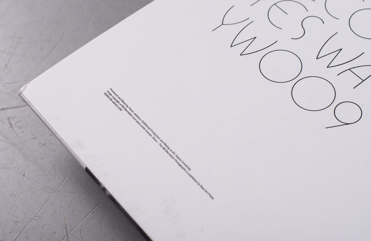
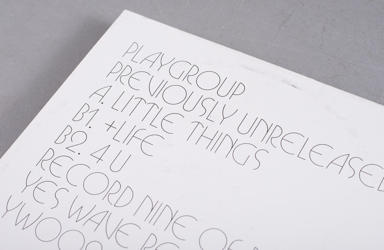
Trevor Jackson raided the vaults of his late ‘90s Playgroup project earlier this year for nine EPs of previously unreleased music made between 1997 and 2001 during the recording of Playgroup’s debut album. Something of a homage to what Jackson calls the “sensory overload of chemicals, bass, smoke, sweat, sex and danger” that defined bygone eras of underground club culture, each limited 12” in the 9xEP set was fed out on a weekly basis, each carrying a grainy, abstract fragment of monochrome photography. Tiled into a perfect 3×3 square however and they reveal a salacious print by legendary disco photographer Bill Bernstein. Line up the spines correctly and you get the name of the band spelled back to you. Cute.
17. James Blake
The Colour In Anything
(Polydor)
Artist: Sir Quentin Blake
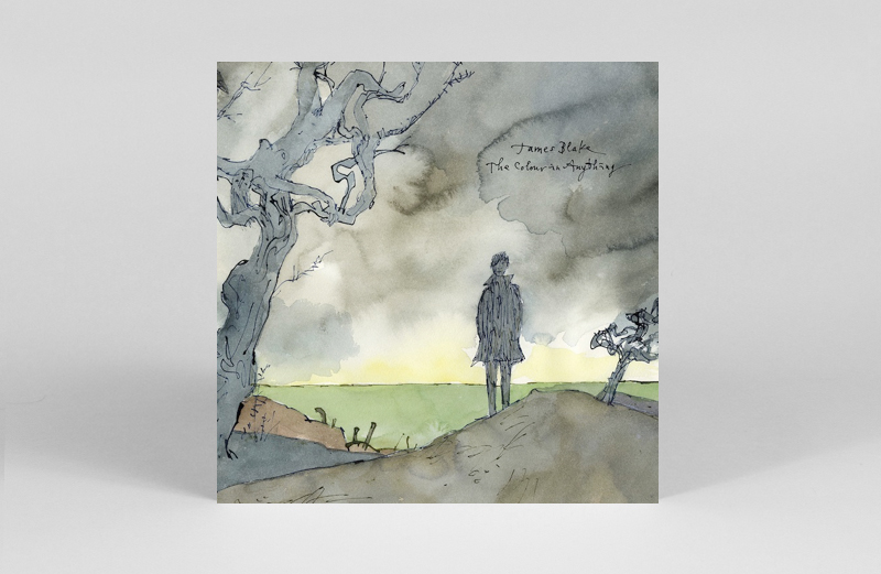
If you were raised on Roald Dahl, the new artwork on James Bake’s third album will instantly bring back a wave of nostalgia. The unmistakable ink, watercolour work, and handwriting of Sir Quentin Blake features on a number of promotional billboards, posters, music videos as well as the sleeve itself. “I am a sort of musical illiterate in that though I listen to music, I don’t really know what is happening,” Quentin said of the collaboration. “Nevertheless I can respond to atmosphere and James and I also have, I think, some similar ideas about how the imagination works.” Stormy clouds and strange tree frame a portrait of James that is remarkably uncanny.
16. Ennio Morricone
The Hateful 8 OST Bullet Hole 7” Box set
(Third Man Records)
Artist: TMR
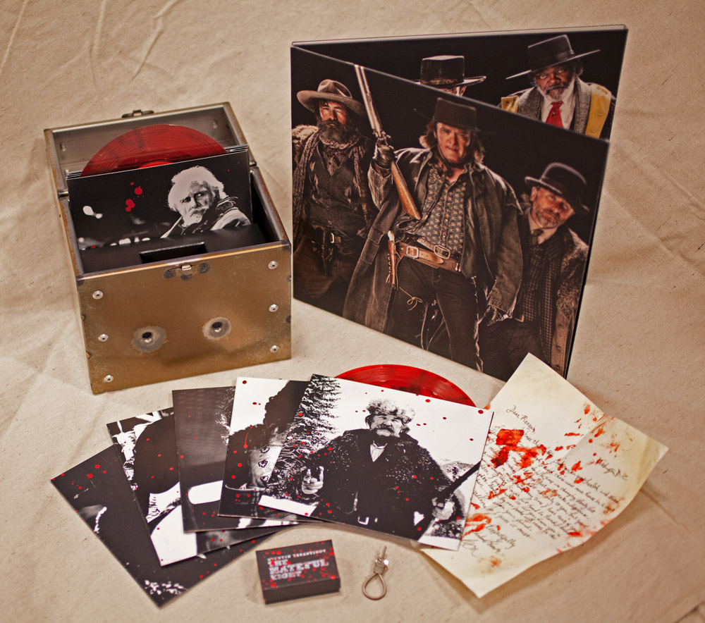
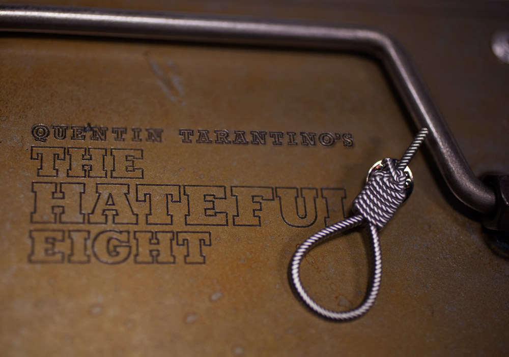
A release from Third Man records is almost a given on such a list as Jack White’s label continues to push the possibilities of pressing and packaging with vinyl releases, and this bullet-riddled galvanised steel box that breaks Morricone’s score for The Hateful Eight into 8 blood red 7”s is another release that’s testament to their efforts. With Quentin Tarantino never having commissioned an original score, and maestro Ennio Morricone’s scores having been silent from Italian Westerns for over 40 years, when the two giants of the genre joined forces it was quite the soundtrack event and this box, which arrived right at the start of the year, was an appropriately excessive and well-crafted way to mark the event.
15. Various Artists
Knowone Timber Box
(Knowone)
Artist: Unknown
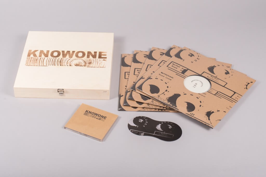
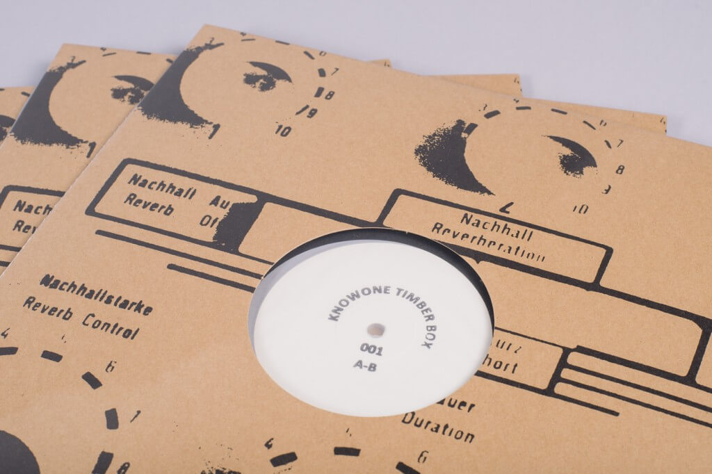
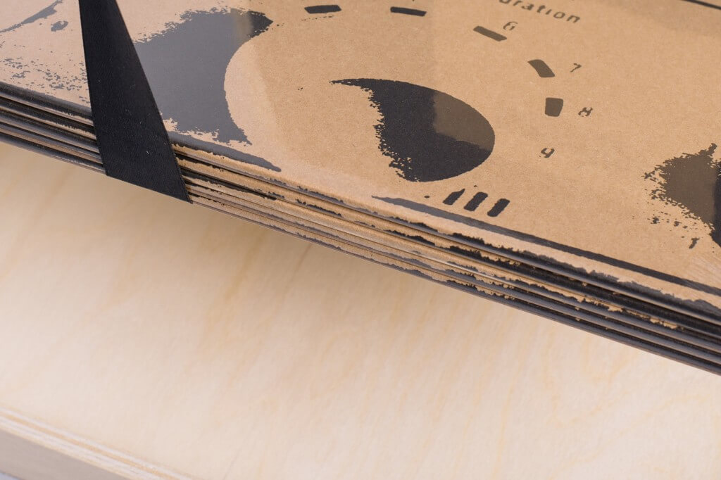
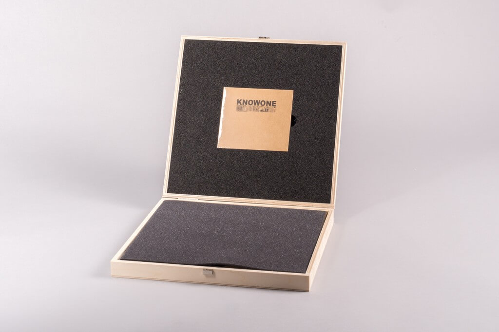
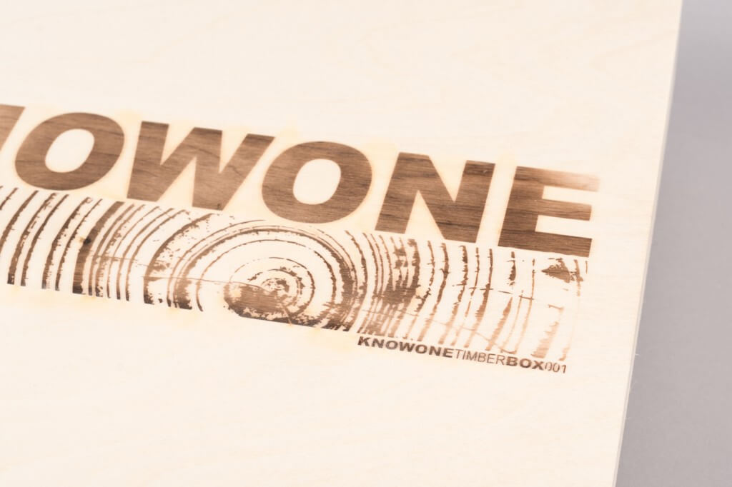
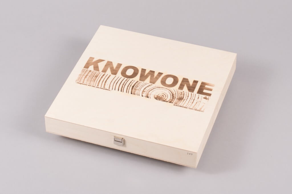
For a label specialising in austere hand-printed dance 12”s to make our list of the year’s best artwork and packaging, something special must have happened. Included here more for the extreme audacity of the presentation rather than the “artwork” per se, Knowone have collected 5 dub techno 12”s on differing shades of grey vinyl, housed in a hand-made, clasped and pyrographic wooden box. A CD nestles within the foam insert like an assassin’s sniper kit, an aesthetic that befits the music’s reticent description as “functional Basic Channel influenced techno releases from unknown sources”. The inner sleeves are also hand-printed and there’s a “record butler” thrown in to keep your rave-sweated hands from dirtying the wax.
14. The Dust Brothers
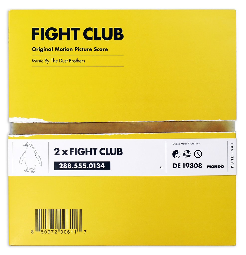
Fight Club
(Mondo)
Artist: Alan Hynes
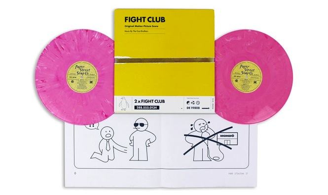
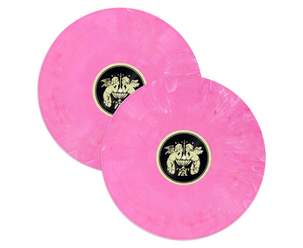
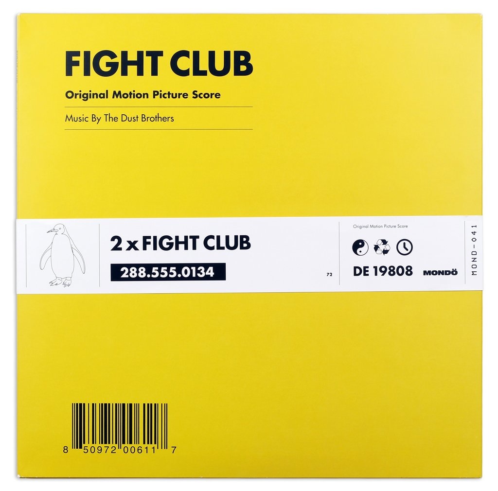
While the instrumental trip-hop score for Fight Club has been touted as one of the best sequenced of the decade, the real attraction on this reissue is with what Mondo have done to with the artwork. Enlisting graphic designer Alan Hynes, the release comes in a yellow cardboard package with an IKEA-themed jacket (with nice touches like “Mondö” and pull-out assembly instructions), a nod to Edward Norton’s character’s obsession with keeping the appearance of being a normal, successful adult. It also features his spirit animal, the penguin. But that’s not all, in order to access the double pink soap coloured-vinyl, you have to actively tear the outer packaging apart, using a “sacrifice” tab to, as the teaser video instructs, “destroy something beautiful”.
As Mondo put it: “Buy it or you will be incomplete. But be warned, this album will not stay beautiful, clean or perfect. It will not stay mint, or even VG+. It will become fair at best. Just like you.”
13. Christian Marclay & Mats Gustafsson
In Hindsight
(The Vinyl Factory)
Artist: Christian Marclay
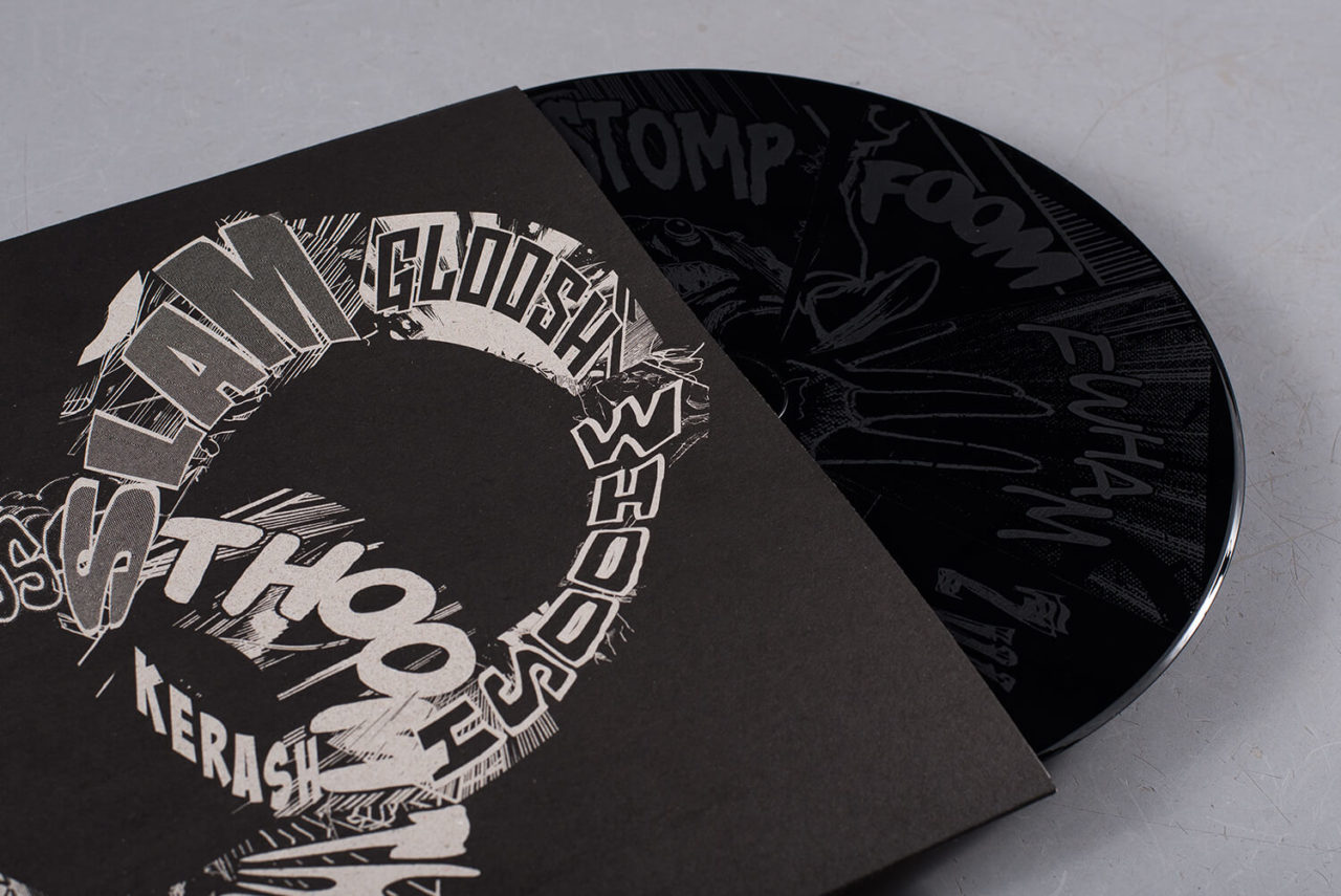
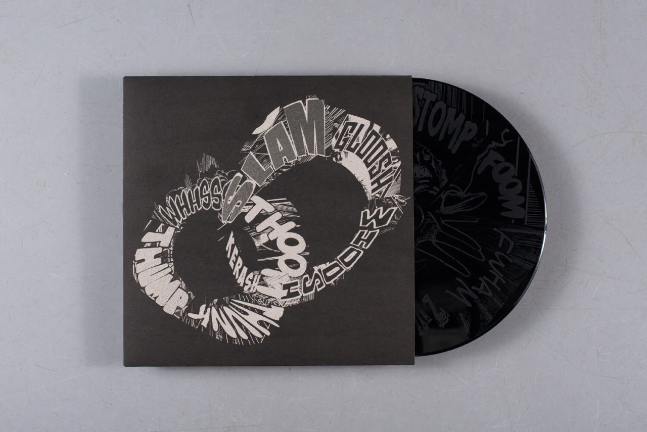
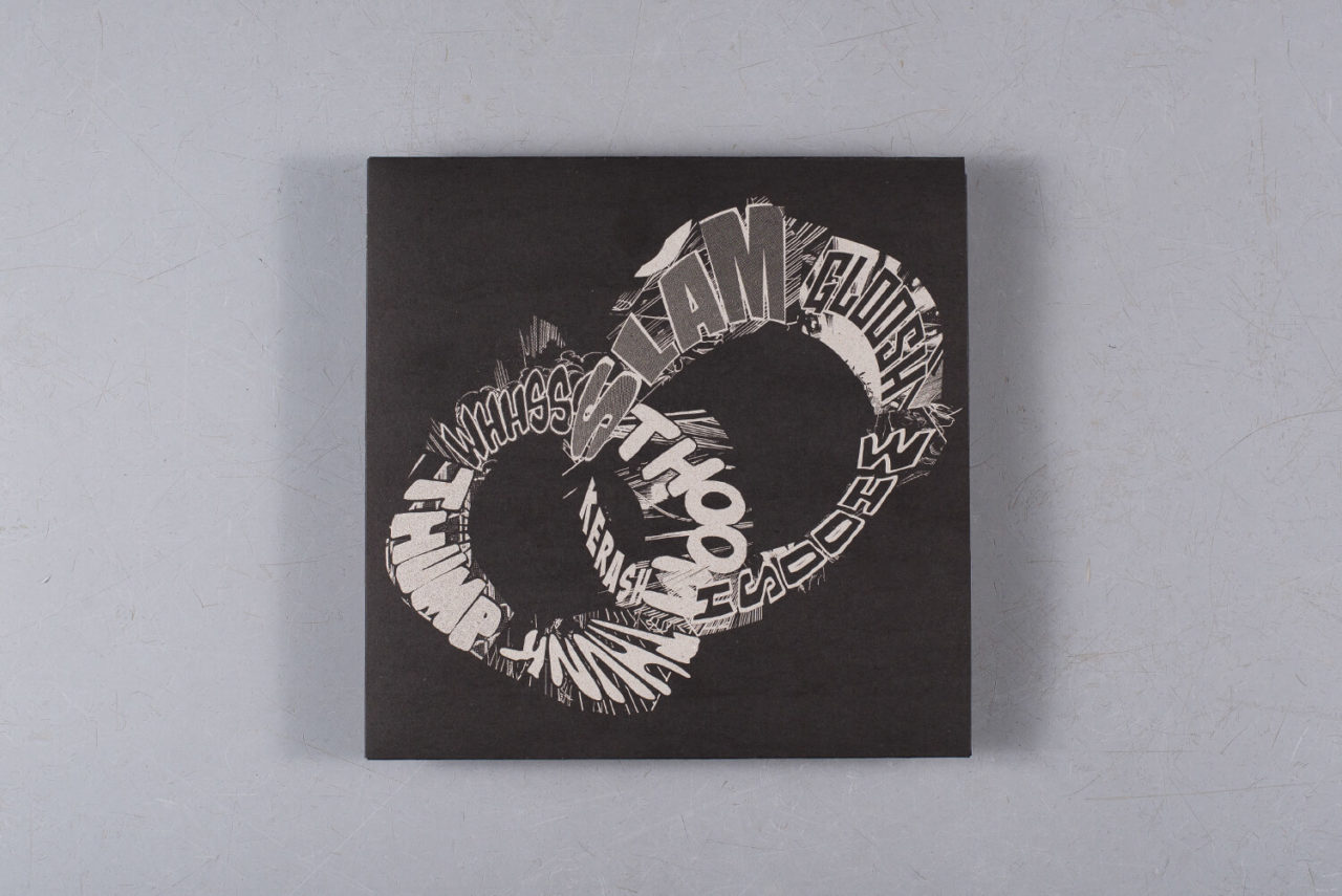
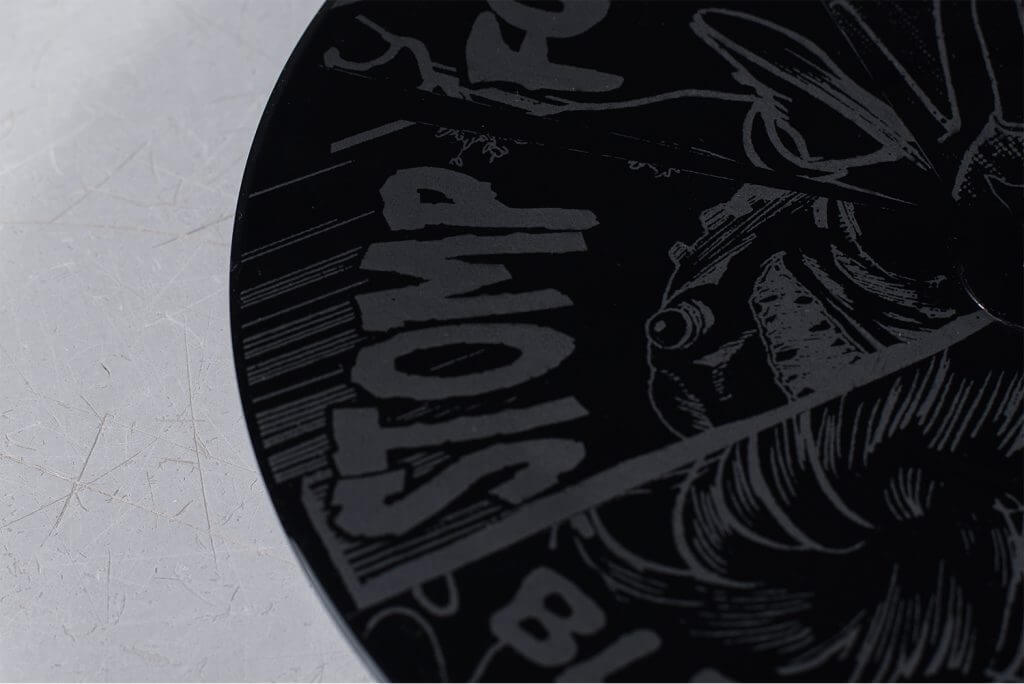
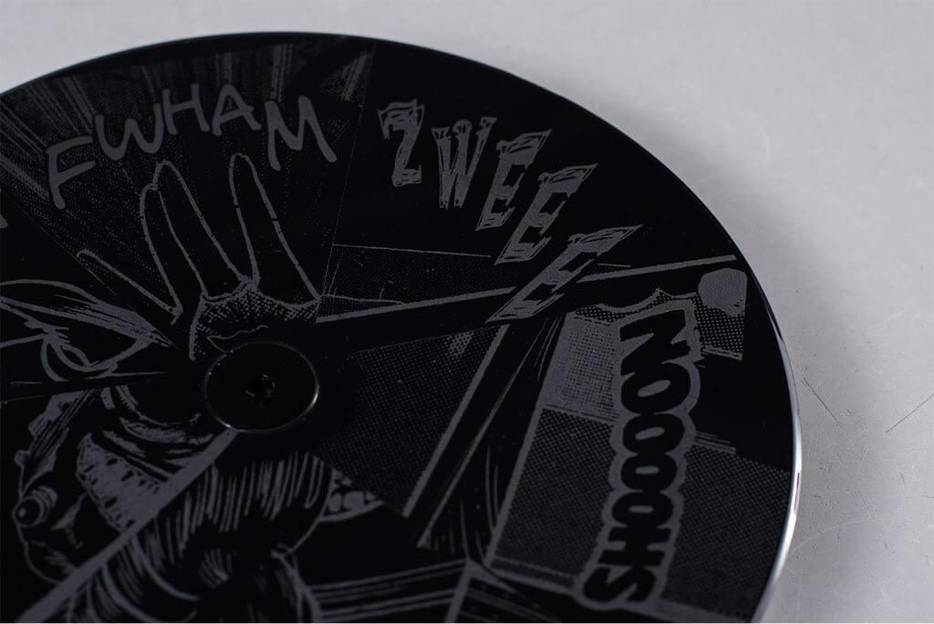
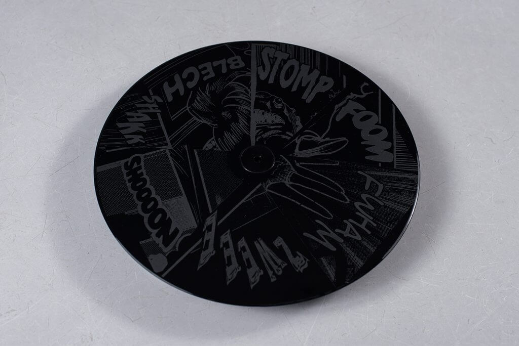
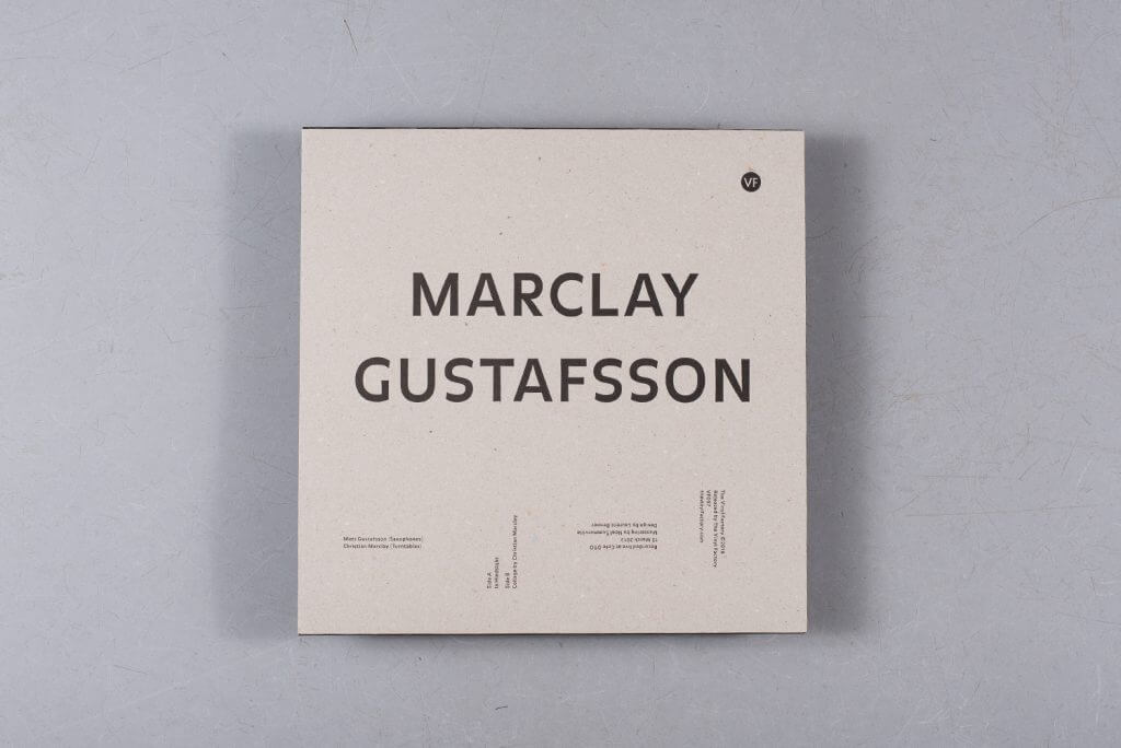
In 2013, multimedia artist Christian Marclay and free jazz saxophonist Mats Gustafsson performed together at Café Oto in London. The collaboration, which featured Marclay on turntables and Gustafsson on saxophones, was last month given a limited release of 500 copies only. The editions includes the duo’s performance on the A-side and an etching by Marclay on the flip side. Marclay’s onomatopoetic artwork is also been screen printed on the thick card cover.
12. Mala
Mirrors
(Brownswood Recordings)
Artist: Jorge Luis Dieguez aka Fido / Mark James Works / Camille Van De Veld
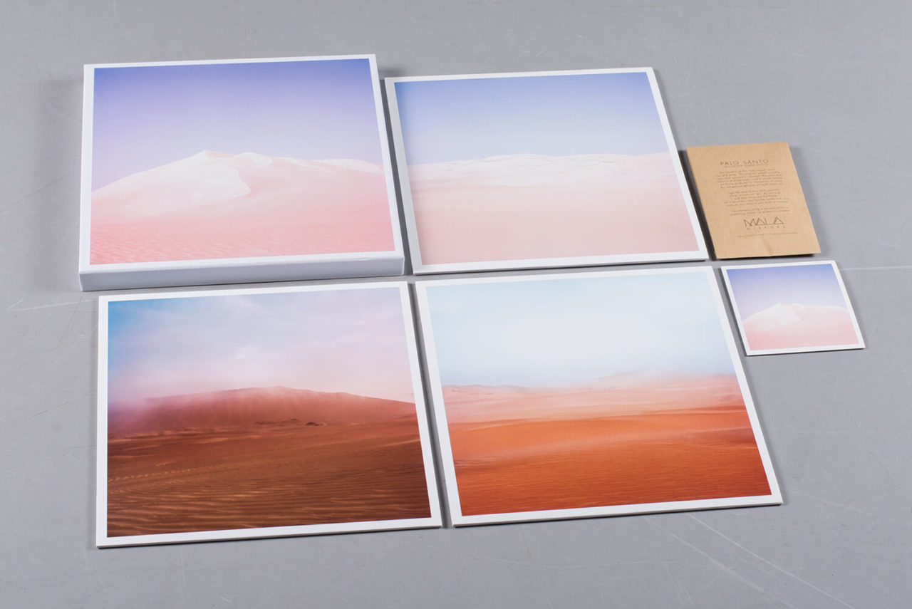
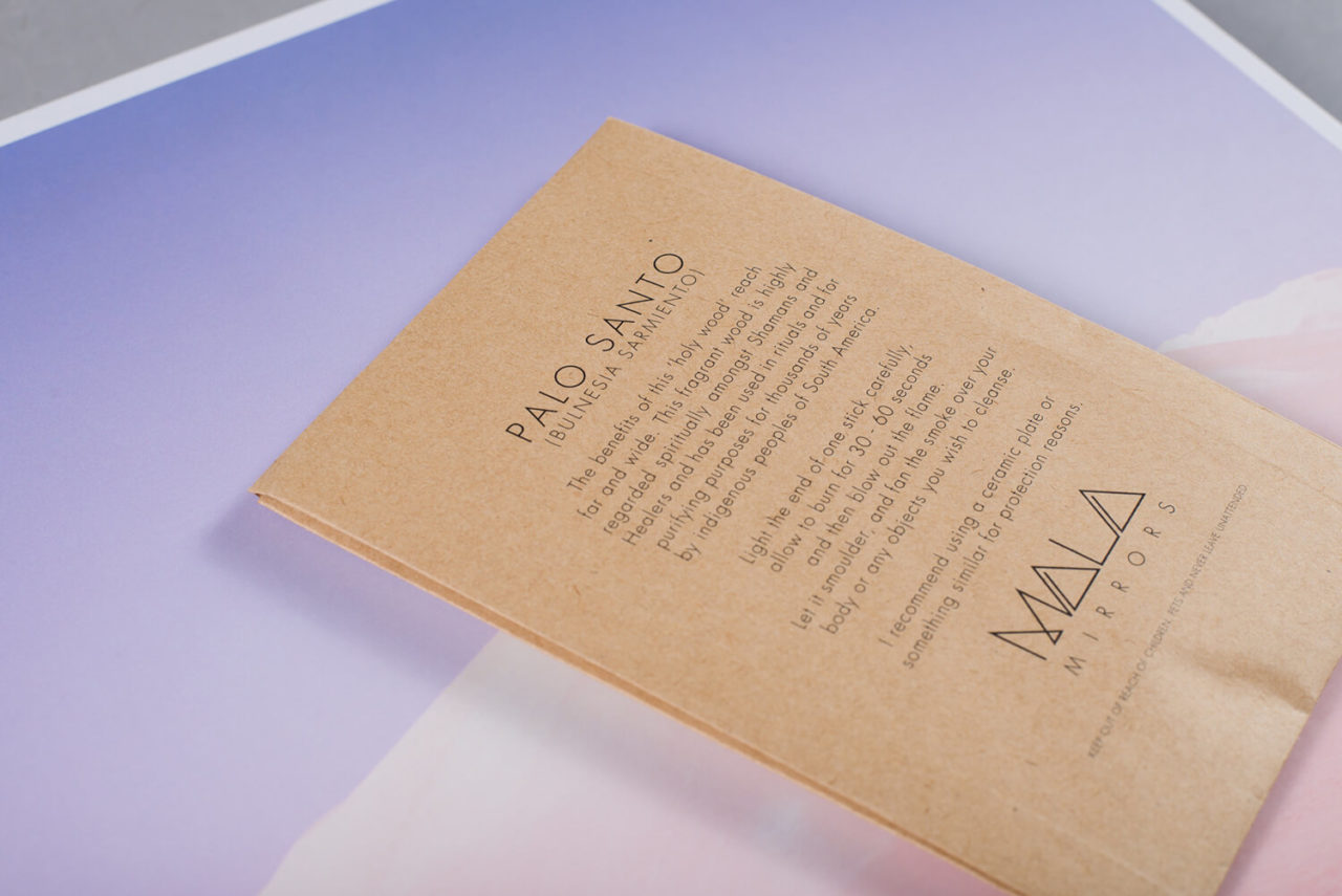
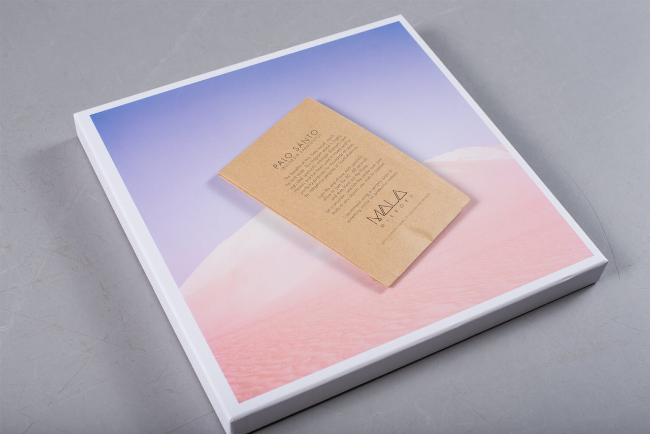
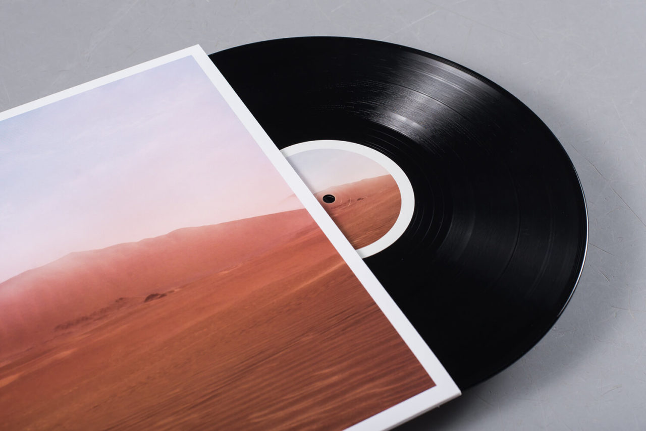
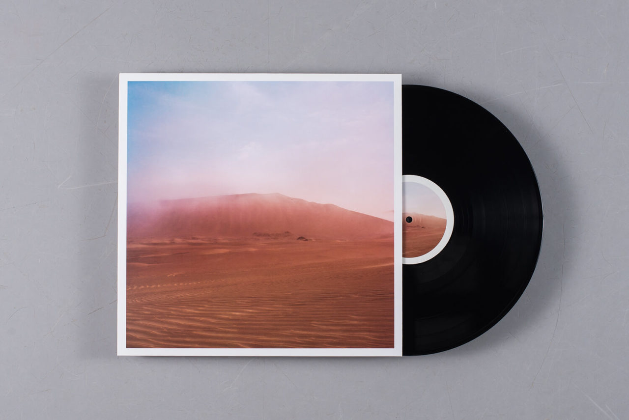
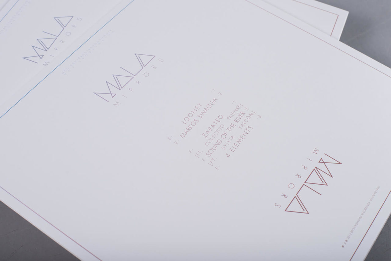
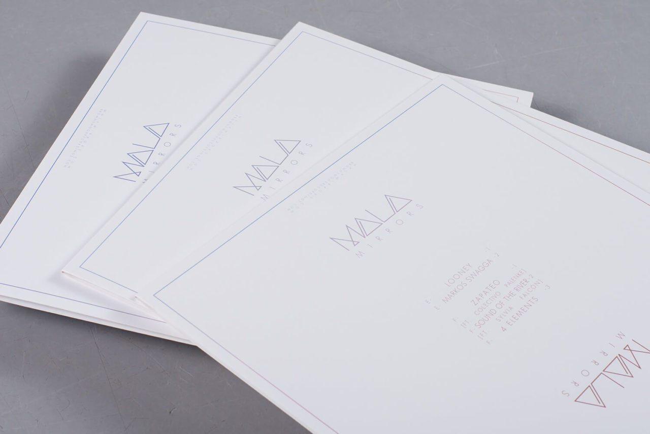
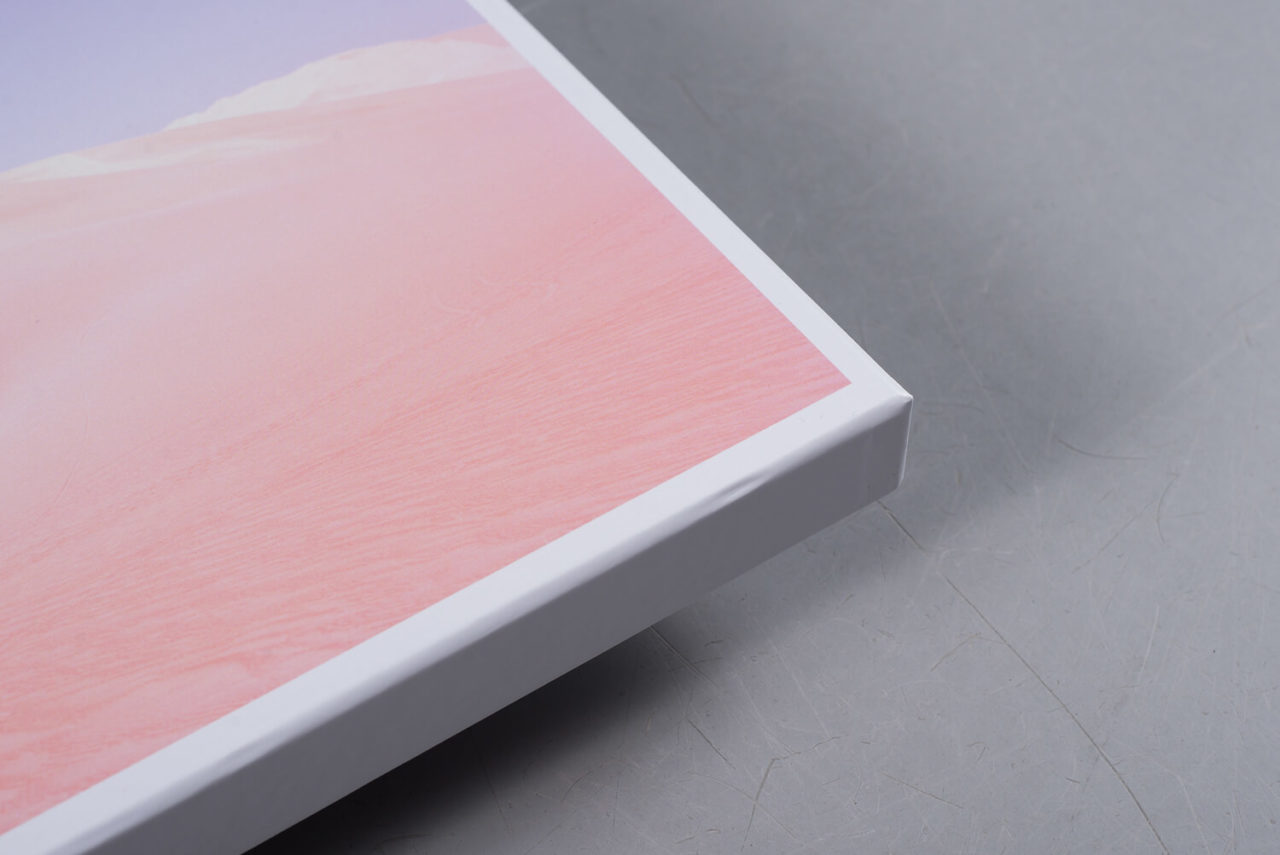
Where his debut LP explored the rhythmic and melodic heritage of Cuba, Mirrors finds Mala immersed in the folk sounds of Peru, collaborating with local musicians to reinterpret ancestral sounds with contemporary studio techniques. Paying their respects to the stunning sounds found within, Brownswood gave Mirrors the box set treatment, pressing the audio onto three beautifully sleeved 12”s housed within a printed box. Alongside the records, the box contains a CD version of the album, transparent sticker, extensive liner notes and a chip of scented healing wood used by shamans to provide healing. It’s truly a feast for all the senses.
11. Nevermen
Nevermen
(Lex Records)
Artist: Keith Tyson
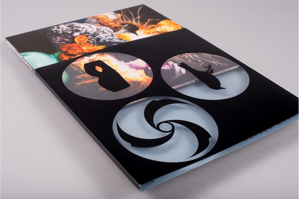
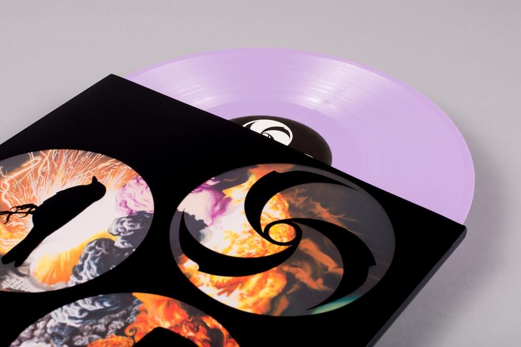
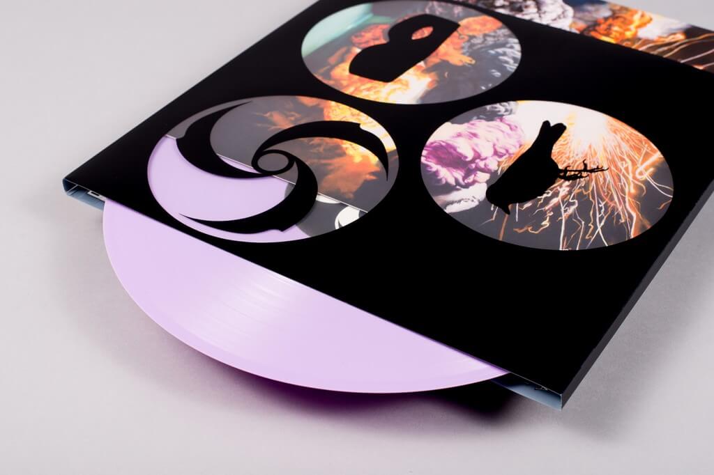
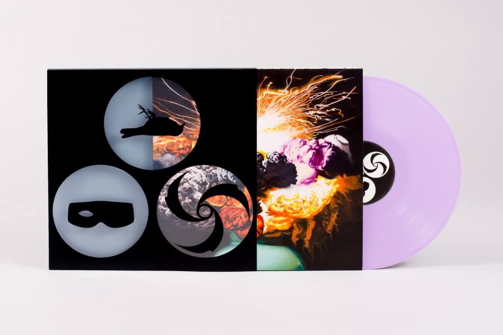
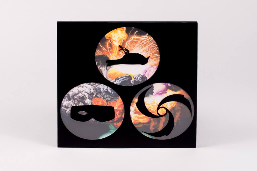
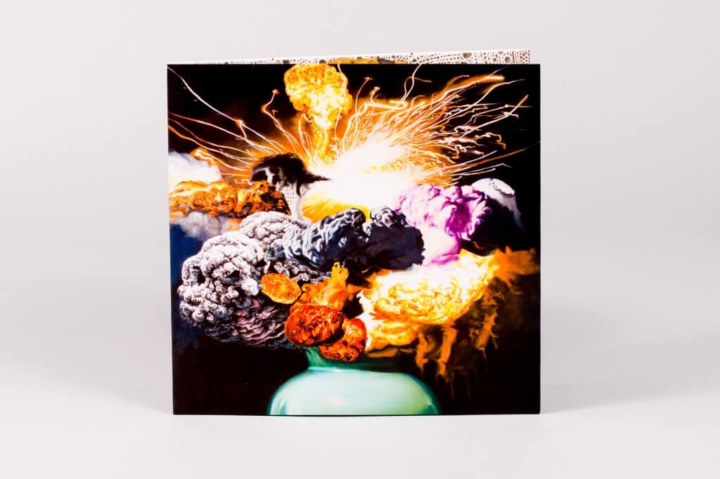
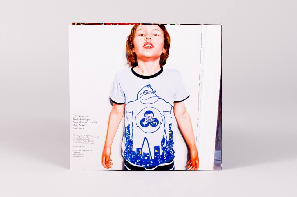
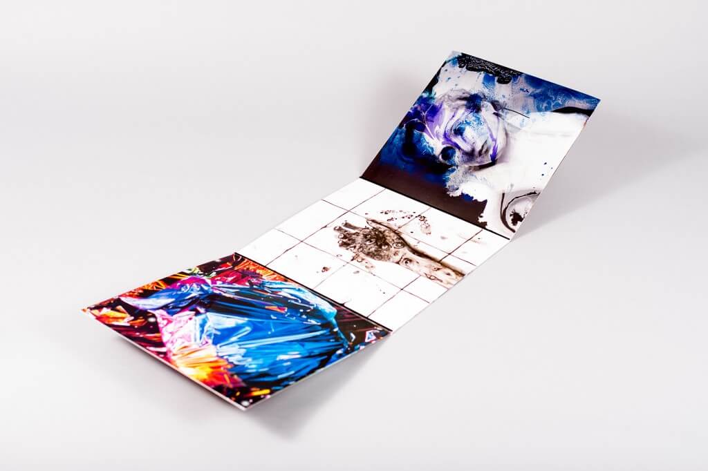
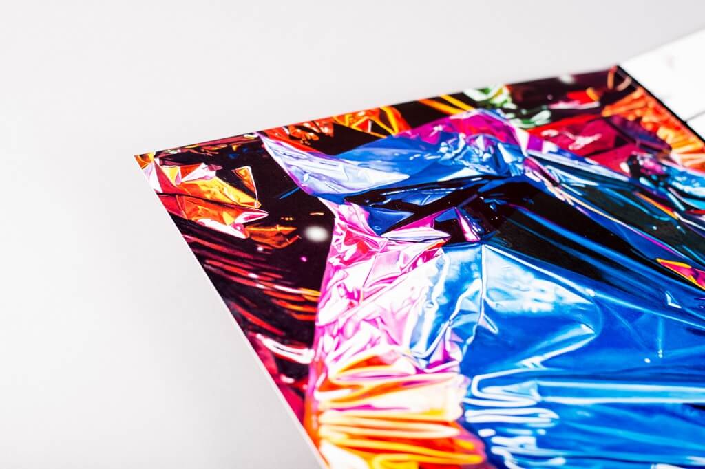
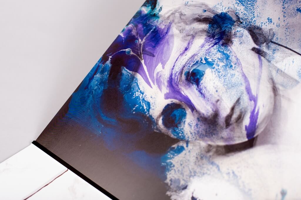
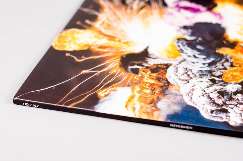
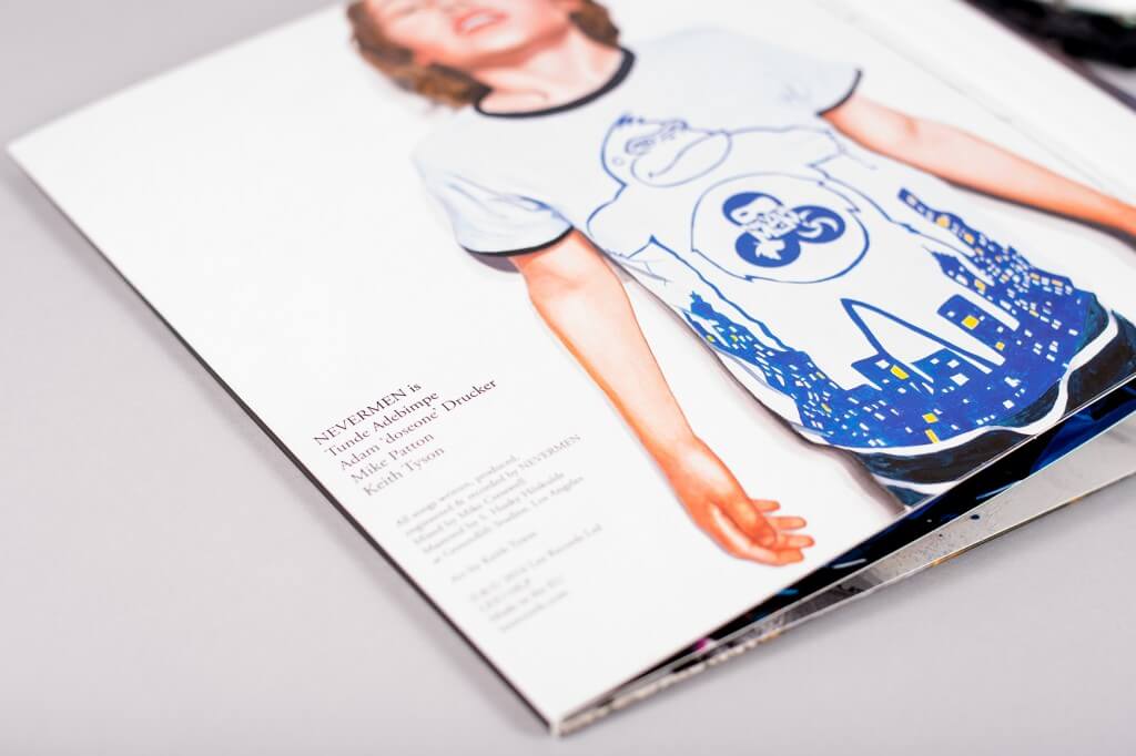
Nevermen call themselves a “leaderless trio”, jamming in the nether regions of rock, rap and soul they released a self-effacing, self-titled debut on Lex records earlier this year. Given the task of creating a visual identity to this fluid process, the trio enlisted visual artist Keith Tyson, winner of the 2002 Turner Prize in what was one of its most controversial years, for the sleeve design.
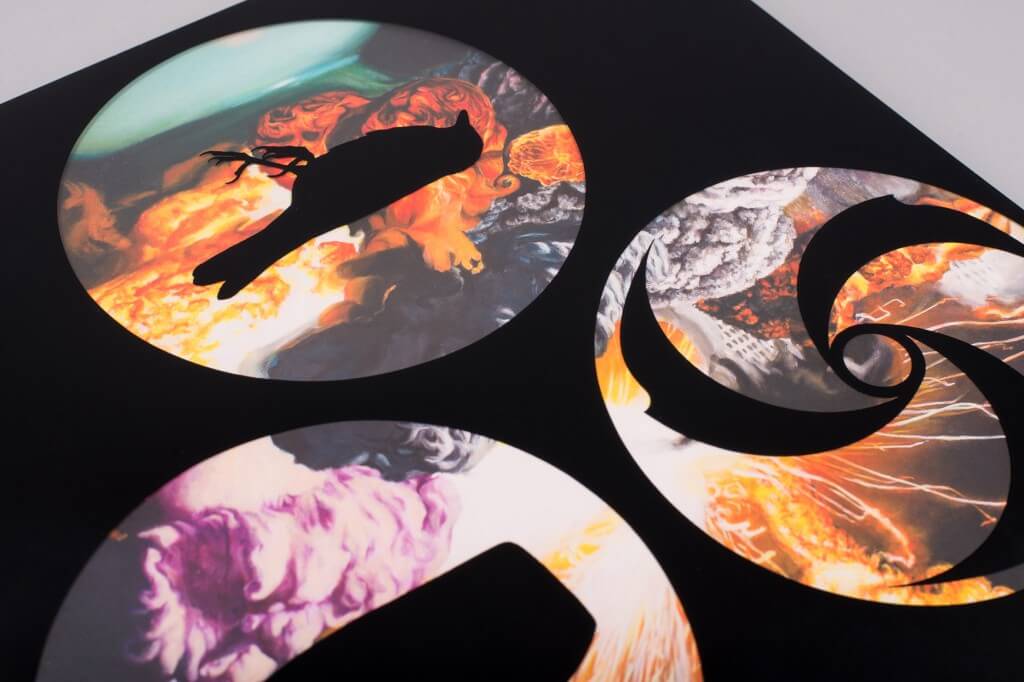
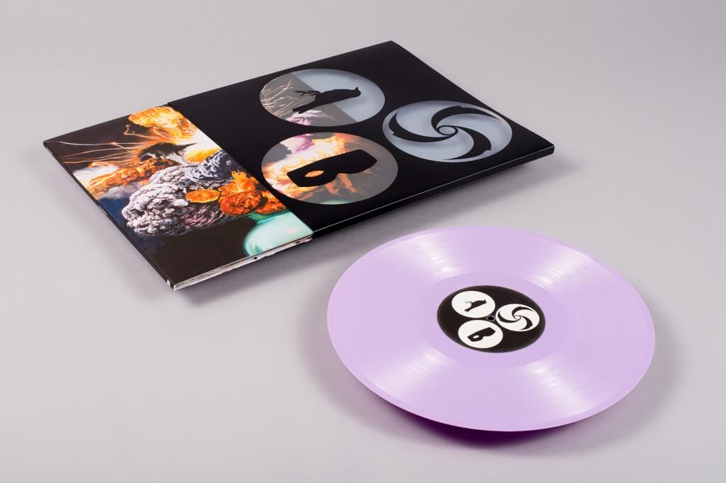
Laid out by Optigram, the studio responsible for iconic sleeve work with Hyperdub, Warp and Ninja Tune among others, the triple gatefold is housed in a perspex sleeve, emblazoned with a triumvirate of symbols that bind the band together. Inside, Tyson captures that coalescence of ideas and influences in a mixed-media explosion of anarchic collage, hyper-real, post-pop art painting and dystopian print work, each 12″ panel a canvas for a separate piece created exclusively for the project.
10. Woodkid & Nils Frahm
Ellis
(Erased Tapes Records )
Artist: JR
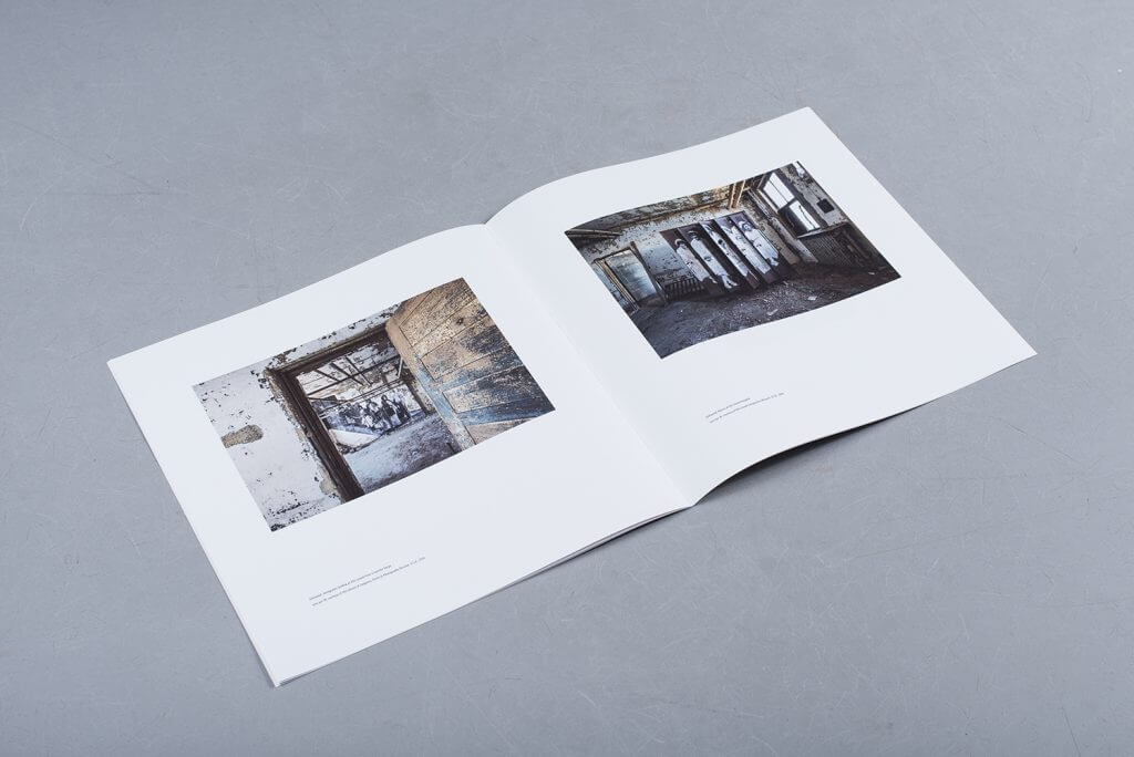
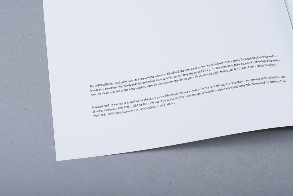
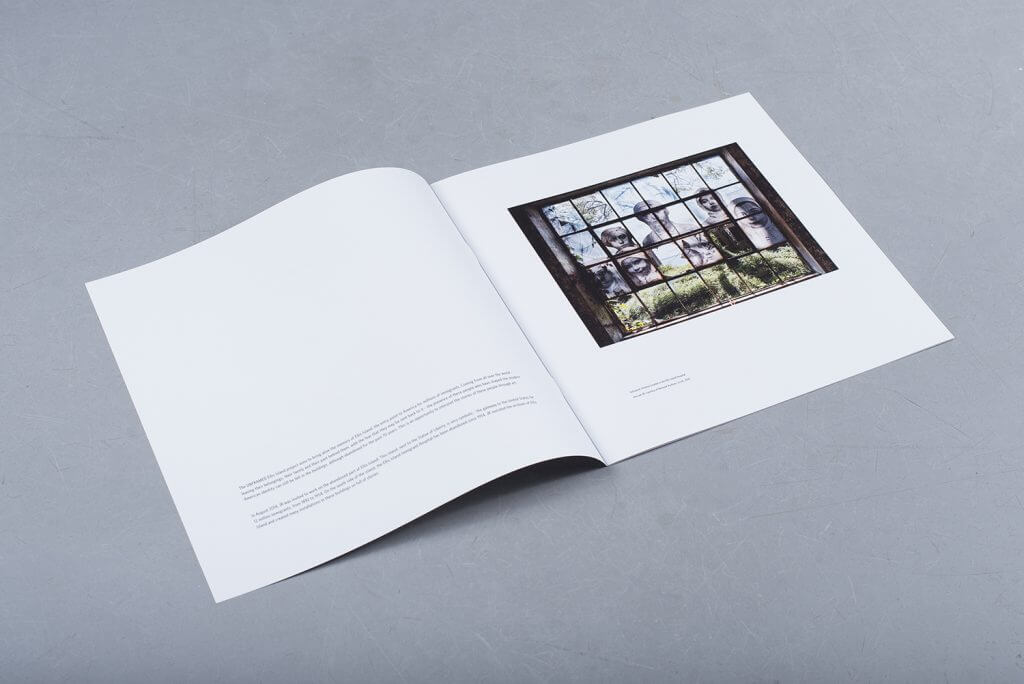
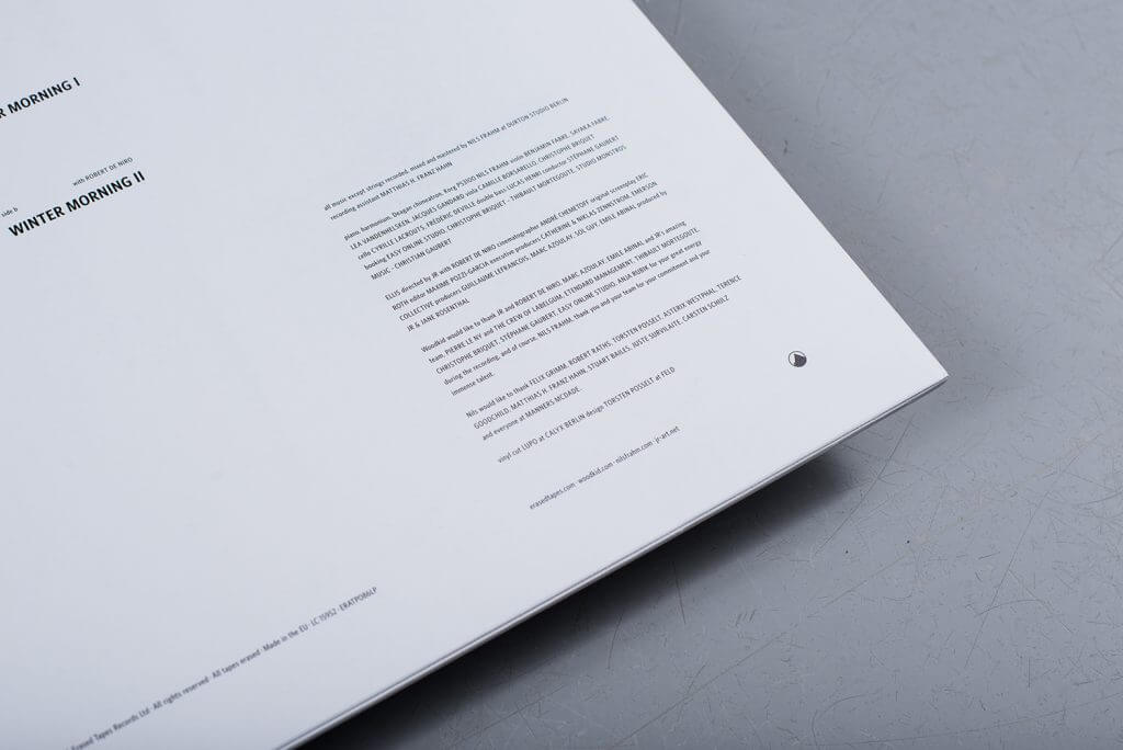
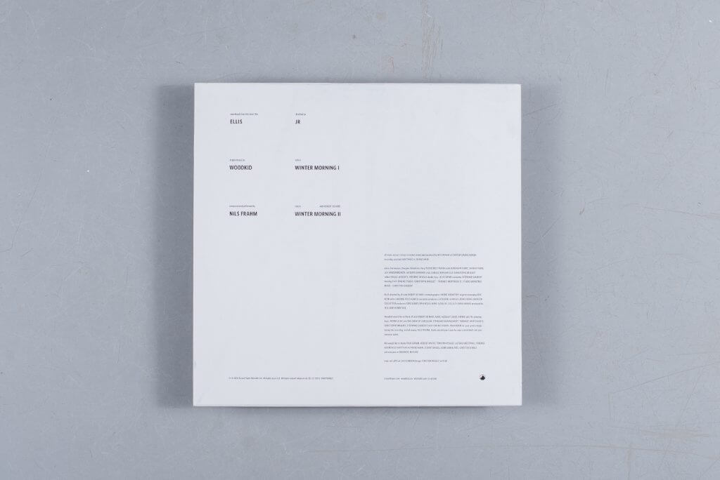
Directed by the elusive French artist JR, 14-minute film Ellis stars Robert De Niro as a man reflecting on the immigrant experience as he wanders the halls of the abandoned Ellis Island Immigrant Hospital. De Niro’s narration – which holds up a mirror to the current migrant crisis – forms the spoken word for the soundtrack Nils Frahm and fellow composer Woodkid. Released by Erased Tapes, the stunning artwork and 12-page picture book uses photographs by JR, designed and packaged by FELD, a Berlin-based studio for digital arts.
9. Radiohead
A Moon Shaped Pool – Deluxe Box Set
(XL Recordings)
Artist: Stanley Donwood
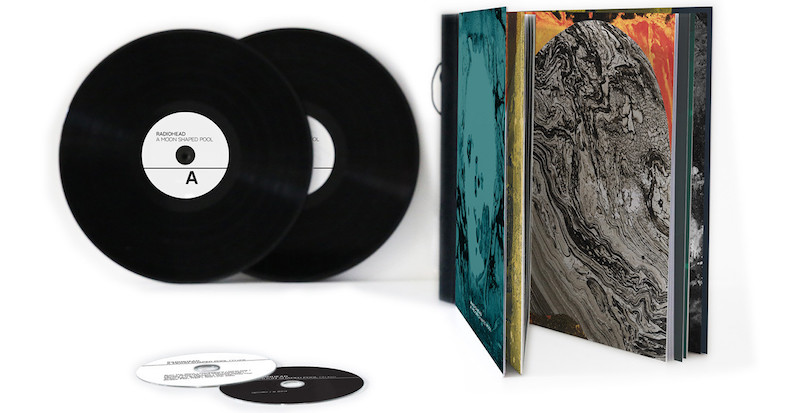
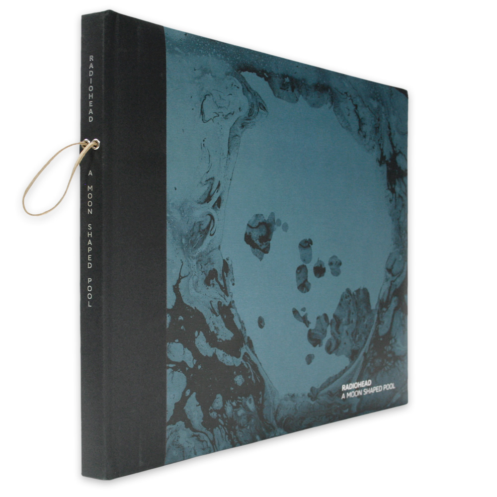
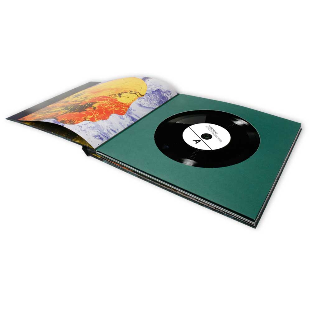
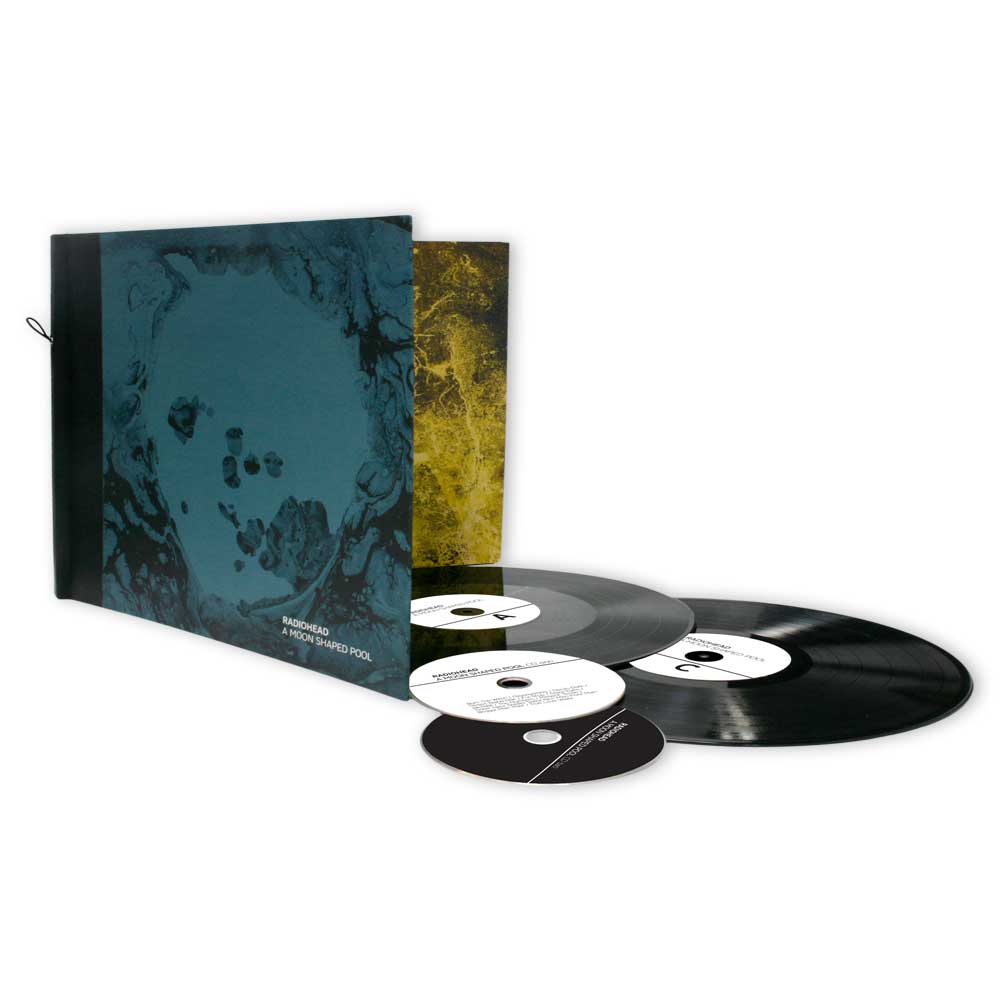
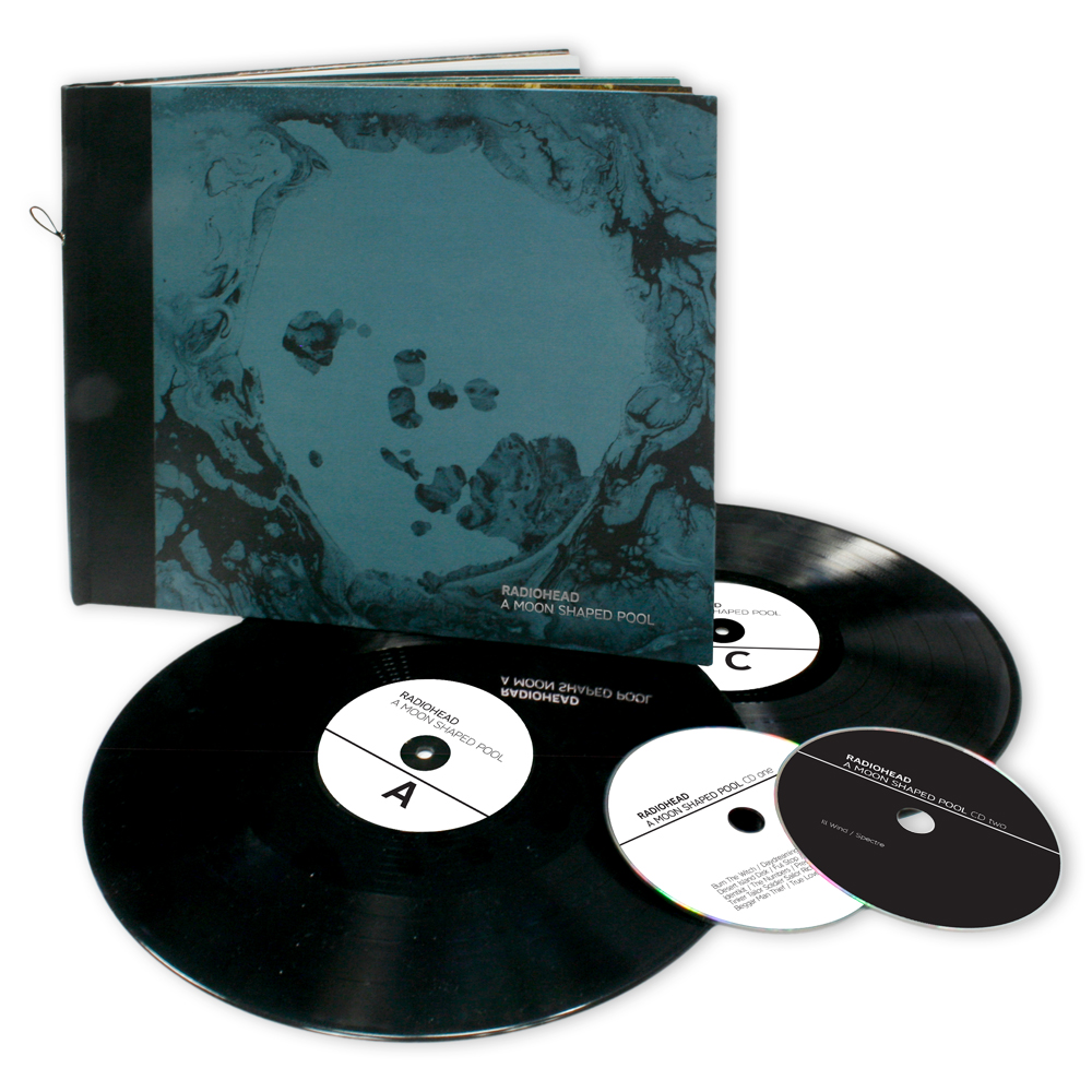
So not only did Radiohead return this year with an absolutely killer long player but they also found the time to drop one of their fine limited edition pieces as well. To get to the point, it includes the album split over two heavyweight LPs, a cd of the album and a CD with two bonus tracks all housed in a beautiful bound case fully created by Stanley Donwood. What makes each one unique is the tape they are bound with. The band decided to cut up their old master tapes and wrap sections around each one. Pretty cool huh? Who knows, you could get that killer bass line from ‘Myxomatosis’ on yours.
8. Aphex Twin
Cheetah EP
(Warp)
Artist: The Designers Republic
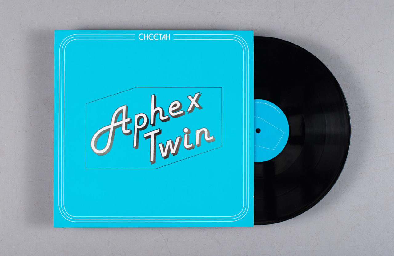
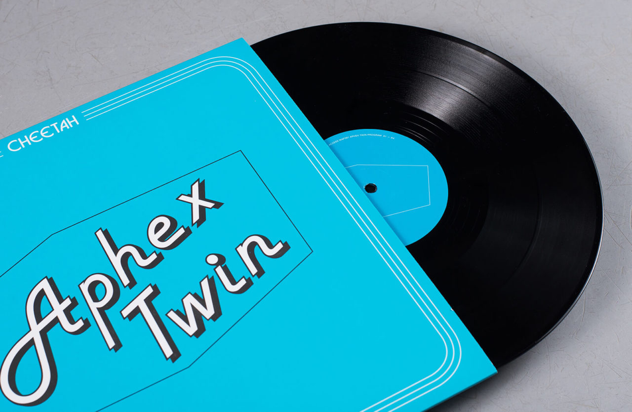
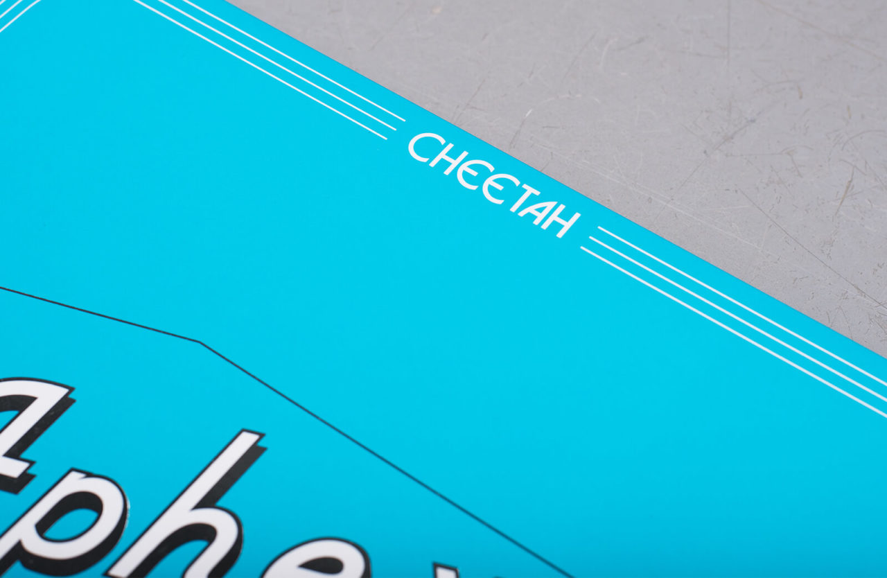
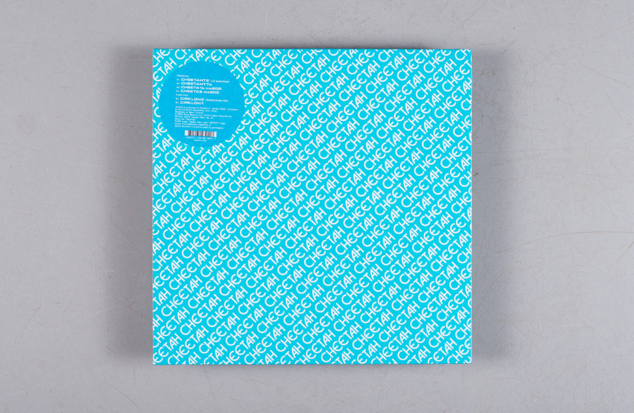
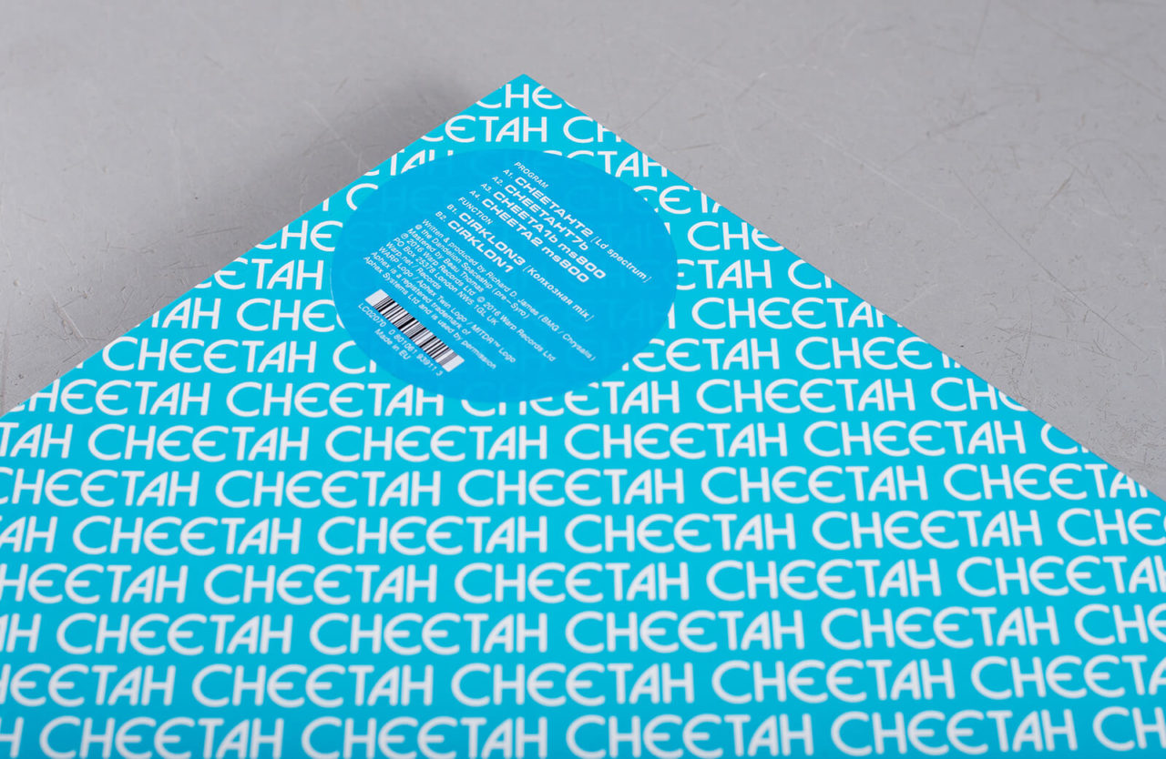
Initially marketed as a new piece of kit, with a tongue-in-cheek retro advertising campaign sent to record shops, Aphex Twin’s Cheetah adopts all the idioms of the clunky micro-synth it draws on, instructing listeners to “read the owners manual carefully before attempting to operate” as well as encouraging them to make their own records from the EP. And given that every Cheetah Sweet Talker came with a pre-recorded demo cassette (‘Beebtalk’ or ‘Chatbox’), it’s no surprise Aphex has chose to make the EP available on tape too, all 2,000 of which apparently sold out in advance of the street date.
7. Jonny Trunk
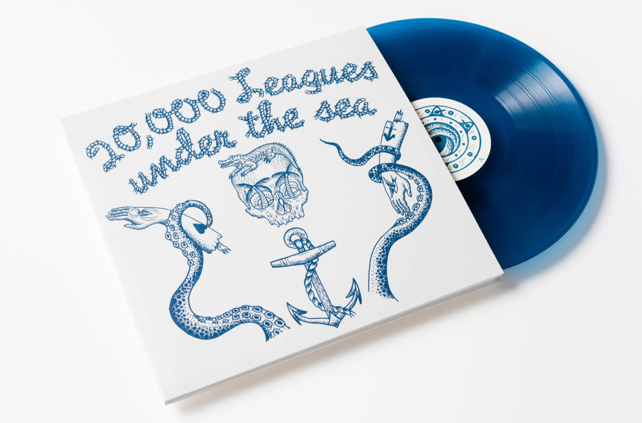
20,000 Leagues Under The Sea
(Trunk Records / Four Corners Books)
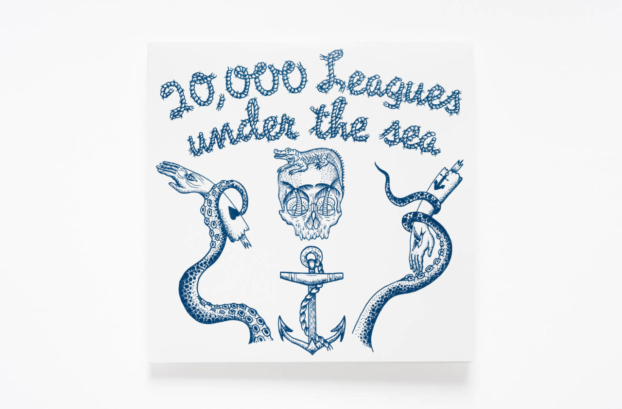
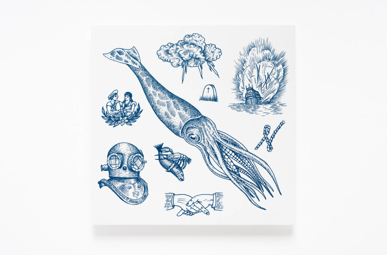
Artist: Liam Sparkes
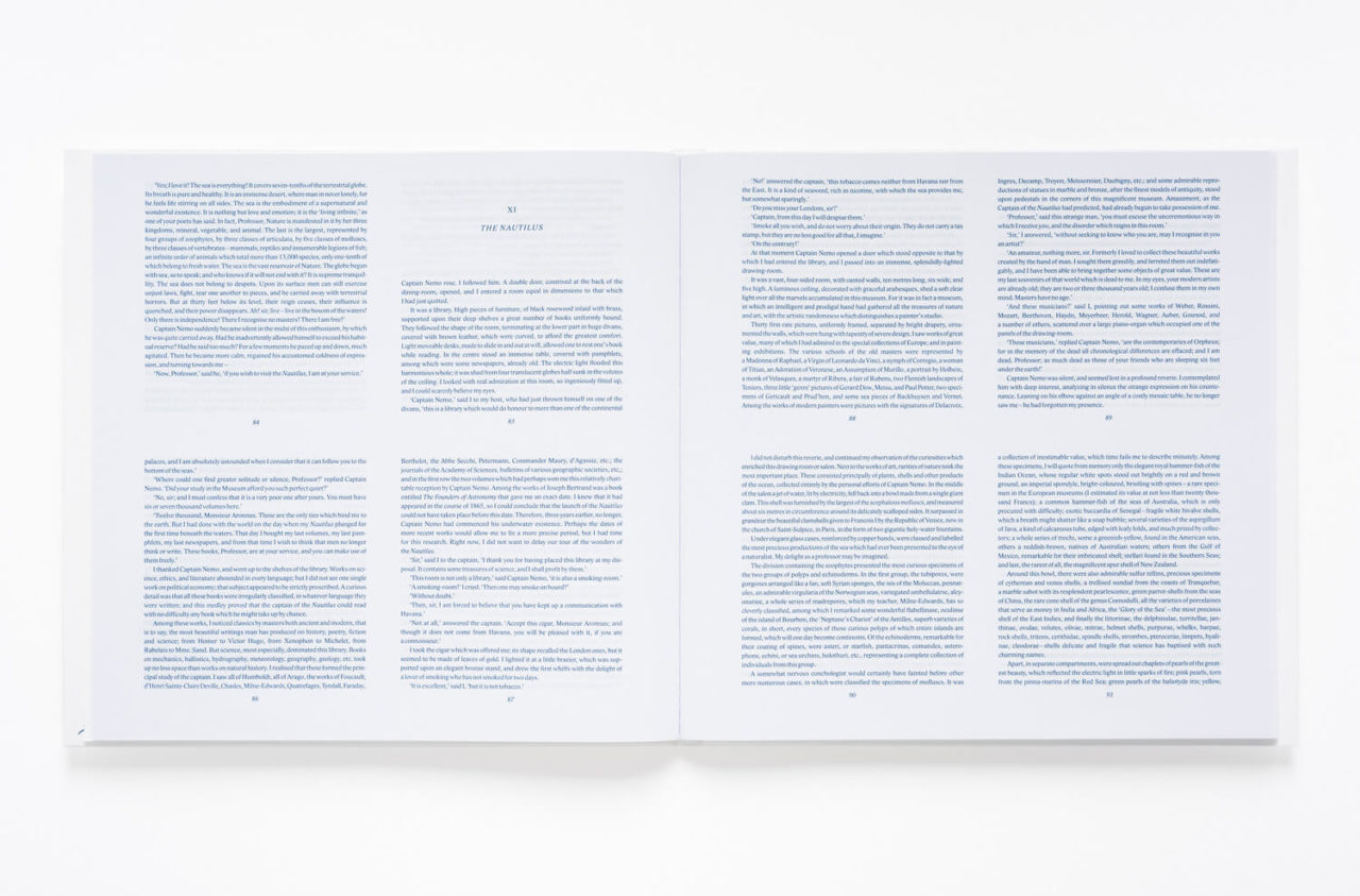
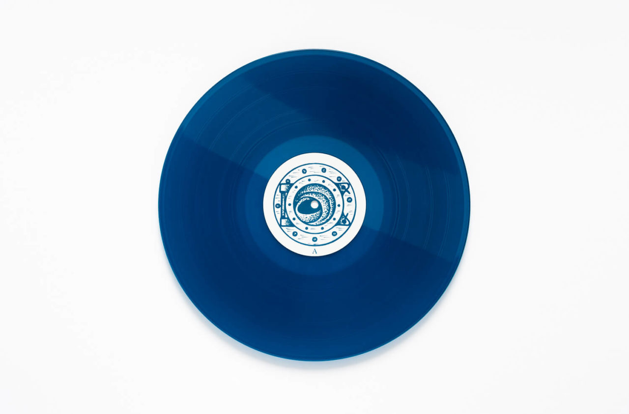
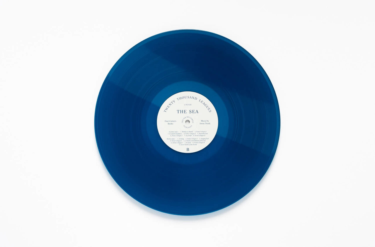
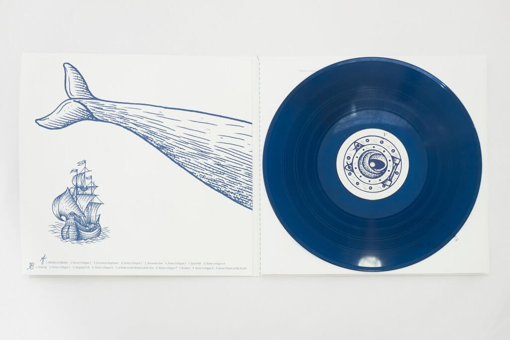
Jonny Trunk’s Cousteau-inspired underwater jazz score for a new edition of Jules Verne’s sci-fi classic is one of the year’s most understated releases. The kind of record you’re as likely to find at an independent book fair or art gallery gift shop as stuffed to the back of a set of crates, the narrative is presented across a 120-page book, with audio accompaniment pressed onto a positively aqua-marine blue vinyl. The cover artwork itself is contributed by cult tattoo artist Liam Sparkes whose nautical observations are emblazoned across the gatefold.
6. John Foxx
The Complete Cathedral Oceans
(Metamatic Records)
Artist: John Foxx / Paul Agar
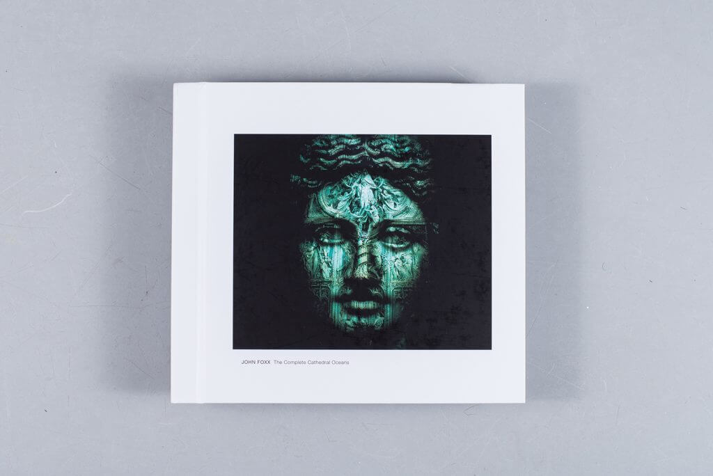
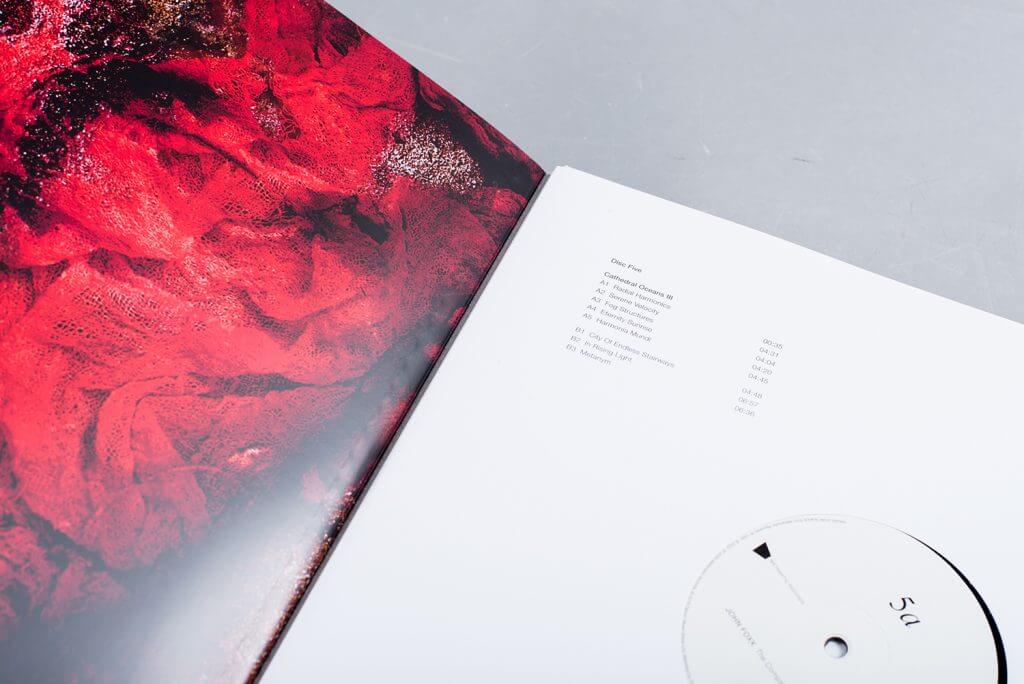
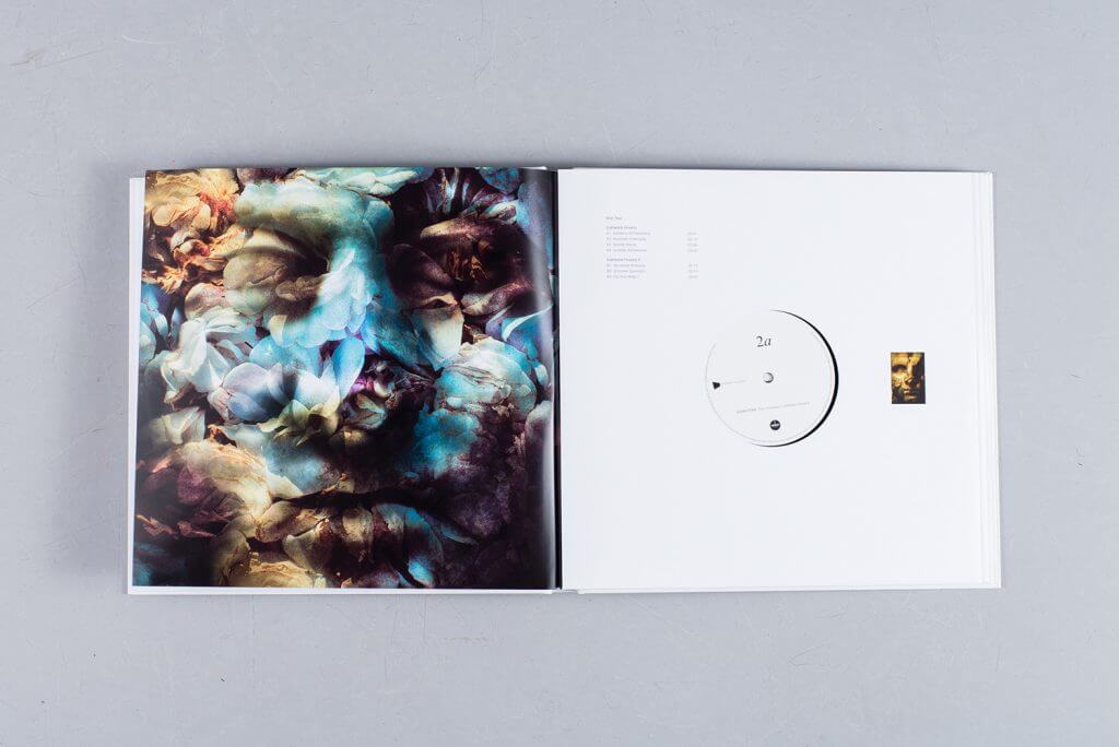
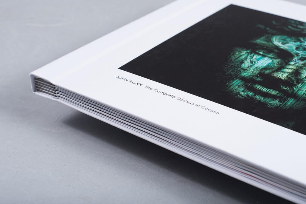
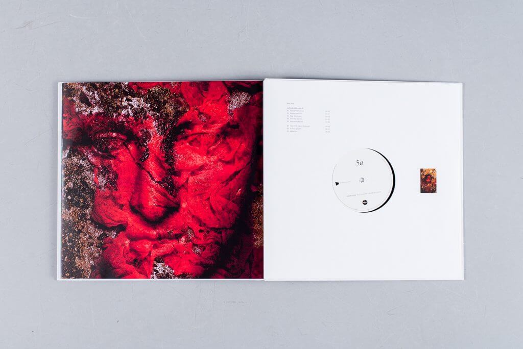
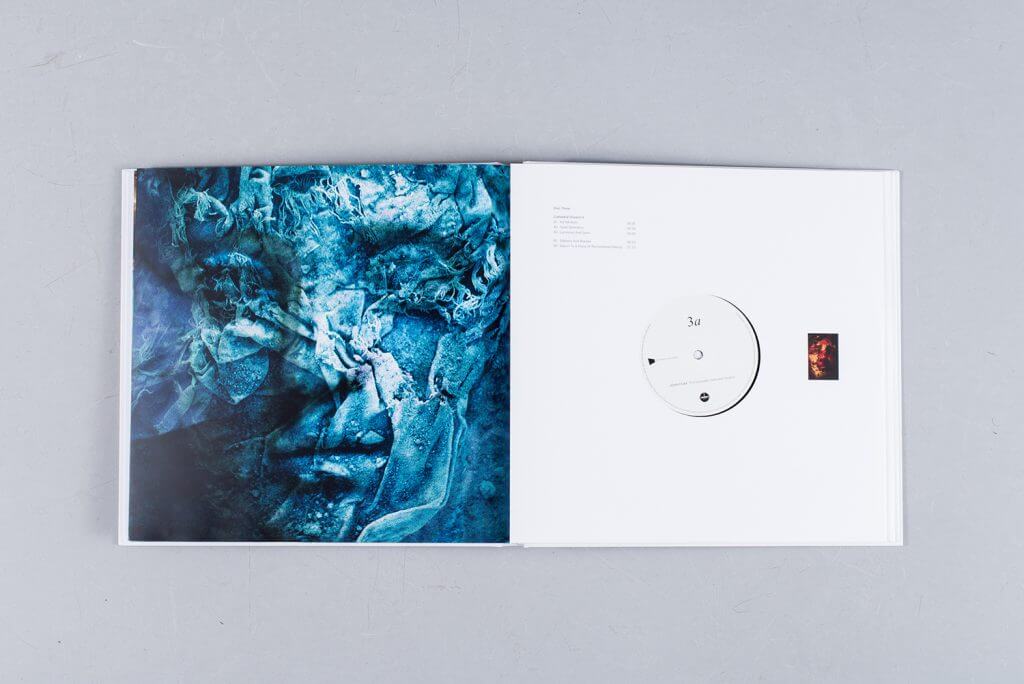
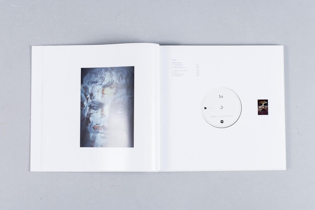
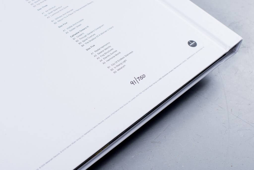
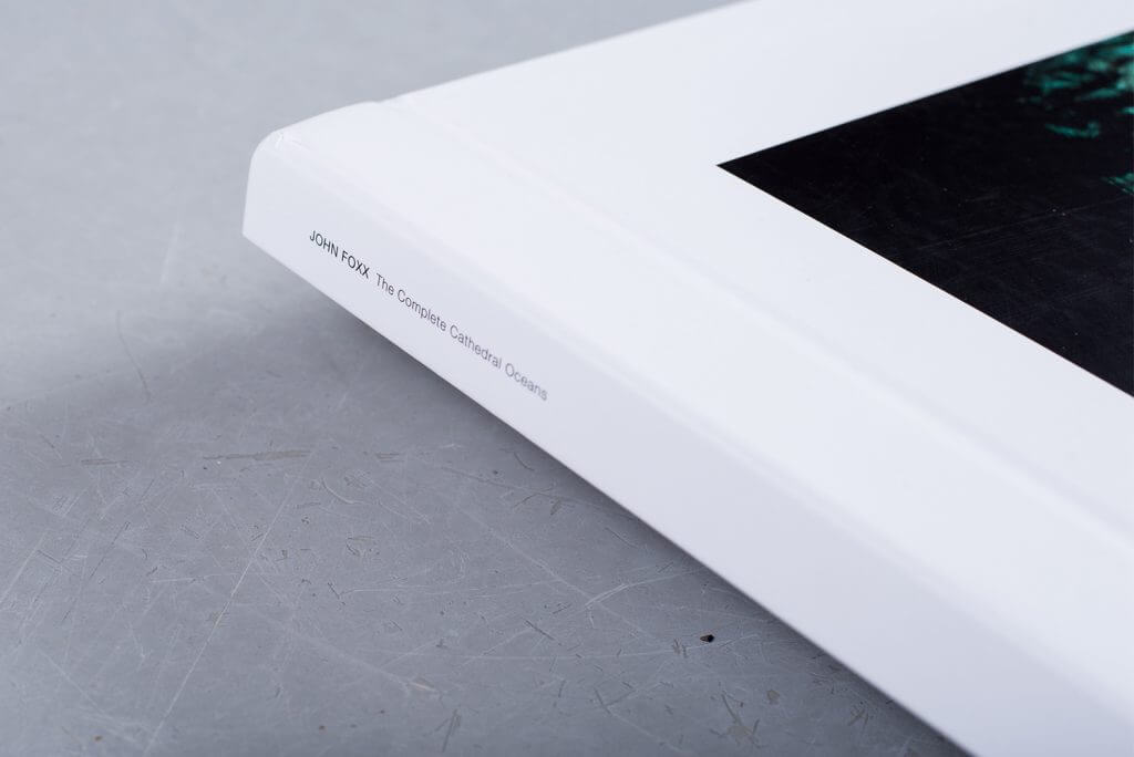
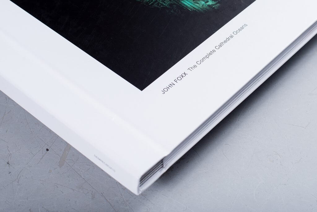
An undisputed, if somewhat unrecognized ambient masterpiece, John Foxx’s Cathderal Oceans trilogy was given its first vinyl release this year, binding the 5xLP set into a gorgeous book, making the case more strongly than ever for its inclusion in the amorphous canon of ambient music. Its claim for beatification from a visual perspective comes from Foxx’s psychedelic photography, which reference a series of accompanying videos, and appears next to extracts from his novel The Quiet Man before you even get to the music. The layered, double-exposed images of statues, crumbling buildings and foliage that adorn the work are described by Foxx as “stained glass windows that you can sit and look at for hours”. It is a grand statement and one of the year’s most considered, multi-disciplinary releases.
5. James Horner
Aliens OST- Liquid Filled Vinyl Edition
(Mondo)
Artist: Curtis Godino
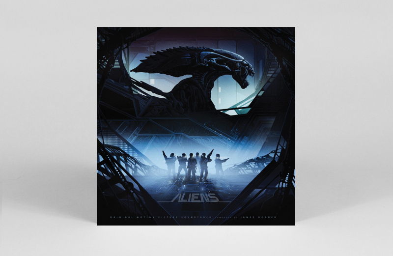
Following on from a failed attempt to release the 1978 soundtrack to the Black Hole on liquid filled vinyl, Jack White staked the first official claim to this novelty format with his 2012 single for Sixteen Saltines. Since then liquid vinyl specialist Curtis Godino has certainly kept the ball rolling with his innovative designs, and here Mondo and Godino joined forces for a “xenomorph blood” filled edition of James Horner’s classic soundtrack, in celebration of the first ever “Alien Day”.
Baiting the appetites of hardened Alien fans and lovers of unusual vinyl alike, this one proved a rather unobtainable affair, as the 75 copies disappeared in a flash and at no small undertaking in terms of its price either. Such issues aside, as with Godino’s red blood filled edition for Friday the 13th this release certainly looked the part in pairing film and medium together, and when considering it’s garish and audacious irreverence to the humble black vinyl, this one definitely stepped up to the mantle.
4. Thomas Vaquie
Ecume- Resin-cast Box Set Edition
(Antivj Recordings)
Artist: Yannick Jacquet
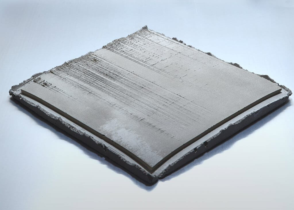
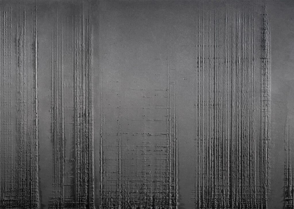
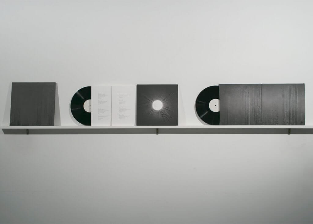
Having already staked their claim in visual arts, Antivj’s inaugural vinyl release set forth their goal for realising sound as a physically crafted object. By digitally visualising sound waves from one of Thomas Vaquie’s audio installations, the label and Swiss artist Yannick Jacquet 3D printed these sonic landscapes into a concrete cast from which the resin-cast covers of this limited vinyl edition are drawn. A cover that effectively acts as a textured sound object to the sonic terrain covered within, this release definitely stood out as a conceptual success from this year’s releases. With the label and Vaquie already having pulled off a number of impressive audiovisual installations, and stating further intentions for physical realisations of these events, it will be intriguing to see what they put out next.
3. Nicolas Jaar
Sirens
(Other People)
Artist: David Rudnick
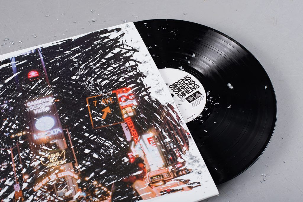
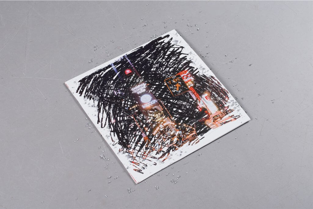
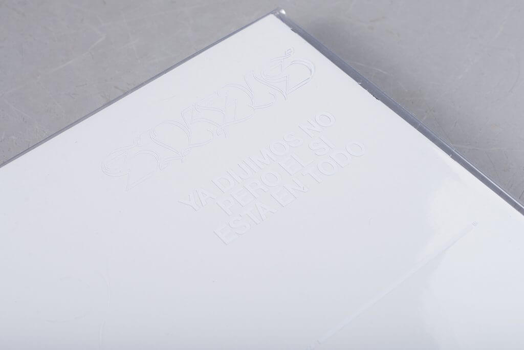
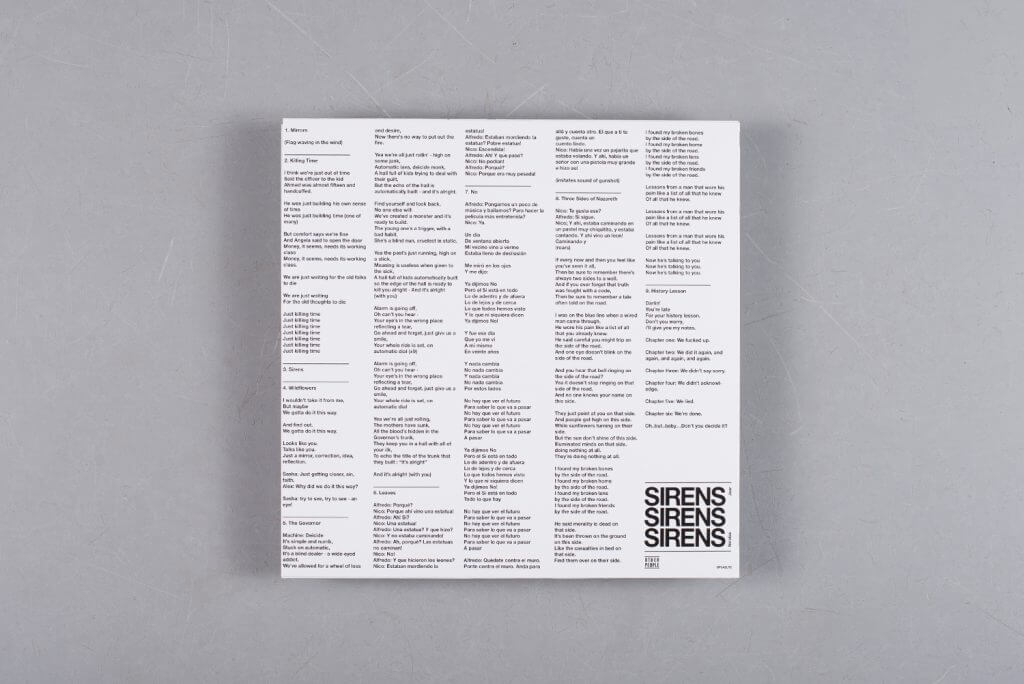
After breaking the internet with the digital delight of Pomegranates in 2015, Jaar answered our vinyl prayers and returned in 2016 with a brand new long player, Sirens. An album of contradiction and contemplation, Sirens shifts between personal and political themes, expressing introspection and agitation through ambient electronics and thrashing post-punk respectively. This musical complexity is only half of the story however, with the striking album art left to fill in the blanks. Within a printed PVC boasting nods to Chilean revolutionaries and a Spanish lyric sheet, lurks a matt silver sleeve and freshly minted quarter. A collaboration with artist David Rudnick, the sleeve invites the listener to scratch off a film of lottery foil to reveal a photo of Times Square taken by Jaar’s artist father Alfredo. Raising questions about identity, family and nationality, the artwork provides no answers, figuratively and literally urging us to look beneath the surface in search of a deeper understanding.
2. Various Artists
Leaf 20 Box Set
(The Leaf Label)
Artist: Tony Morley / Split / The Print Project
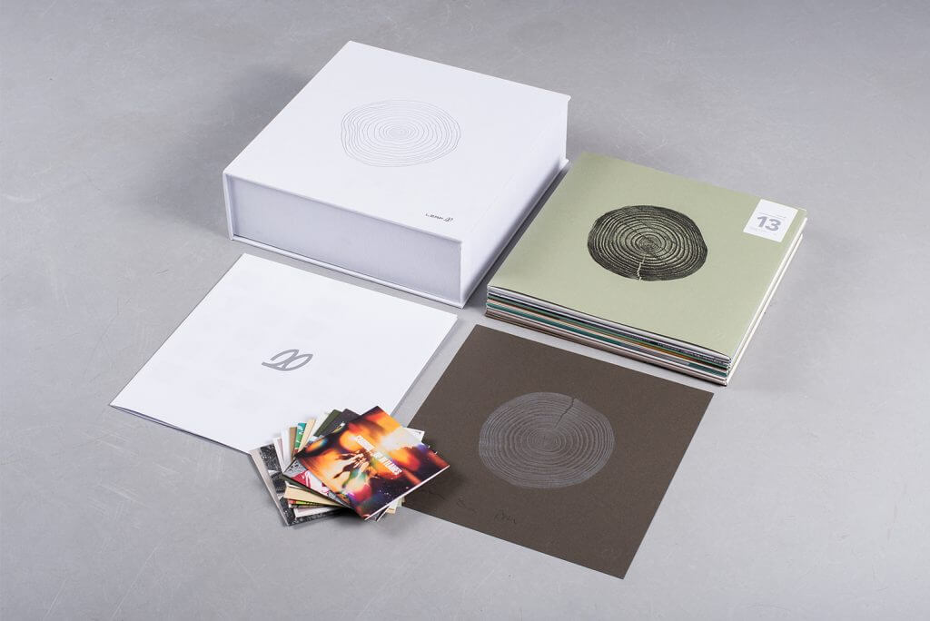
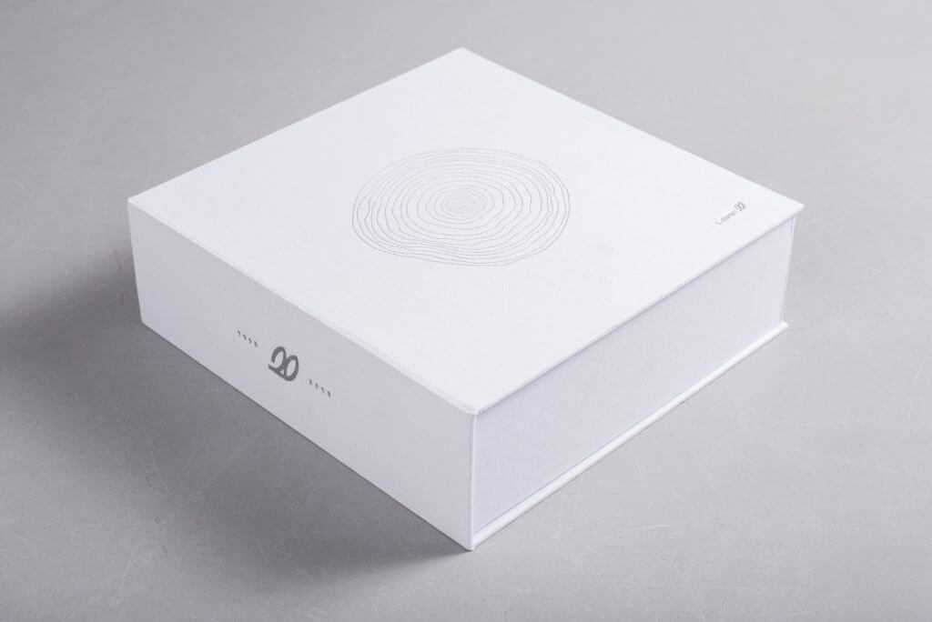
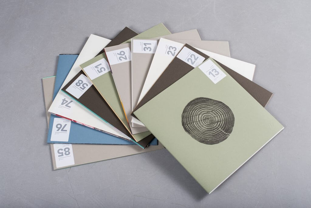
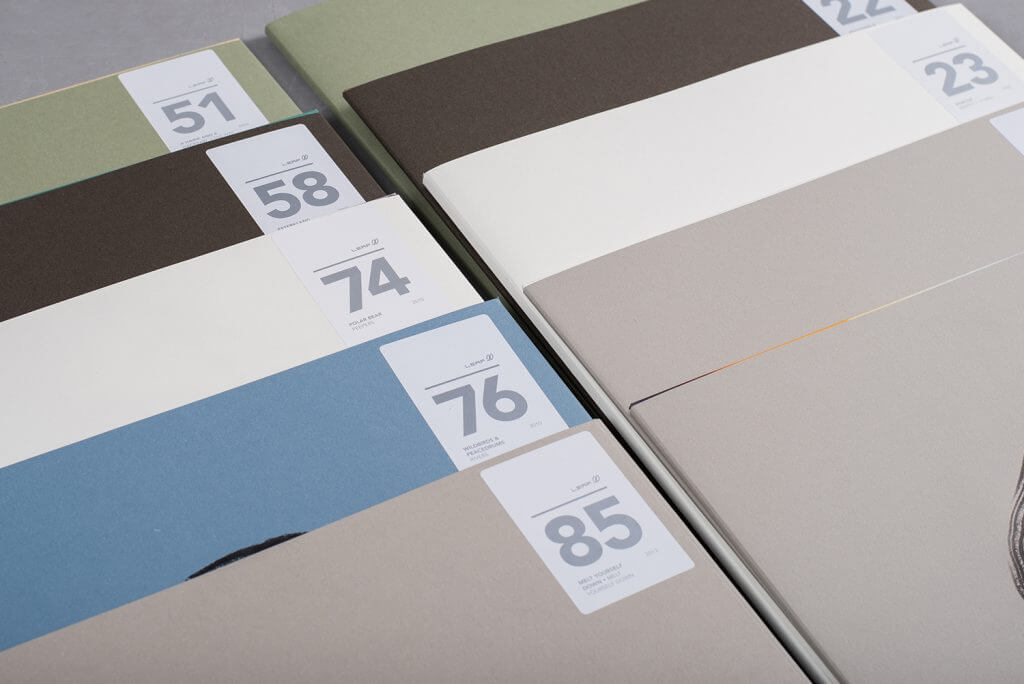
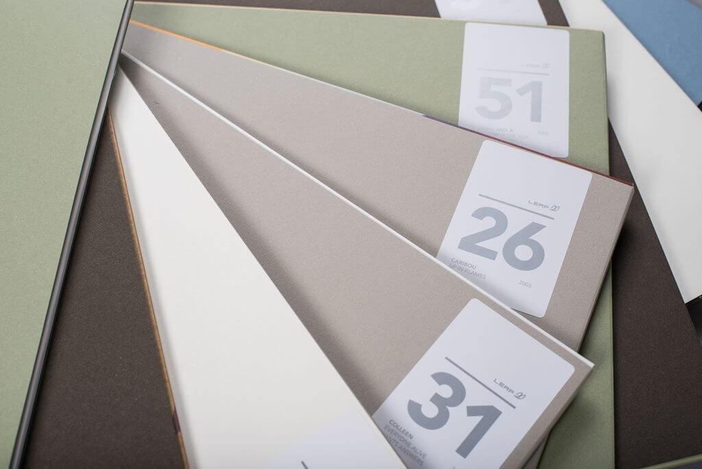
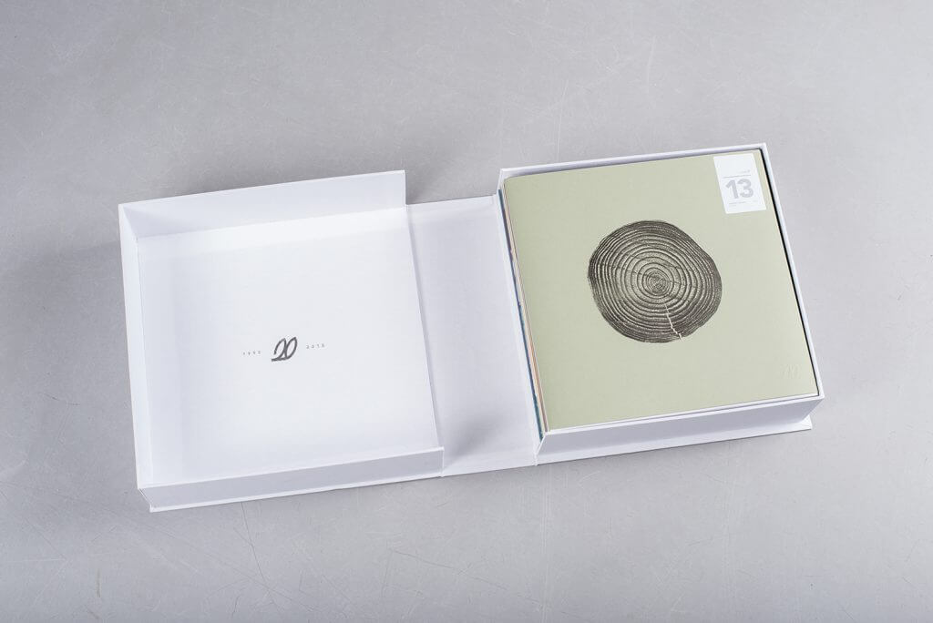
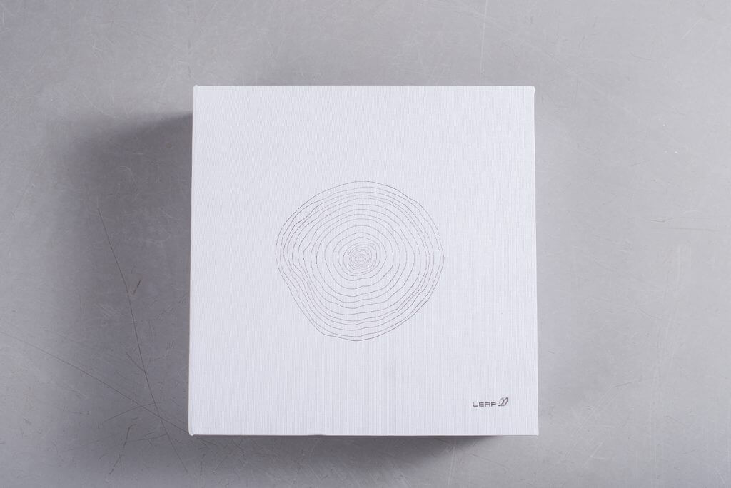
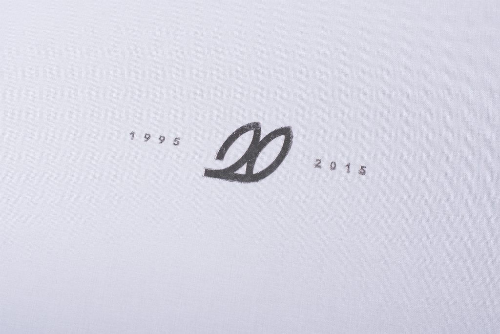
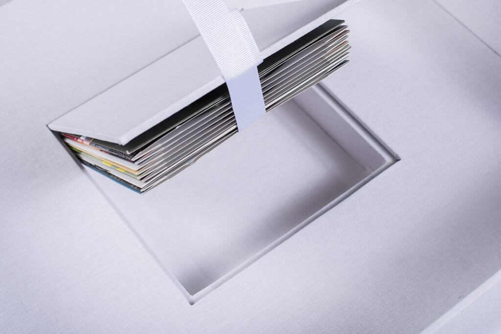
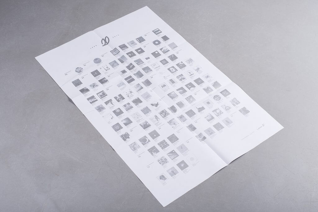
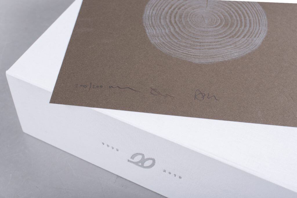
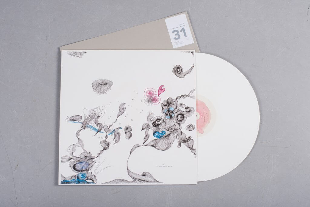
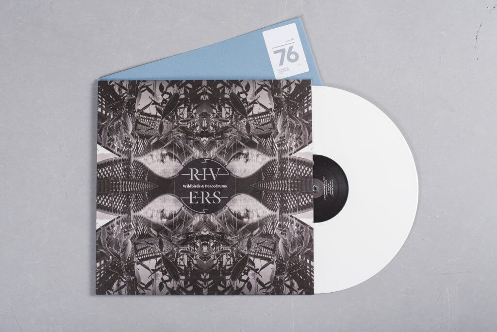
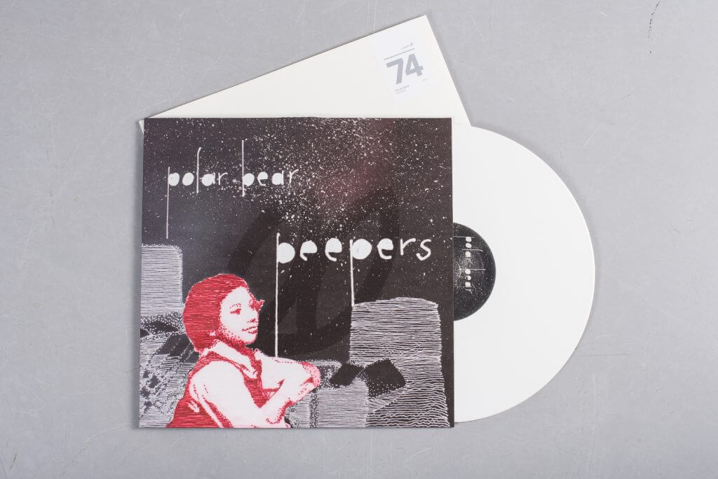
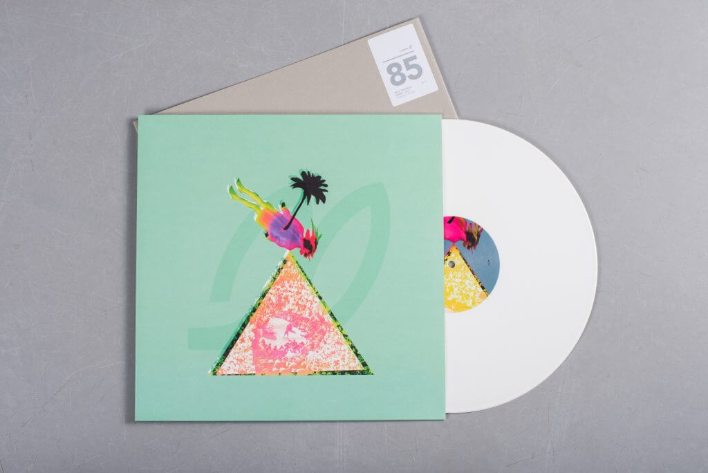
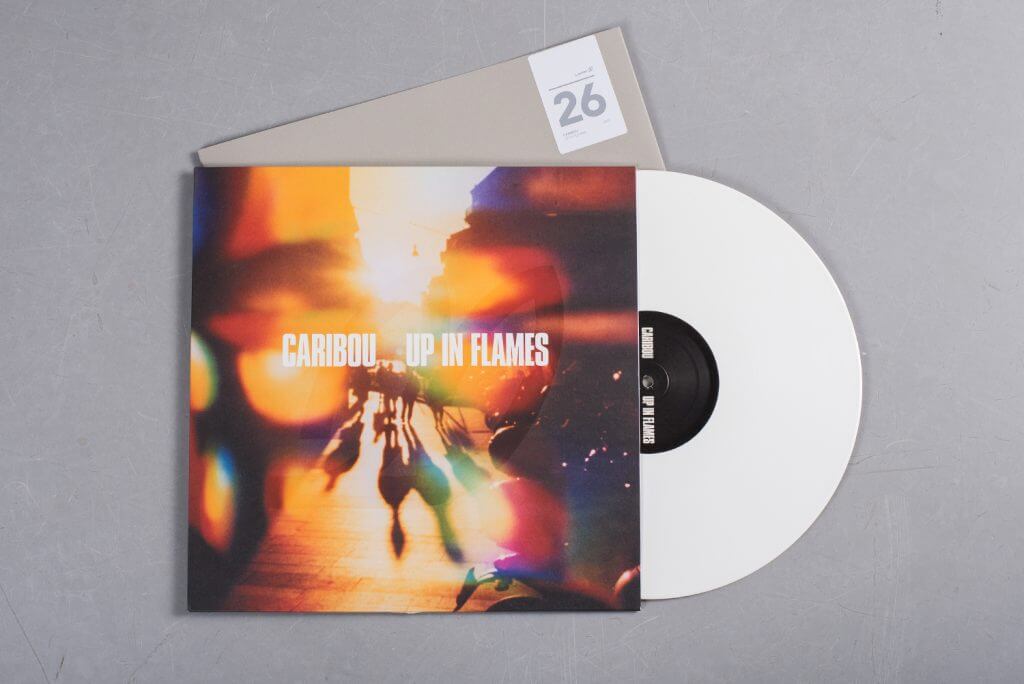
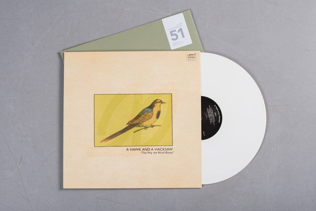
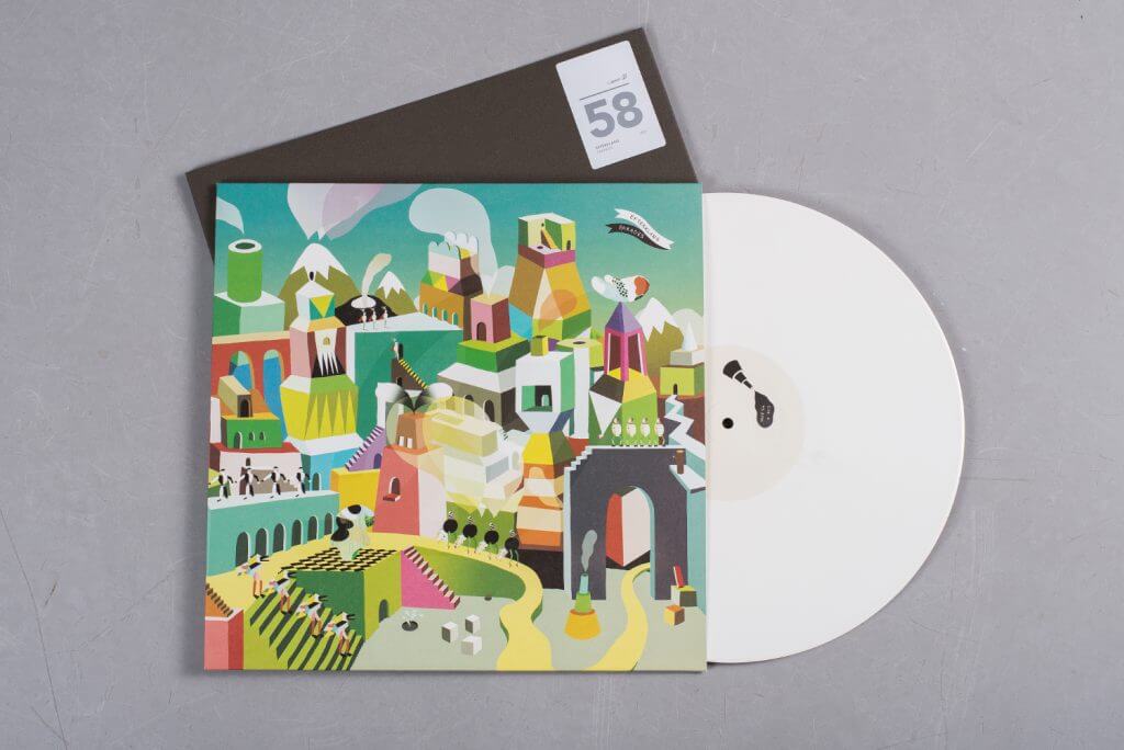
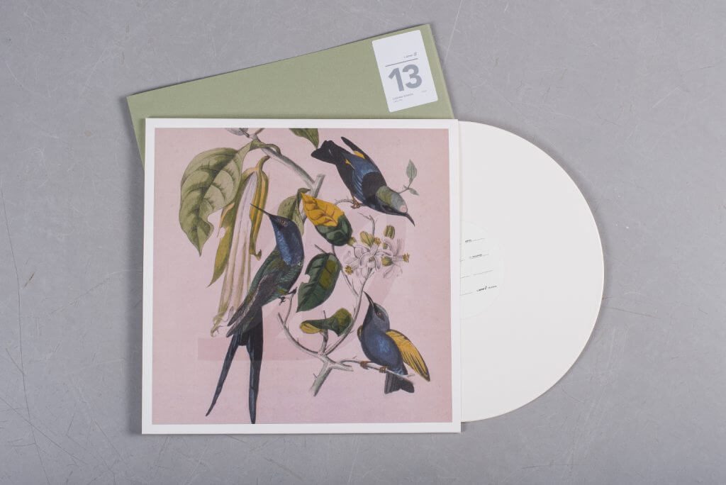
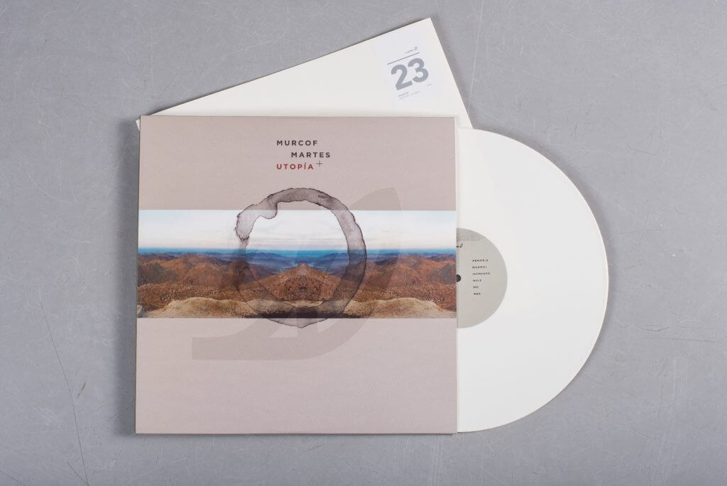
What was a twentieth birthday celebration in 2015 was marked as a true coming of age this year, as The Leaf Label were finally able to unveil their astonishing 10xLP retrospective box set. Overcoming untold hurdles in the design process, the box set arrives as one of the most ambitious and carefully assembled we’ve ever seen.
Inspired by the images of leaves from the label’s maiden EP in 1995, the whole set draws inspiration from several natural motifs, centred around a series of cross-sectional cuts taken from the trunk of a 20-year-old tree. Ten slices were taken, inked and hand-stamped on 10×200 inner sleeves, a limited edition pull-out print and embossed in silver on the lid of the fabric box. Collecting ten definitive albums from the label’s history (including Caribou, A Hawk & A Hacksaw and Susumu Yokota) each pressed onto white vinyl, the love and attention to detail shines through in what is the most impressive box set of the year.
1. David Bowie
Blackstar
(ISO)
Artist: Jonathan Barnbrook
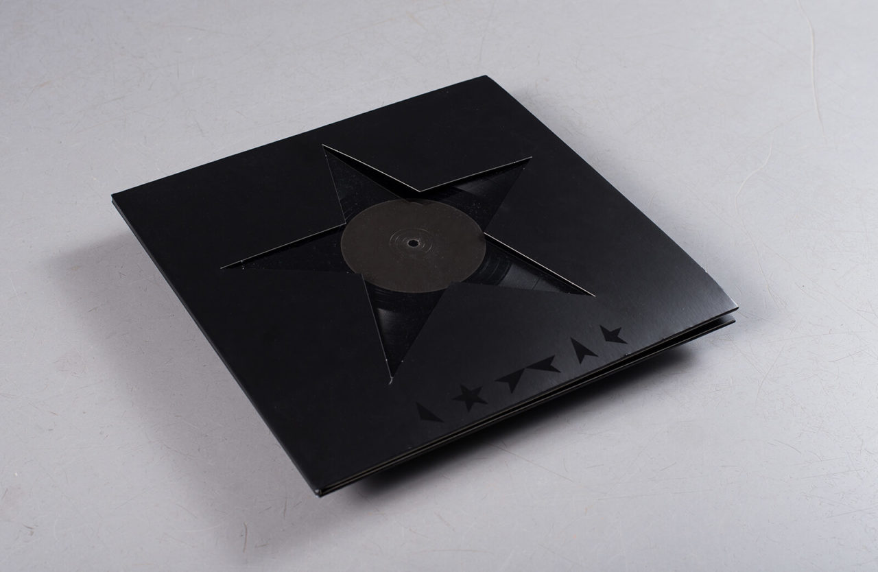
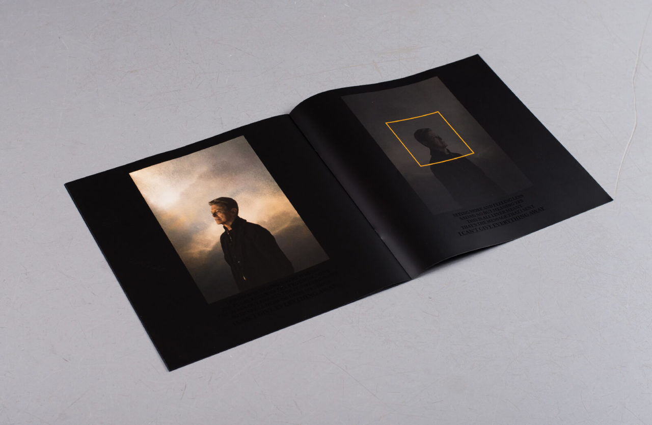
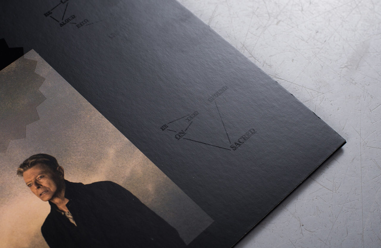
“A lot of people said it was a bullshit cover when it came out, that it took five minutes to design,” Jonathan Barnbrook told Dezeen not long after Blackstar was released. It was a week after Bowie’s passing, the record had just sold out at source and fans were beginning to unpick their own grief from that final artistic statement he’d left behind.
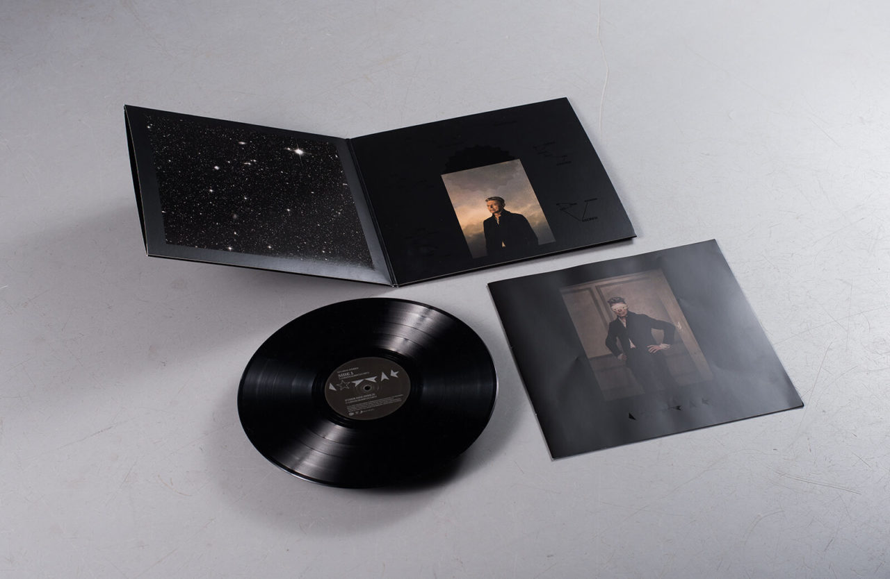
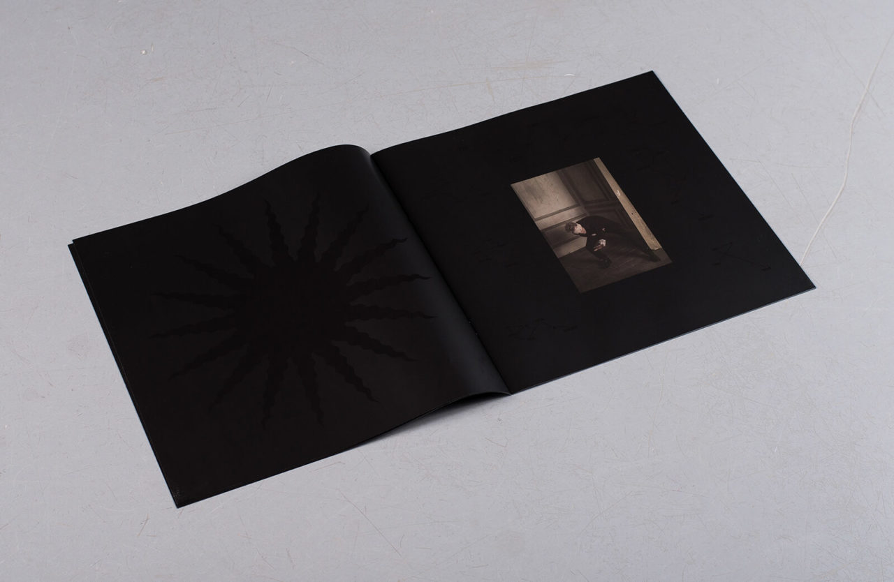
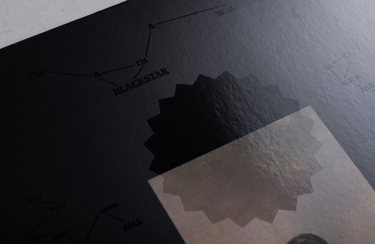
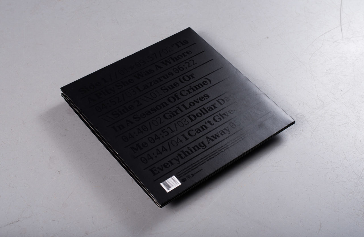
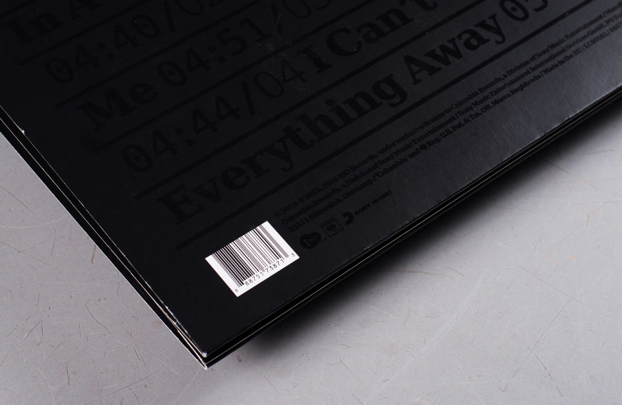
Simple it may be, but everything about the Blackstar sleeve (like the music itself) was executed with a purpose in mind, to represent, in Barnbrook’s words, “a man who is facing his own mortality”. There’s the dark finality of the ★ symbol which permeates everything, cut out of the sleeve to reveal a record that degrades, as we do, as soon as it is used for the first time. The font on the back cover, Terminal (hint), belongs to a design suite named Lazarus in reference to the track of the same name.
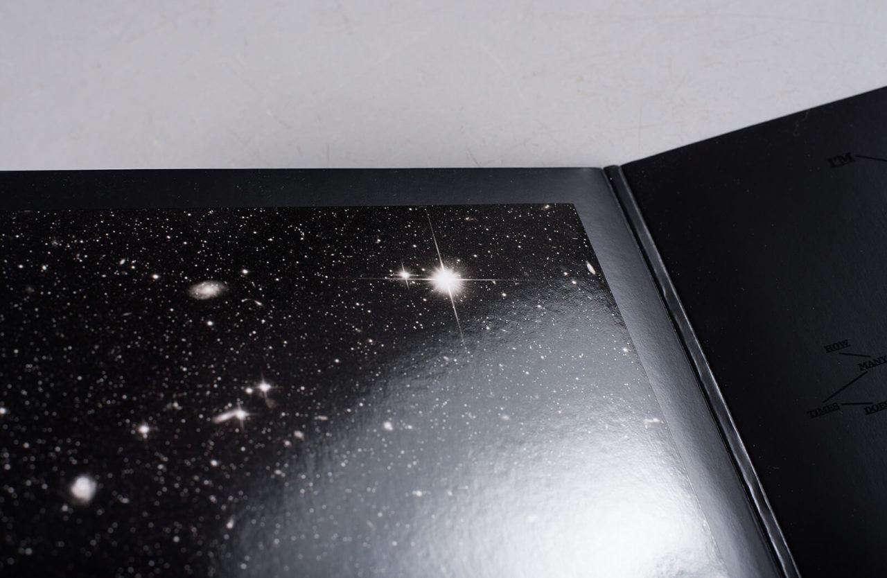
But beyond the artwork’s formal semiotics lurked something less tangible. Several months later, accidental exposure to sunlight by one astonished fan revealed a galaxy on the record’s inner sleeve and suddenly the world was holding their Blackstar’s to the sun in pagan anticipation of a miracle. Forums debated whether it was intentional (the paper used on said sleeve was meant to be of thinner stock than the rest, you know?) but by now, it didn’t matter.
Between artist and audience was created an environment of wonder and possibility, where the reflection of an image, caught at the right angle could carry a hidden message, or a suspect marking around (or was that beneath?) the centre label could transform into a holographic visitation.
For every further hint of undiscovered secrets Barnbrook gave, we returned to the “bullshit” sleeve to search for more. Most crucially, unlike most “gimmick” sleeves that reveal themselves in the press release, Blackstar left it to fans to find out for themselves. The potential was there all along, like energy locked in the nucleus of an atom, waiting to be split.
“There’s one big thing which people haven’t discovered yet on the album,” Barnbrook said recently. “Let’s just say, if people find it, they find it, and if they don’t, they don’t. And remember what Bowie said about not explaining everything.”
Artwork by Hector Plimmer
Contributors: James Hammond, Chris Summers, Patrick Ryder, Amar Ediriwira, Anton Spice.

