Published on
April 8, 2019
Category
Features
Graphic designer and writer John Foster hones in on one album cover a month, discussing the finer details of the design, and the processes behind it. This month, it’s Daniel Thorne’s Lines Of Sight.
Daniel Thorne
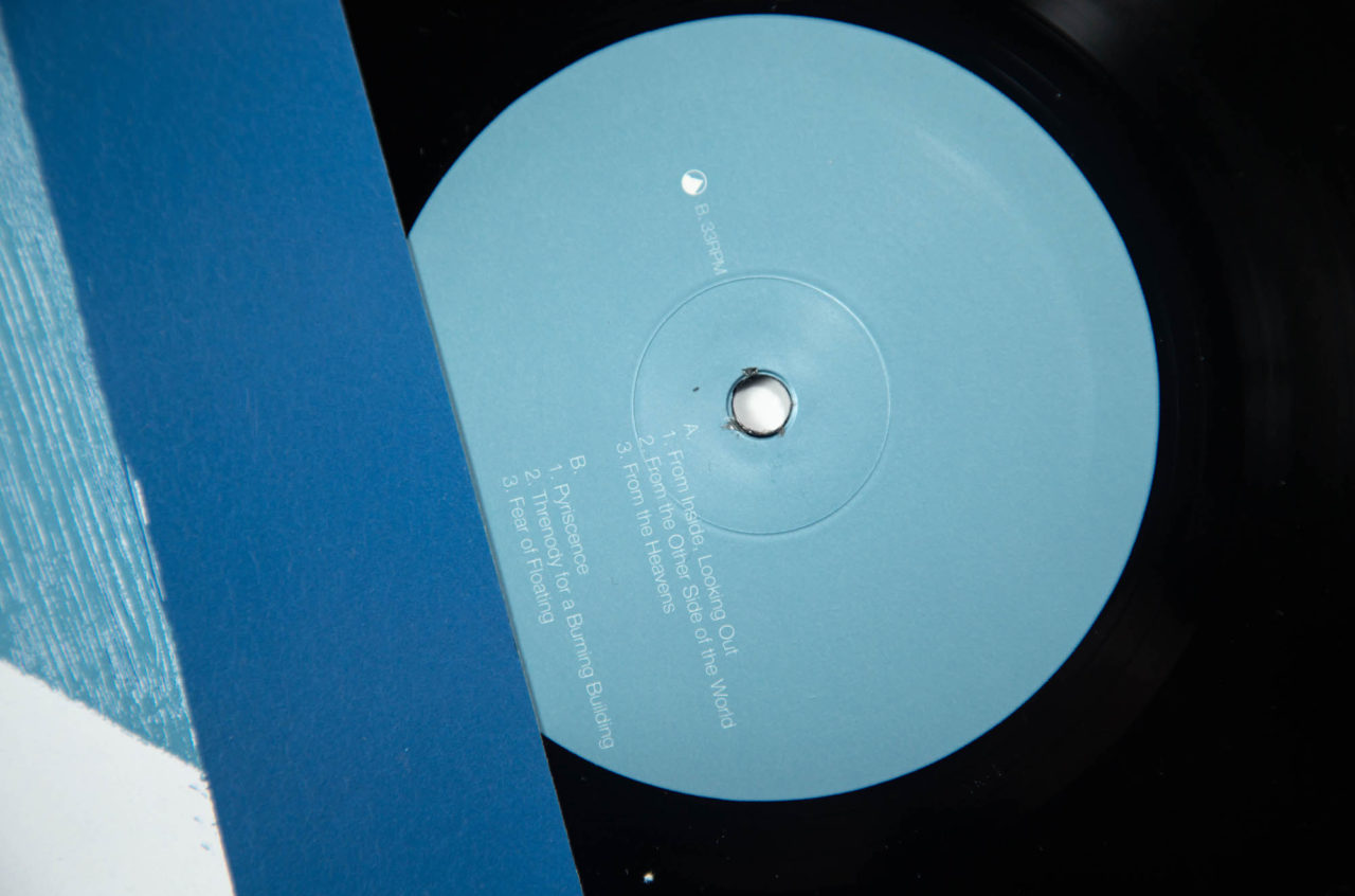
Lines Of Sight
(Erased Tapes)
Design: Paul Rafferty
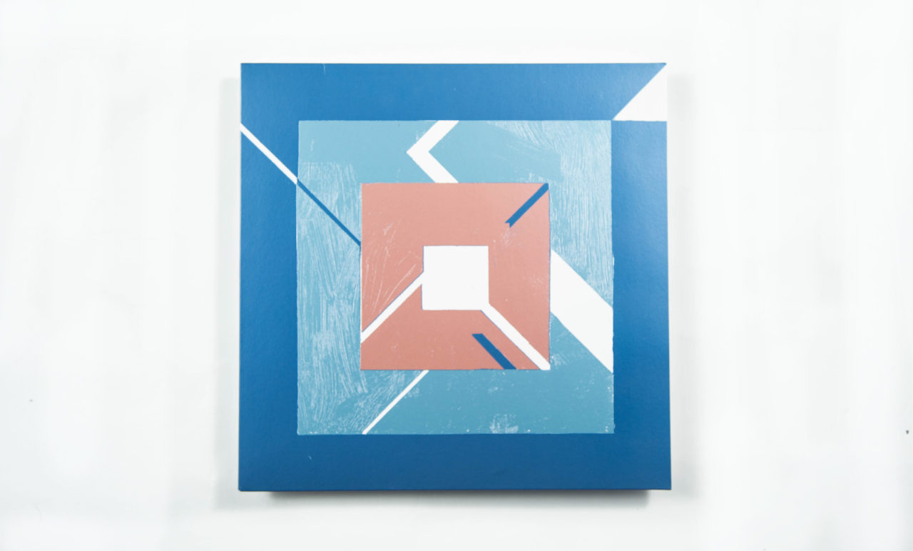
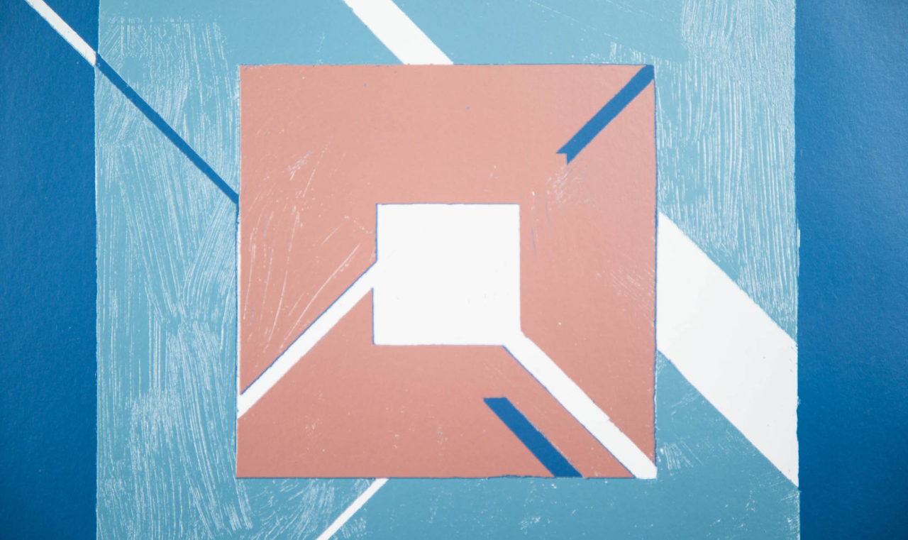
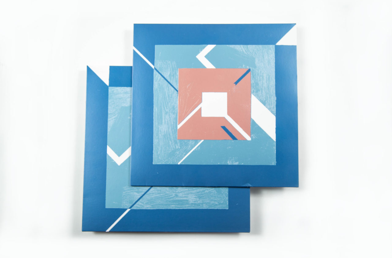
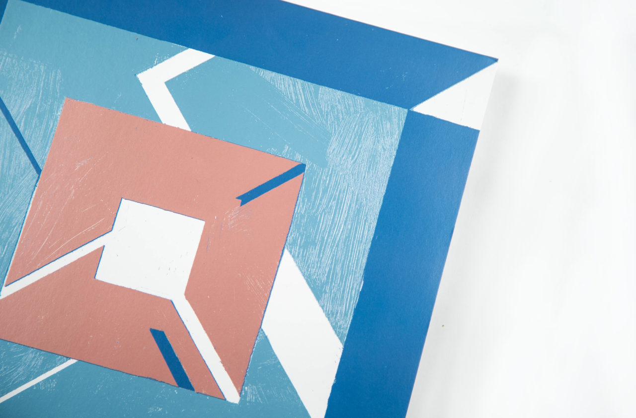
“I had originally wanted to use some kind of aerial photograph for the cover image, and had a fairly comprehensive mood board of images that I’d collected while I was working on the album,” explains Daniel Thorne. The Australian saxophonist had completed his solo debut and was discussing packaging possibilities with his label head, Robert Raths at Erased Tapes. After that conversation, Thorne was left feeling that something abstract would be more appropriate. “The next day I was at the Tate Modern, and I saw these amazing woodcuts from Lygia Pape’s ‘Tecelares’ series. The way in which they juxtaposed simple geometries with the beautiful, organic patterns in the wood felt analogous to the themes of Lines Of Sight.”

Thorne then sought out designer Paul Rafferty, who he had worked with on posters for his Immix Ensemble project. Rafferty locked in to the combination of synthetic and acoustic sounds, and sought inspiration from albums that had a similar feel, often returning to Wire’s landmark 154. “I’ve loved that album for many years, and I like the way the sleeve ties together the band’s newfound musical experimentation without any kind of laboured specificity,” Rafferty explains.
“I then started making a number of paintings and collages based on the original computer-generated artwork,” he adds. “I experimented with brushstrokes and created relief between the different shapes by making them from different weights of card and paper. I assembled the artwork as a collage and once I’d found the right balance of texture, I scanned it” – a process which captures the human element needed to balance out the final design.
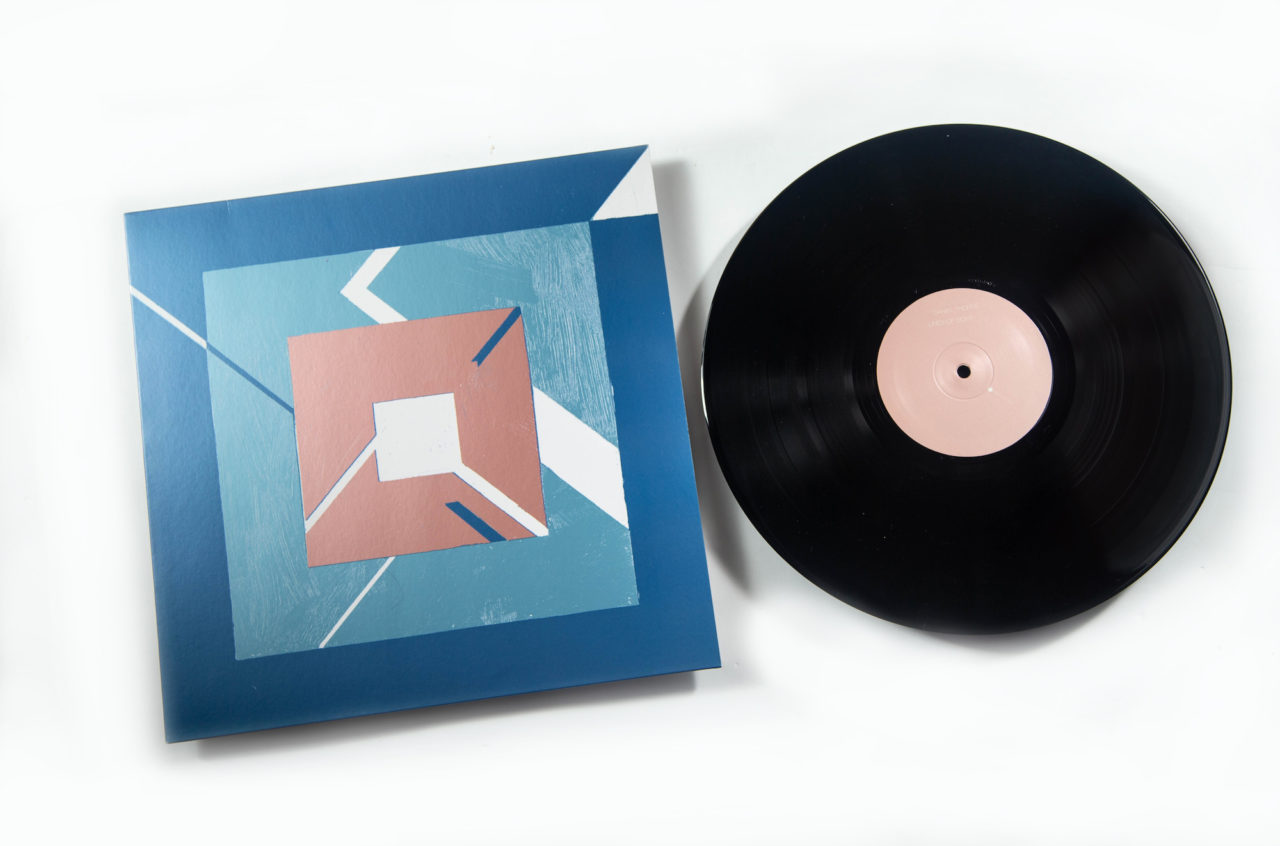
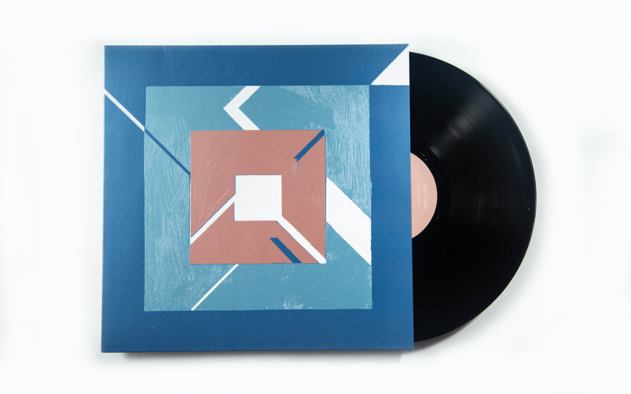
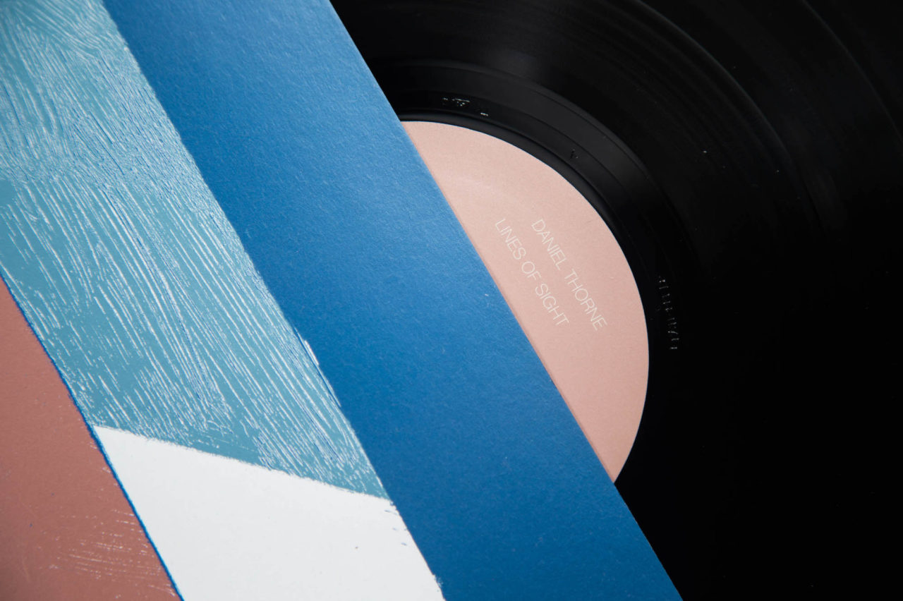
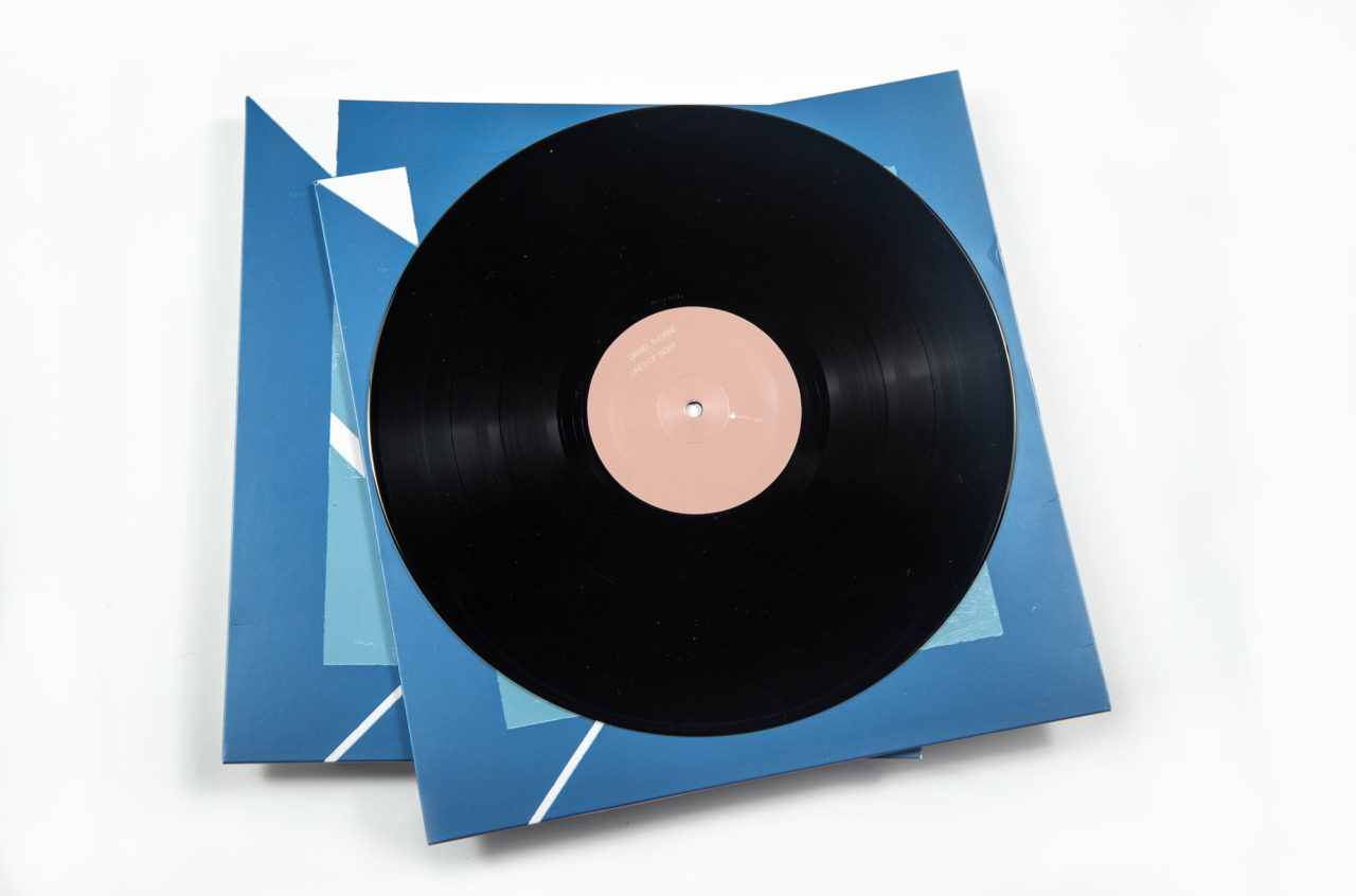
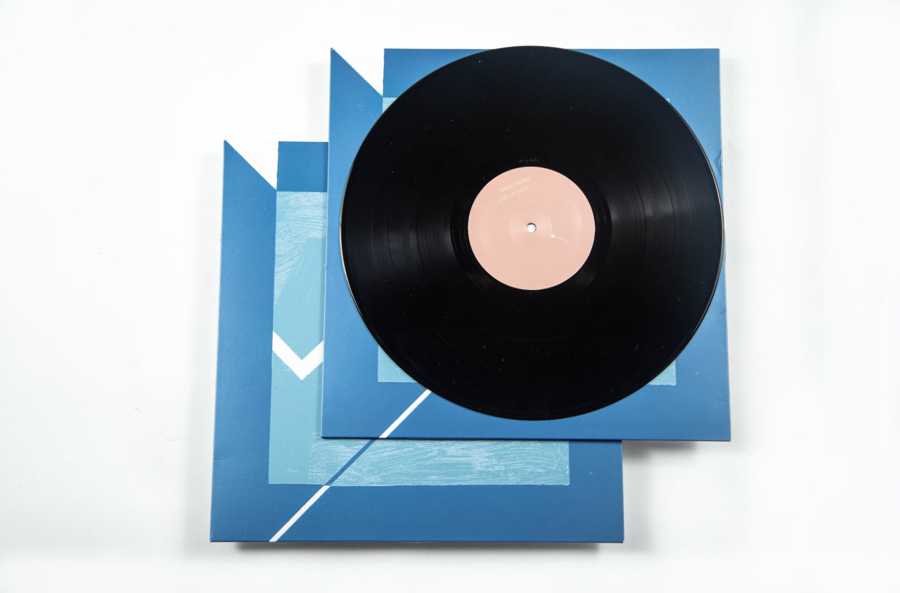
Sending over suggestions for type options, Raths proposed printing the sleeve using metallic inks. It is an expense that most labels would shy away from, but is an example of why Erased Tapes continues to produce such marvellous packaging.
Sign up to our weekly newsletter
Never miss a thing


