Published on
April 28, 2017
Category
Features
Patterns, strobes and optical illusions.
“My criteria is… when you look at a record and go ‘WTF?’” A collector’s collector, if anyone’s got an eye for the unusual it’s DJ Food. Keeper of one of the country’s most eclectic record collections, he’s spent the last two decades supplementing his vast archive of beats and breaks with forgotten relics from vinyl’s more obscure niches.
A graphic designer with a passion for comic book culture and visual ephemera, his attention to record sleeves and packaging is second nature. Having let us into his peerless collection of flexi-discs we were blown away by the variety of weird and wonderful records that remained largely undocumented in his impeccably organised shelves.
To remedy this, we’ve invited Food to hold down a monthly column exploring the stranger corners of his collection, from mini-records to postcard novelties. Following from his eye-popping look at 3D covers, optical-art record sleeves, odd-sized records and holographic vinyl, Food gets hypnotic with these glorious gif-tastic moiré effect sleeves.
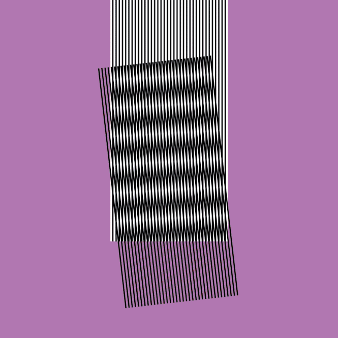
A moiré pattern is the effect when an equally spaced set of lines or dots is placed over a similar pattern and moved, creating the illusion of moving or strobing designs as the contrasting black and white lines cover or reveal the image below. Similar to the way a strobe light works on our vision in a dark room, turning the light on or off.
Printing a pattern on a transparent record sleeve or acetate overlay placed over a card sleeve containing a contrasting design can throw up all sorts of interesting illusions. Even the smallest movement of the patterns, causing them to be mis-registered, can lead to the eye perceiving movement from two static images.
The term moiré originates from a type of textile with a rippled, uneven appearance and this effect is sometimes confused with a lenticular image which is a form of movement caused my viewing an image from different directions.
Ultravox’s U-Vox LP from 1986 uses a very simple version with the title printed in broken horizontal lines that are filled in as you pull the record cover from the outer sleeve, thereby causing an animated ‘flicker’ on the letters.
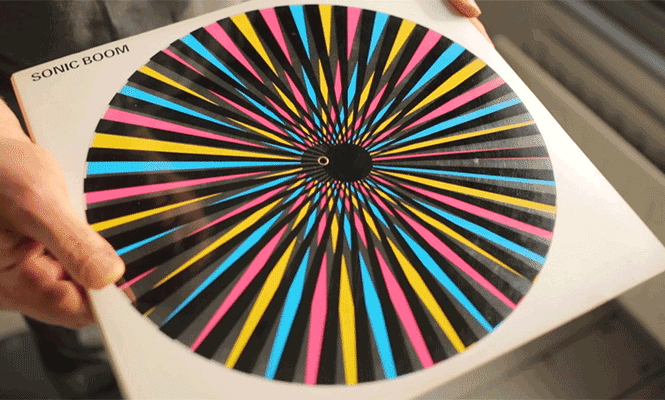
The limited edition UK version of Sonic Boom’s classic Spectrum LP on Silvertone from 1989 comes with a circular, printed acetate ‘pinwheel’ attached via a central spindle that makes psychedelic waves when manually revolved. A second wheel is revealed when the front flap of the LP cover is opened as well.
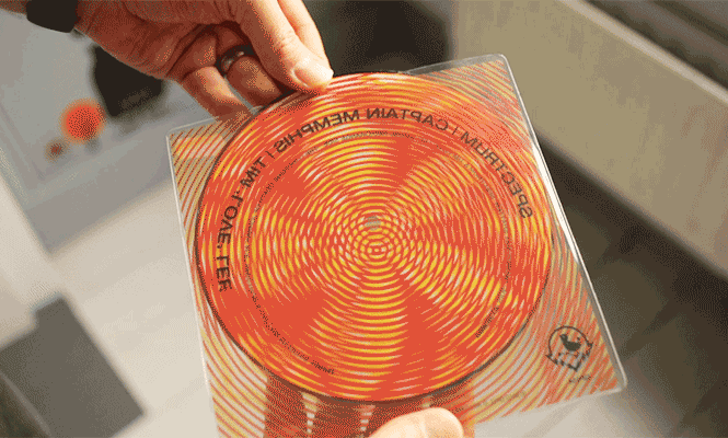
His later Spectrum offshoot’s split 7″ picture disc single on The Great Pop Supplement uses a coloured circular pattern with varying results.
A beautiful example appeared from Danish band Machine, Dear on their sole self-released album, Killing Something That’s Already Dead in 2012. The intricate outer sleeve, designed by OddFischlein, fits perfectly so there is no movement when the inner is removed and rotating the pattern 90 degrees creates a different effect.
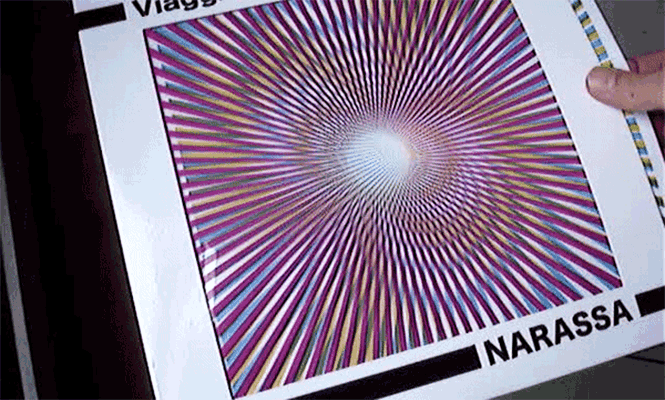
Italian label Cinedelic released a compilation of music by Narassa (Alessandro Brugnolini) entitled Viaggio Pop N. 1&2 in 2015 which featured a printed window in the front half of the gatefold sleeve containing a magenta starburst pattern. A yellow and blue printed insert creates fantastic moiré effects when removed or jiggled inside.
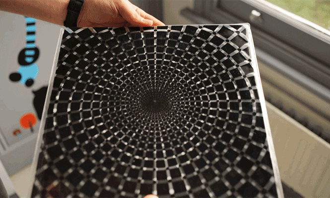
Fruits de Mer Records went to town on Astralasia’s Wind On Water LP with a double-side moiré pattern outer cover alternating black and white patterns that radiated out from the centre when moved.
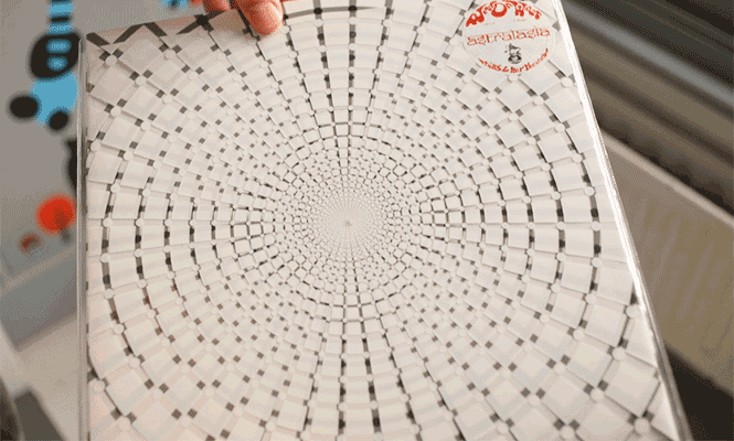
Designed by Pixi Cosmos, the album came on clear vinyl and included a colour insert and bonus 7″, now that’s value for money.
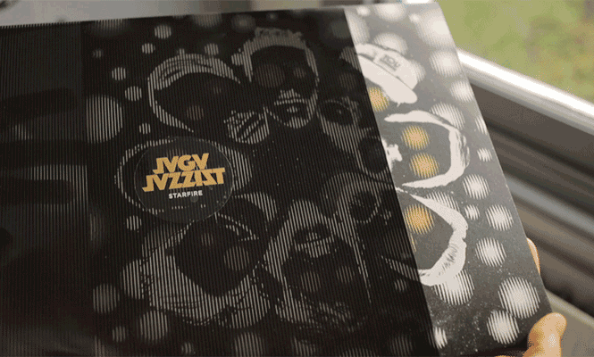
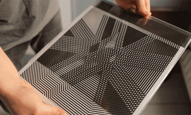
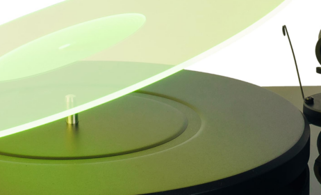
Jaga Jazzist’s Starfire LP on Ninja Tune from 2015 has perhaps one of the best examples of the moiré effect. Designed by Martin Kvamme & Martin Horntveth, the front and back images animate as you pull the outer sleeve away from the cover.
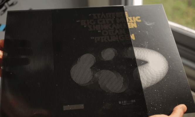
Planets and eyes on the assembled heads pulse on the front and revolve on the back cover. The op-art inner sleeves just add to the beautiful black, white and gold design.
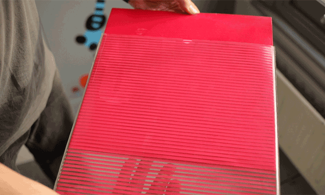
Hot Chip’s Why Make Sense? LP had a variation of a basic moiré pattern printed on each sleeve using variable data printing meaning that one set of lines was offset differently for each copy printed. The patterns were then printed on to an array of different coloured backgrounds making every copy unique.
By their very nature, these releases are limited, fragile and rarely appear on the secondary market in mint condition. They add an extra interactive element to the packaging and will usually be found accompanying music of a psychedelic nature. Also search out the three ‘Poemotion’ books by Takahiro Kurashima for multiple variations on these ideas, all with a moveable acetate sheet to play with.

Sign up to our weekly newsletter
Never miss a thing

