


Channeling the cosmic imperfections of Sun Ra's record sleeves
With a catalogue of striking cover art for the likes of Strut, Sofrito and Soundway, artist Lewis Heriz invites us into his Bethnal Green studio to show us how he creates the visuals for Strut’s Sun Ra compilations and releases.
Although Londoner Lewis Heriz grew up in a family of creatives, he didn’t decide to become an artist from an early age. But Heriz always had a pen in his hand, doodling and illustrating for fun rather than necessity.
Collecting records since he was a teenager, Heriz moved to Nottingham for university, and began promoting club nights and live shows to bring the musicians he loved to the city. It was at this point when his pals decided to use him as the resident designer.
“My friends would be putting on music nights or events of some kind, and they would always ask me to do a flyer for them. I studied English, so I thought I’d be going into doing some sort of writing. It’s just that this kept on taking up my time, not in a bad way, I was being repeatedly asked to do these things.”

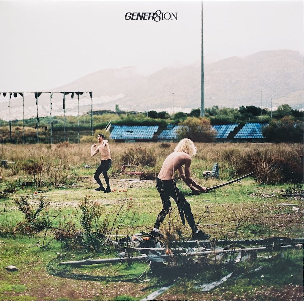
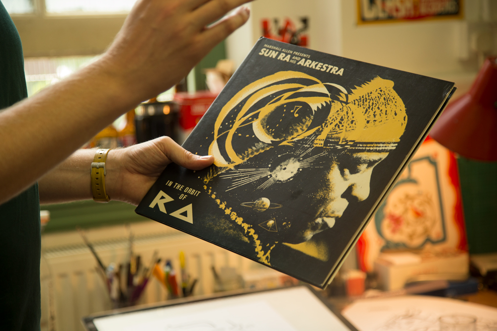
From this early work, Heriz became the go-to illustrator for the Nottingham scene, while bringing DJs like Sofrito’s Hugo Mendez and Soundway Records up north. (As this happened, illustration became a full-time gig.) This lead to his introduction to Strut, who have since tapped Heriz to create the art for some of the label’s most striking Sun Ra releases and reissues, including Gilles Peterson’s Sun Ra and His Arkestra compilation, and the Sun Ra 45s Singles collection.

Eager to find out more about how he has created the work for the mystic musical world of Ra, we spent the morning with him in his sunny London studio to get a behind-the-scenes look.

When did you first hear Sun Ra’s music?
I think it might have been when the Poets of Rhythm played in Nottingham. I was starting to listen to the spiritual jazz releases on Jazzman, at the time, which opened me up to that world.
Had you listened to jazz before?
I listened to it with my family, but not the more out there out there cosmic stuff. I hadn’t been listening to Alice Coltrane, for instance. But because I had been listening to a lot of jazz, and I’d really, really enjoyed experimental music, I was like, “this is amazing!”

Were you familiar with the Arkestra artwork before Strut asked you to design the cover?
Possibly the more famous ones. Until I got the brief I don’t know whether I’d seen that much of it, but it just made so much sense to me when I did. Artists who have humor and depth at the same time, that’s my thing. I absolutely love people who are saying beautiful, profound things, but when you take a closer look at them you realise that they’re doing it with a twinkle in their eye. I think Sun Ra was a very funny man, and maybe sometimes that’s not appreciated so much by people. He was a trickster.

Does that combination of humour with depth and playfulness influence the way you create the Sun Ra covers?
I think I’m permitted to do it with the art as well, because Sun Ra made it very clear that was something that he not only permitted, but wanted. I think he created metal plates and did block printing. But again, when you’re creating something that’s more permanent it’s a printing press, essentially. You’re creating something that you’re going to be repeating over and over again. The ‘normal’ instinct would be to refine it so it was as perfect as you could make it every time. And that perfection was repeated, because most people would be frustrated by the fact that it was a mistake, but that’s not what Sun Ra was doing at all. And that’s clearly not because he was aesthetically naive –it wasn’t that he didn’t understand what he was doing, that was part of the expression.

Are there any examples of how you create that organically in your work?
That’s the reason why I was using Letraset to create the typography for Sun Ra’s Singles: The Definitive 45s Collection, rather than using a computer font, which is perfect – it’s always going to be perfect and perfectly reproducible. I got out the Letraset and that’s what that is. It’s transferring it physically. It’s pretty neat, but it’s still not straight, and even if I did do it with a grid there would still have been misalignment there. So it includes imperfection, just by the nature of the process.
Imperfection?
That’s probably the wrong term, because it what he was intentionally trying to achieve, so it’s not imperfect. But as much as possible I will try to do that. Sometimes, and quite often, the nature of the job will mean that it’s just unviable to work in the way I’d like to work, because of time constraints and the potential for last minute changes.

You said this links with the artwork you were doing with Sun Ra?
Sun Ra’s approach to music is cosmic, but there’s also a discipline in free expression. That was reflected in the artwork that he used for his covers, the covers themselves were improvised. Basically Ra would say, “that’s it, we’ve done it! The mistakes are there and the mistakes are part of it, and the mistakes are part of the beauty of it.” He wouldn’t refine and refine and refine, until you refine the soul out of the thing, which you can easily do.

You can take a concept and just square it off and smooth it off, and he wouldn’t do that. That was an important part of the way he approached and taught music, and that’s why he would allow there to be a cacophony in his music, because it’s part of the expression, it’s part of the way that the universe works. And so, with these covers, I wouldn’t be fulfilling the brief if I didn’t include an element of that. But, I have to also incorporate a photo of him, that’s in the brief. I also have to make it look like it’s a compilation. But yet, for me, if I didn’t include some element of the unexpected, the improvised, then it wouldn’t really be true to the music.
Were you given access to archival photography?
Yes, but not a huge amount. The Sun Ra estate or Art Yard records have an collection of original photos, and I don’t know what the decision making process was before it came to me, but Quinton would say, “we have these amazing photos that haven’t been used before, choose one, or see how they work
out.”

What makes you select a particular image?
There’s a decision making process there in terms of ‘we have to include the photo, so how much of it do we include? How does it work in terms of the design?’ This is a photo of Sun Ra we used, where he’s playing the keyboard and you can see all the equipment around him. With this photo I loved the fact that he had his eyes closed and he’s listening to the music. He doesn’t need to see, he’s just responding to the vibrations, or whatever. And then I thought “that’s a really beautiful encapsulation of him as an artist.” So then I tried to think about what was happening in his head. I was in Buenos Aires when I was asked to do this, and it was a very tight deadline. I set myself up in this cafe, I was like, ‘right, I’ve just got to do this in the cafe.’ And it was really nice to have all of these beautiful Sun Ra recordings to listen to, because the cafe was just playing Moby and Robbie Williams on repeat. Luckily I was able to block it out with this amazing music.

I guess in the case of Sun Ra and the Arkestra it’s a particular group, so there are thematic signifiers and there is a style that people associate with them?
Completely. I mean, I’m very happy in this mode of working, where I’m allowed to keep it rough, I’m allowed to just make something up and then go, ‘I’m just going to keep it like that’ and then have that in there. It’s more of a pure expression than what I’m normally able to do. And, Ayé A. Aton, the artist that worked with Sun Ra for a while, and also painted lots of murals in the house he lived in. That was the specific reference here. I hadn’t really referenced him before in anything that I’d done. It’s quite hieroglyphic as well. But that’s what was going on there. Amazing photo, again, that I was sent, really amazing.

How does your process start?
I’ll show you my digital drawing process. I would just start off with some kind of improvised shape in one colour. Actually this is the way I ended up doing the Singles set…


That’s all I’m doing really, then it’s just refining from there. But it does really help to have that flexibility, especially when there’s a really tight deadline, which they always are. If there’s something that really needs to be changed in terms of the design, like if I had done it in ink and I had to re-ink it would be a nightmare. I always used to work that way, drawing in ink then importing it digitally then layering up the ink, and I would, ideally, like to carry on working like that all the time, but it’s just not viable. I had to develop a way to try and create the same effect, essentially. I don’t even like the idea of emulating it, it’s like it’s a second rate version of the ink. That’s why I often try to do it digitally and work to digital’s strengths, but still create the same kind of effect I want to have aesthetically.

What are digital’s strengths?
Flexibility is the main thing, and the fact that you can take the design, and apply quite a multitude of effects to it to make something you may not have even be able to do physically. It will always be specific to the digital approach, but sometimes that’s only evident to you. It really doesn’t matter, because it’s going to go through the digital phase anyways.
How does that change when you’re not working in a digital medium?
Well, I love working in ink for example. I don’t have as much control over it as I would like to – or perhaps as I used to – because I work in ink less now. But that’s kind of OK when working on the Sun Ra records because, again, like the music, there’s a beauty in the unexpected. The physicality of it forces what some might call an error, but in this way of thinking it’s the universe expressing itself, you could say.

That’s a very Ra-esque way of putting it. How does this expression manifest itself in the art?
The actual physical interaction between things creates that irregularity, that’s why this is distinct from digital. You can make mistakes and have unexpected things in digital, but not in the same way. The physical world isn’t binary. This is one of the reasons I love physical formats like records as well – they decay in a much more beautiful and human way.

A human way?
I mean in the sense that they’re part of the physical world, and so they age, but we can live with it, and you can still listen to a tape that’s gone slightly fuzzy or a record that’s got a few clicks or crackles. Whereas if a CD degraded, it’s literally unlistenable, that’s it, you’ve got to skip the track. That’s useless. And we now know that CDs do decay, so they’re not perfect. I think, for me, that’s a real distinction. The entropy that is built into the physical world is a beautiful thing. And again, I think that’s sort of worth leaning into, by working with or celebrating it, in the same way Sun Ra enjoyed almost breaking stuff and the aesthetic effect of pushing things to do things beyond what they were made to. That’s not to say that technology isn’t integral to Sun Ra’s music. He was very clear in vocalising that he thought Black Americans would be the last to get a hold of new technology, so Sun Ra would be like “I’m going to get the new technology and I’m going to do everything that you can do with it!” So, that was a very important part of it as well. I’m not being a Luddite!

Do you try and convey a certain feeling or reaction with your artwork?
Absolutely. I enjoy playing with style as a means of communication, of content and of the type of music that’s inside. I’m trying to achieve a cover that gives someone who’s looking at it that same feeling. It’s a communication across space.
Head here to check out more of Lewis Heriz’s work.
Photos by Elina Abidin for The Vinyl Factory