


Judging A Cover By Its Cover: April’s best record sleeves
Welcome to Judging A Cover By Its Cover, a sideways glance at the month’s most striking vinyl visuals.
Each month we will be hailing the joys of music packaging as we celebrate innovative and awe-inspiring sleeve design. Walking with you will be designer and author John Foster as he discusses imagery, typography, layout and finishing techniques of the finest artistic talents in the music industry. Occasional forays into classic albums and general pop culture nonsense come at no additional charge. Now, get those eyeballs at the ready as we cue up the opening number…

Cecil Taylor
Conquistador
(Blue Note)
Cover Design: Reid Miles / Photography: Francis Wolff
Starting things off on a sombre note, April brought with it the passing of free jazz legend Cecil Taylor. Taylor left behind a mountain of wonderfully challenging music, and I have to admit that I loved seeing all of the amazing stories from other musicians who had played with him this week. I could actually hear the crazy sounds Taylor would make offstage before joining the improv fray as I read each loving recollection.
Deep in his discography are two of the definitive record sleeves from the beloved Blue Note label. While some might lean towards the often imitated cover for Unit Structures, I will always favour Conquistador. Expertly laid out, as always, by the one and only Reid Miles, the cover features some really delightfully subtle type moves. More than that, it has one of my favourite Francis Wolff photographs, which is really saying something.
Both Wolff and Miles would experiment occasionally with exposure times in challenging settings, often adding motion or mystery to their portraits. In this instance, Wolff literally captured a dynamic and kinetic personality via this technique. Taylor vibrates with creative cool, as Miles provides a crop that seals the deal. Now, he will always look like that to me. The jam band upstairs just got a whole lot crazier.

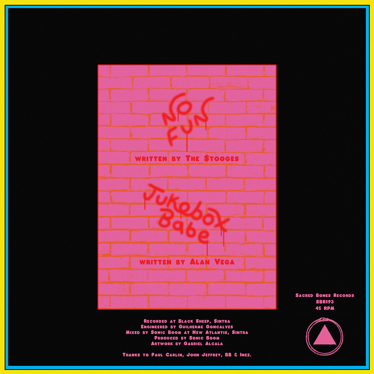
Moon Duo
Jukebox Babe/No Fun
(Sacred Bones)
Cover Design: Gabriel Alcala
I have always been a huge admirer of Moon Duo, and my devotion to Suicide and Alan Vega is at the fanatical stage. So when you pair a cover of ‘Jukebox Babe’ with a take on The Stooges’ classic ‘No Fun’, and have it all produced by Sonic Boom, well, you had me hooked at “Moon Duo”. When you wrap it all up in a wonderfully illustrated sleeve by Gabriel Alcala, and even throw in a poster, you know what everyone is getting for a birthday present this year!
Alcala always has a playful quality to his work, and his colour palette often reflects that, as is the case here, particularly with the neon pink and cyan working off one another. Simple line work only serves to make the final image even more sophisticated, and his leather-clad rats, cruising for a variety of trouble, feel right at home against the brick wall and era-specific pay phone.
Alcala comes by his rock and roll bona fides legitimately as a member of Jacuzzi Boys, and he elevates his design chops via the wonderful handmade typography on display here. Clearly referencing both ’50s neon signage and graffiti spray paint in different areas, he still manages to employ a truly distinct personality to both. The overall effect is totally rock and roll, but also fun and in keeping with the disco psych that the listener finds within.


Goat Girl
s/t
(Rough Trade)
Cover Design: Philip Laslett / Illustration: Miguel Casarrubios
One of my favorite aspects of the massive Goat Girl promo push has been their eschewing of easy options when it comes to visuals. Everywhere one would expect a moody portrait of the young band, they are instead met with raw paintings. Those paintings are the work of artist Miguel Casarrubios, who works quickly in acrylic to capture oddly playful scenes from his imagination. They come across as something akin to studies for a Chagall painting, with their bold color and manipulation of scale and form.
There is also a sense of poetry about them that is at the heart of their appeal. As Beggars Art Director Philip Laslett explains, “Miguel is a good friend of the band and an amazing artist, and the band were very keen to use his work from the start.” Building up a visual system as Laslett “used his paintings for a couple of their 7”s, which allowed Casarrubios’ imagery to really give us a strong aesthetic to work with,” they then added in a fanzine with the debut LP. “For the fanzine, the band wanted to make it more personal, so the illustrations and paintings were made by Ellie and Rosy from the group and the lyrics were written by the rest of the band,” Laslett adds. The end result is a buzz band with a visual base upon which to build a long and lasting career – with the group already clearly wise beyond their years.


Unknown Mortal Orchestra
Sex & Food
(Jagjaguwar)
Cover Design: Miles Johnson / Photography: Neil Krug
Unknown Mortal Orchestra have been hit or miss throughout the years, but Ruban Nielson and his assembled crew always give full effort, and when they hit, they hit hard. For the new offering of Sex & Food, the band went to the man you go to these days if you want to capture your indie rock muse in a slightly weird and mildly sexy pose – photographer Neil Krug. Perhaps best linked with his striking portraits of Lana Del Rey, Krug has delivered images for everyone from The Weeknd to Tame Impala to Boards of Canada, which, thinking of those three, makes him a surprisingly obvious candidate for UMO.
Had he done a typical band photo though, it is unlikely that I would be talking about his work right now. Instead, the cover is intriguingly complex for what amounts to a pretty simple set up. The image is not entirely sexy, or futuristic, or feminine, or provocative, or disquieting, but somehow caught in the middle of all of those feelings, like a quirky hint towards an uneasy experience. Upon close inspection it looks like a fencing outfit and some baggy shiny pants, but the pastel colour saturation, odd cropping and disguised features – right down to the lack of descriptive body form – all make it so much more.
The real star is the single pink hand on the belly though, as it seems to emerge from an entirely different image altogether, yet is immediately essential to everything happening here before us. It really takes this to another level. Secretly’s Miles Johnson handles the layout and wisely lets Krug’s photo do all of the heavy lifting.


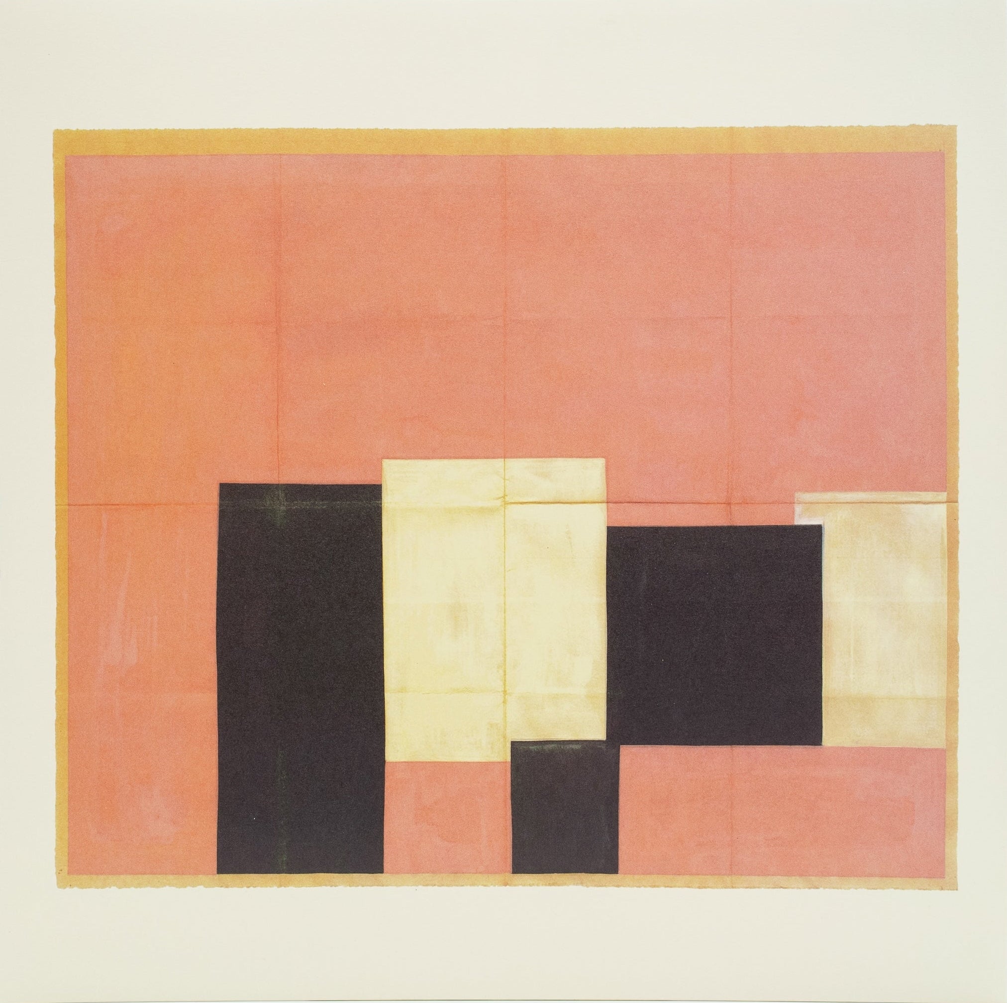
Q
The Voice of Q
(Isle Of Jura)
Cover Design: Bradley Pinkerton
The underground disco classic ‘The Voice of Q’ has been floating around for years as a pretty bad bootleg, and even worse, it had a terrible clunky ’80s record cover. Isle Of Jura have finally cleaned up the recording and issued a proper release for this looping and lovable piece of space funk. Their passion for the record extends to a new sleeve designed by Melbourne-based Bradley Pinkerton, who emerged on the design scene in a big way over the last year with his simple mix of shapes and textures over scanned images for music and surf clients. I had been watching his work waiting for that next step, where he would discard the found images and really make something bracingly original. I didn’t have to wait long. What he has created here for ‘The Voice of Q’ belongs in the family of the wonderfully simple art from Gina Franklyn for ESG or Richard McGuire for Liquid Liquid, but with a spacey twist. I love it.
John Foster is the author of Album Art: New Music Graphics (Thames & Hudson), New Masters of Poster Design (Rockport) and numerous other books. As principal of his design firm Bad People Good Things he has designed hundreds of record sleeves for everyone from Teenbeat to Warner Bros.