


Judging A Cover By Its Cover: June’s best record sleeves
A sideways glance at the month’s most striking vinyl visuals.
Each month we will be hailing the joys of music packaging as we celebrate innovative and awe-inspiring sleeve design. Walking with you will be designer and author John Foster as he discusses imagery, typography, layout and finishing techniques of the finest artistic talents in the music industry. Occasional forays into classic albums and general pop culture nonsense come at no additional charge. Now, get those eyeballs at the ready as we cue up the opening number…


Oneohtrix Point Never
Age Of
(Warp Records)
Art Direction and Design: David Rudnick, Oneohtrix Point Never
The longer you read this column the more you will appreciate that the kind of graphic design that inevitably excites me the most is the kind of graphic design that could never ever have come from my own hands. David Rudnick has left me absolutely fascinated with both his wild typography, and his application of those letterforms, which feels equal parts hopeless adoration and delicious subversion.
My favourite part of Rudnick’s work is the restless nature that spurs on his desire to experiment, and also allows him to push a concept straight through the wall. All of those qualities are more than evident on his work for Oneohtrix Point Never, with the winking imagery in Jim Shaw’s painting (when have I ever been able to say that a Jim Shaw image was the least interesting part of a piece?) and the heavy application of an eclectic mix of typefaces. It is undeniably bold and points to a brand of retro-futurism that can only exist in the mindmeld of Rudnick and OPN’s Daniel Lopatin.
When it is all said and done it could be argued that the CD packaging is the ultimate application of all of this madness. The final product was something Lopatin glowingly referred to as “the most OPN thing ever, and something I’ll never be able to top.” That may seem like crazy praise from an artist with a deep catalogue of wonderful packaging. But you know what? He might be right.


DRINKS
Hippo Lite
(Drag City)
Design: Tim Presley
The pairing of Tim Presley and Cate Le Bon creates an enjoyably odd mix of his California psych roots and her lovely Welsh dada folk, with Presley often coming up with fairly traditional tunes that Le Bon then perverts and deconstructs. Presley can’t help but smile when he says Le Bon “comes out of Mars with ideas.” Making their second album as DRINKS, the overall effect is as if you have discovered an underground private press record, something personal and intimate and pop damaged and weird and sweet and totally removed from modern technology. It is telling that Presley explains that they lacked phone or internet while holed up in a reception challenged commune in a corner of the South of France for a month while making the recordings. Hippo Lite album that ultimately sounds like it was made for the enjoyment (and amusement) of each other, and that quality extends to the presentation.
Designed by Presley, the layout is filled with rough, blown out snap shots of their time recording, and swimming (lots of river swimming!) and has the lyrics, logo and credits scattered about the cover. The band name is endearingly on there twice, as if was being decided where best to have it but then fell in love with the version they mocked up to figure it out.
It is the kind of design that could have easily fallen apart, but it is done with such joy, weirdness and lack of inhibition (yet, what is clearly killer aesthetic taste) that it is undeniably winning, just like the record it wraps around.


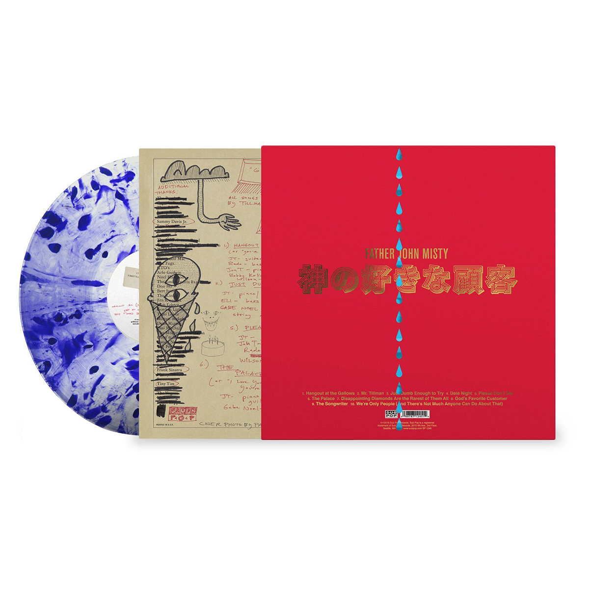
Father John Misty
God’s Favorite Customer
(Sub Pop / Bella Union)
Art Direction: Josh Tillman and Sasha Barr
Photography: Pari Dukovic
Few labels have done as much as Sub Pop has in making fans feel they simply MUST own the physical version of their favourite artist’s records. The full catalogue of Father John Misty releases cry out to be held in your hands. Past albums featured pop-ups, die-cuts and detailed illustrations, but for God’s Favorite Customer, Josh Tillman and his trusted in-house design maven Sasha Barr brought along a dejected headshot to carry the day.
Pari Dukovic, of New Yorker fame, turns his colour-saturated style of portraiture on Tillman, capturing Mister Misty in a contrived, yet believable pose. It delights on many levels, right down to the effort to style his hair, with the lighting only serving to outline the fact that it has a mind of its own. So much of the joy in Father John Misty is figuring out which parts are authentic and which are exaggerated, with a swirling ego front and centre.
The production element that takes it all to another level is exclusive to the “Loser Edition” of the album, with a string of blue foil teardrops running down the front and back cover. Paired with a gold foil and splatter vinyl (of course, with the tears) the inner sleeve features doodles (very Barr-styled), photos and ramblings that assemble in four variants, making each interior as personal as is possible on this scale.


Secret 7”
(Various Artists)
The Secret 7” series is pretty simple in concept – they take 7 songs from well-known musical acts and press 100 of each song for the first time ever on 7” singles. The rub is in how they package them, and how you purchase them. Each contributor creates a single, unique sleeve, so the final result is 700 sleeves, which are then exhibited before going on sale. For £50 each, you can buy the release, and only then do you find out who created the sleeve and what song it is for. You receive a unique piece and collectable disc with the proceeds going to charity. The series has given creative opportunities to some of the best designers and illustrators in the world with stunning results.
As rewarding as it can be, it is also an exhausting process to assemble, so it warms my heart to see the series return this year after taking 2017 off. The exhibition runs until June 23rd at The Jetty on Greenwich Peninsula in London, with all sleeves going on sale starting at 10am on June 24th. Tracks this year come from The Clash, Primal Scream, Jimi Hendrix, Jeff Buckley, Manic Street Preachers, The Eurythmics, and London Grammar. I have displayed a few of my favourites here and I can’t wait to discover who designed them.


Air Miami
Various releases
(Teenbeat / 4AD)
Design: Teenbeat Graphica (Mark Robinson)
I don’t know about you, but I HAVE WORLD CUP FEVER! I absolutely love the opening round with three games blasting away over my shoulder in my studio all day every day. Every four years it also gives me a good reason to shout out my love for Air Miami’s skittering anthem ‘World Cup Fever’ and sit back and appreciate the graphic genius of front man (and Teenbeat label head) Mark Robinson.
I was fortunate enough to be able to watch Mark grow as a designer, as I circled the same music scene and often found myself standing behind him in line at the video store. Much in the same way that he embraces music, he threw himself into design, tossing aside traditional rules in favour of just endlessly tweaking elements that he liked. Everything, from the barcode to the registration marks, were fair game to be used as part of the creative process.
His active brain was truly on display when he had multiple formats to work with, as you can see with the design of Me, Me, Me where he changes the back of the sleeve for each format and territory, slowly manipulates elements with every opportunity. Robinson accelerated his progress by constantly working on new designs at every turn – whether it was extra promo posters, or simply the coffee mugs and ball point pens around the office (famously adopting the Factory Records style of giving catalogue numbers to everything involved with the label) – growing into the accomplished book and LP sleeve designer he is today.
John Foster is the author of Album Art: New Music Graphics (Thames & Hudson), New Masters of Poster Design (Rockport) and numerous other books. As principal of his design firm Bad People Good Things he has designed hundreds of record sleeves for everyone from Teenbeat to Warner Bros.