Judging A Cover By Its Cover: July’s best record sleeves
A sideways glance at the month’s most striking vinyl visuals.
Each month we will be hailing the joys of music packaging as we celebrate innovative and awe-inspiring sleeve design. Walking with you will be designer and author John Foster as he discusses imagery, typography, layout and finishing techniques of the finest artistic talents in the music industry. Occasional forays into classic albums and general pop culture nonsense come at no additional charge. Now, get those eyeballs at the ready as we cue up the opening number…


Swarvy
Anti-Anxiety
(Paxico Records)
Cover Painting: Nick Dahlen
Type and Layout: Swarvy and Chris Hound
With an abundance of glossy photos and minimal risks, the summer releases have left me a little dry, visually. Luckily, Los Angeles experimental hip-hop artist Swarvy brought the unexpected with his use of artist Nick Dahlen’s ‘Jazz Girl’ painting as the cover to his new Anti-Anxiety record.
Dahlen has really come into his own over the past year, forging a voice that stretches beyond his influences. ‘Jazz Girl’ is one of my favourites from his recent array of wonderful pieces and it warms my heart to see it adorning this sleeve, which will hopefully exposing his talents to a larger audience
The move towards a funkier, more colourful cover image suits Swarvy well, as he expands his palette – growing his laid-back, R&B-laced groove into something increasingly panoramic, capturing an insular scene where late nights are only occasionally interrupted by the sunshine. His sophisticated playfulness wraps around a downbeat L.A., much in the same way that Basehead saturated D.C. back in the day.


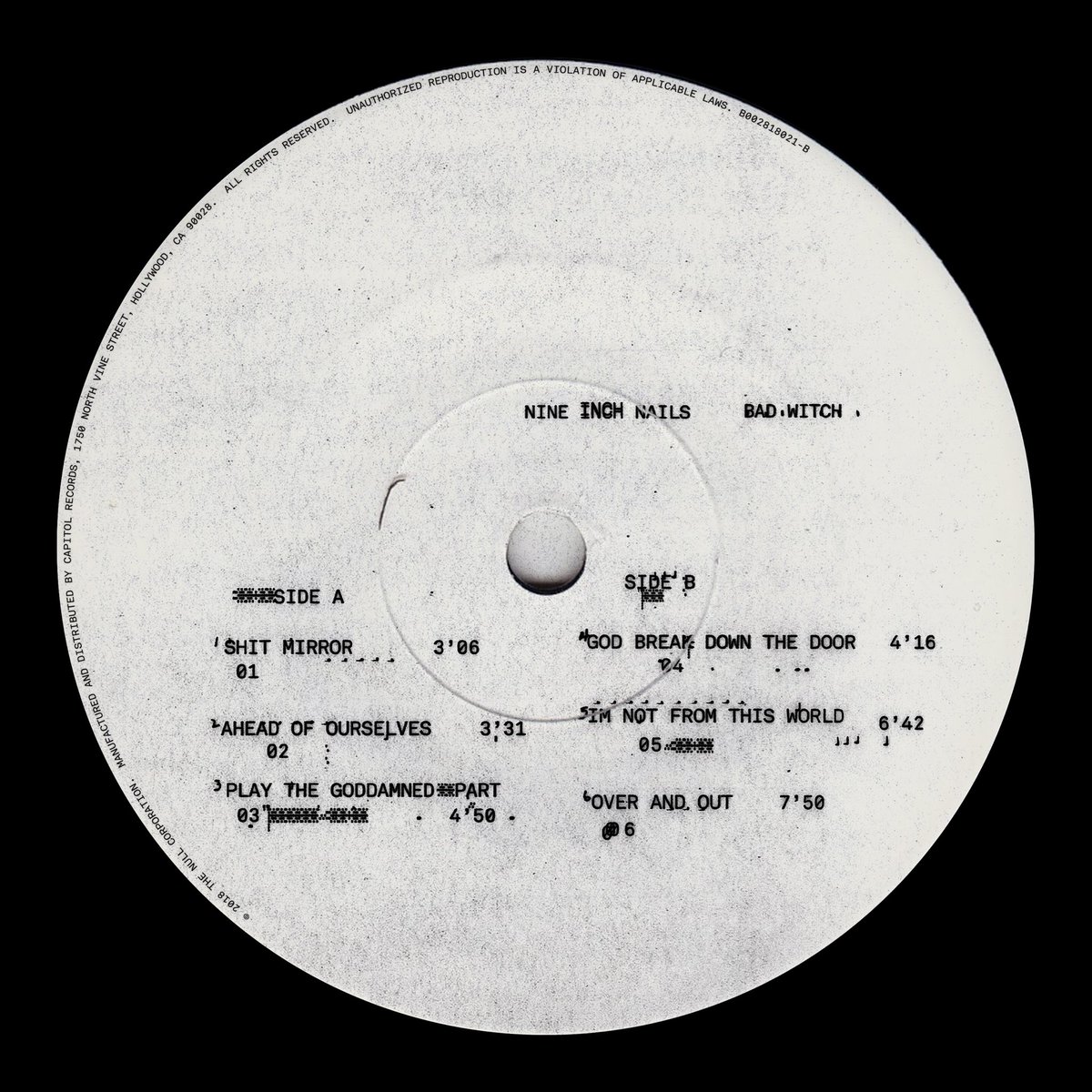


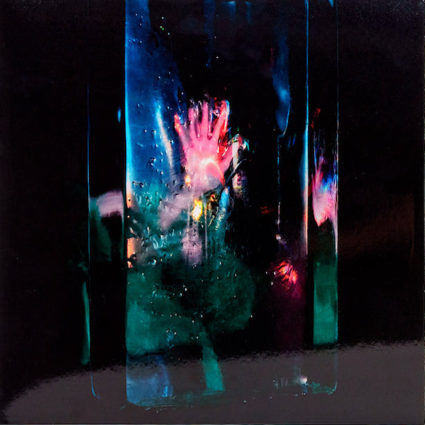
Nine Inch Nails
Bad Witch
(The Null Corporation / Capitol Records)
Art Direction: 12:01 – Office of Hassan Rahim
Nine Inch Nails’ Trent Reznor has a long history of working with some of the most innovative designers in the world, while still managing to envelope everything in his aesthetic. Paired with the brilliant 12:01 – Hassan Rahim along with designers J.S. Aurelius and Travis Brothers – this creation of degraded visuals, and smudged type all goes through the Xerox machine, until a result emerges that is both wildly intriguing and alienating at the same time.
Computer chips and skeletons dug up from a shallow grave manage to carry the same weight and impact; a testament to how cohesive this visual brew truly is. What I think is an image of Reznor and Atticus Ross with their faces blotted out have been copied so many times at such high contrast that they seem to barely exist at all, as if just a faint grimy apparition from another universe.
The final instalment of this NiN trilogy, Reznor relayed the idea of Bad Witch to Lizzie Goodman: “By the time we got to the third one, we had an idea in mind but it felt … rehearsed. Predictable. In the end, what felt true was to say that we as a society and as a species are probably an accident, a mutation. Really what we are is fucking animals. And the illusion was enlightenment.
“The more we’ve connected with each other the dumber we’ve gotten and the more we decide we want to kill each other. We’re not some elevated transcendent beings, we’re bacteria in a jar. I wanted the art direction of Bad Witch to feel like shadows on a cave wall and we’re trying to figure out what it is and really there’s no nice, clean, safe scientific explanation.”


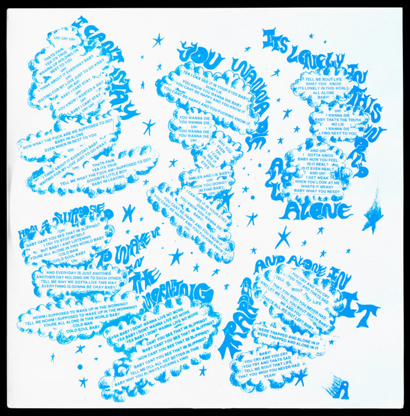

Hank Wood And The Hammerheads
Hank Wood And The Hammerheads
(Toxic State Records)
Design: Sam Ryser
Hank Wood And The Hammerheads start their new record off with a slow, piano-led intro that lasts 30 seconds, before diving head first into rock and roll nirvana, thrashing about like Minor Threat, if they had only listened to The Sonics and old country records.
Designer/musician/owner of Dripper World Sam Ryser captures this spirit perfectly in his layout for the record. Ryser’s handmade work for Toxic State singlehandedly re-instilled my faith in design while I was researching my Album Art book. He more than delivers here, with his drawn type still showing the cutlines as it is placed on the back cover. It’s all punk rock, but it’s also whimsical, free, ironic, and playful at the same time. This is perhaps best displayed in the poster insert with its “Goodbye Little Boy” message, like a reverse Saturday morning cartoon public service announcement. Just like this record, this sleeve is an absolute joyride.


Brockhampton
1998 Truman / 1999 Wildfire
(Question Everything / RCA)
A hip-hop collective originally formed out of Kanye fan forum members, Brockhampton currently boasts 13 members, including a creative director, designer, photographer and video director. “Produced by committee” is usually a recipe for disaster, but the group seems to be finding its feet with these sweeping jump-offs from juxtaposed rap battles, funkadelic choruses, flute melodies and block beats in conjunction with TV shows and radio programs.
While it can be hard to tell who is doing what, I assume this new visual direction is a combination of Kevin Abstract and designer Henock “HK” Sileshi, along with photographer Ashlan Grey. I would be lying if I didn’t admit that I was indifferent to the group’s earlier co-opting of the The Blue Man Group for their visuals, but this new vibe is seeping into everything they do, creating covers that feel like they’re made for an alternate Portishead formed in rural Georgia.
The overall effect is taking them light years into the future in terms of sophistication and nuance.


Wire
Pink Flag / Chairs Missing / 154
(Pinkflag)
Pink Flag
Art Direction: David Dragon
Sleeve Concept: B.C. Gilbert, Lewis
Photography: Annette Green
Chairs Missing
Art Direction: Brian Palmer
Sleeve Concept: B.C. Gilbert, Lewis
Photography: Annette Green
154
Art Direction: David Dragon
Cover Painting: B.C. Gilbert
Writing a column like this you can only dream about an opportunity to talk about your all-time favourite albums. Yet, here I am sitting in front of these gorgeous reissues of the first three Wire albums and it is impossible to put into words how much these records meant to me growing up, and how often I sat studying the sleeves, amazed by the visual jumps while the music grew into something so unique and distinct unmatched by any of their early punk peers.
Born out of art school, it was no accident that the records carried such iconic covers, but it was surprising to find Wire’s insular world wrapped around what amounted to major label releases. Their label Harvest had an artist-friendly reputation but letting loose the vision of Bruce Gilbert and Graham Lewis was inspired nonetheless. With photographer (and Colin Newman’s wife at the time) Annette Green’s sharp eye, they constructed the bracing imagery for Pink Flag and the artful deception of scale in the front to back of Chairs Missing (possibly my favourite sleeve to flip over) before giving way to deconstruction and Gilbert’s minimalistic painting for 154 (Bruce painting is what got us here in the first place).
The band have reissued all three albums via their Pinkflag label, both in their original form on vinyl, as well as paired with additional tracks and 80-page books filled with new interviews and a shock of unearthed photos from Green herself on CD special editions. In a nod to the band’s love of the physical form, the extra tracks are only available on these releases and not via streaming or download. These would be the best records of any year, so you know what to do.
John Foster is the author of Album Art: New Music Graphics (Thames & Hudson), New Masters of Poster Design (Rockport) and numerous other books. As principal of his design firm Bad People Good Things he has designed hundreds of record sleeves for everyone from Teenbeat to Warner Bros.