
Ambiguous Temporality: How Freedom To Spend uses design to re-frame experimental music
Reissue label Freedom To Spend unites artists whose radical and innovative tendencies dovetailed with increased access to electronic instruments in the ’70s and ’80s.
Following Pep Llopis’ nautical minimalism in 2017, this year has seen the label grow in stature and ambition, with releases from Ursula K. Le Guin & Todd Barton, Michele Mercure and a meticulous canvas-bound collection of Rimarimba’s DIY experiments. Kevin and Karisa of Will Work For Good – the design studio behind the label’s identity – explain how deliberate gestures in the artwork help create new contexts for the music.
Freedom to Spend has a spare aesthetic in keeping with our own interests in small gestures and slight material disfunction or misuse. Each album is marked with an alphanumeric price tag that’s applied with a price gun to a typically blank centre label — a nod to record store remnants/appeal — but illogical in that the centre labels aren’t exposed. The tags are all marked with the FTS flag/bill and the corresponding catalogue number. Inside every record are liner notes that we lay out like a correspondence letter on the “corporate stationery” and fold in thirds as it would be to go inside an envelope, and not a record.
FTS makes reissues with an ambiguous temporality avoiding the more common facsimile. With the exception of FTS010, we were able to work with the original cover art and surrounding ephemera and focus on, or extract, certain elements. We’re looking to edit the forms, often opening up a lot of negative space on the covers, using traces of their past. In most instances, we reset type using close approximations to the pre-digitised typefaces, which opens up opportunities to correct decades old typos or possibly create new typos.


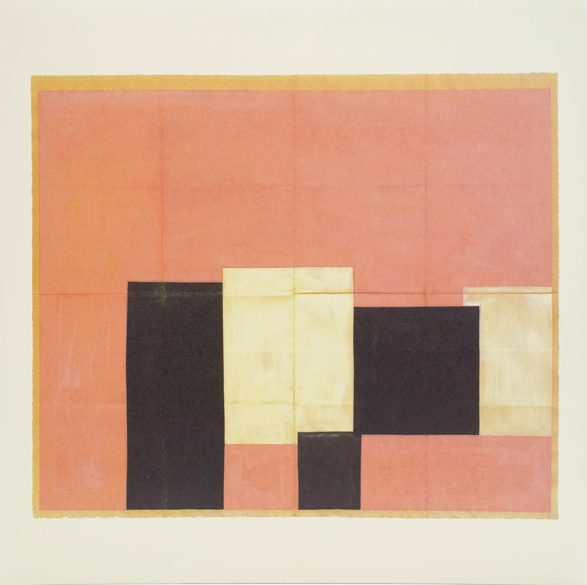
Pep Llopis
Poiemusia La Nau Dels Argonautes
(FTS003)
For Pep Llopis’ Poiemusia La Nau Dels Argonautes (FTS003) we traced outlines of the shapes from the original cover art and floated those outlines over a lay out of the original lyric sheet insert. These two elements became the new front and back covers. The abstractions move through the sea of text like the sailboats in the music.


Ursula K. Le Guin & Todd Barton
Music and Poetry of the Kesh
(FTS009)
For Ursula K. Le Guin & Todd Barton’s Music and Poetry of the Kesh (FTS009) we scanned illustrations from a first edition of the novel Always Coming Home – page 306 for the cover and page 362 for the back. The record labels have segments of the map from page 178, and the first pressing included a letter-pressed book mark of a diagram from page 501. Along with the album liner notes is a facsimile of the original cassettes’ lyric sheet (unfolded). So the book and music merge into a new object.


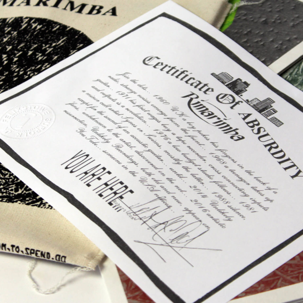


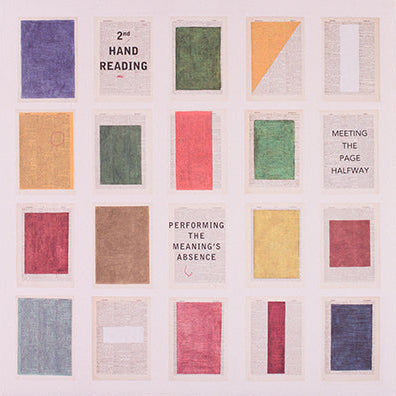
Rimarimba
The Rimbarima Collection
(FTS005–FTS008)
For The Rimbarima Collection (FTS005–FTS008) we wanted to create a cohesive collection for the four albums, so we based the common cover typography on that of the first two albums Below The Horizon and On Dry Land. We featured three of our own images inspired by a photo that was provided by Robert Cox which we used for the unreleased album Light Metabolism Number Prague.
The original Rimarimba releases have a consistently DIY cut/paste, often screen-printed quality. For this collection we created cut-up forms within each image, printed as various spot colours. These forms were then disassembled and rearranged on the screen-printed canvas sleeve that houses the collection. Miscellaneous graphic elements from the original releases can be found floating around the back covers and liner notes.
All three albums are out now.