
Judging A Cover By Its Cover: May’s best record sleeves
Welcome to Judging A Cover By Its Cover, a sideways glance at the month’s most striking vinyl visuals.
Each month we will be hailing the joys of music packaging as we celebrate innovative and awe-inspiring sleeve design. Walking with you will be designer and author John Foster as he discusses imagery, typography, layout and finishing techniques of the finest artistic talents in the music industry. Occasional forays into classic albums and general pop culture nonsense come at no additional charge. Now, get those eyeballs at the ready as we cue up the opening number…


Django Django
Marble Skies
(Ribbon Music/Because Music)
Design: Django Django, Aaron Larney
Photography: Aaron Larney
This seems like a release that has slid under the radar a little both musically and physically. As I was flipping through the racks at the record store I was immediately struck by this sleeve with its mix of the bold OBI strip and the cover adorned only with the languid ethereal photograph taken underwater.
Because Music designer Aaron Larney continues his strong collaboration with the band as all parties bring design and art school backgrounds to the table to create something new and exciting. Larney had explained that the original concept was looking out at the sky from under the water while you were drowning, but luckily for all of us that simplified a bit when they got around to actually shooting the image.
The final shimmering joy was created by band member Dave Maclean’s crescent-shaped balloon being captured by Larney lying underwater in a public pool in Tottenham on an early summer morning. The willingness to put that kind of effort in to capturing something natural and real is what takes this to the next level as the image has a warped and warm distortion that would be impossible to fake.
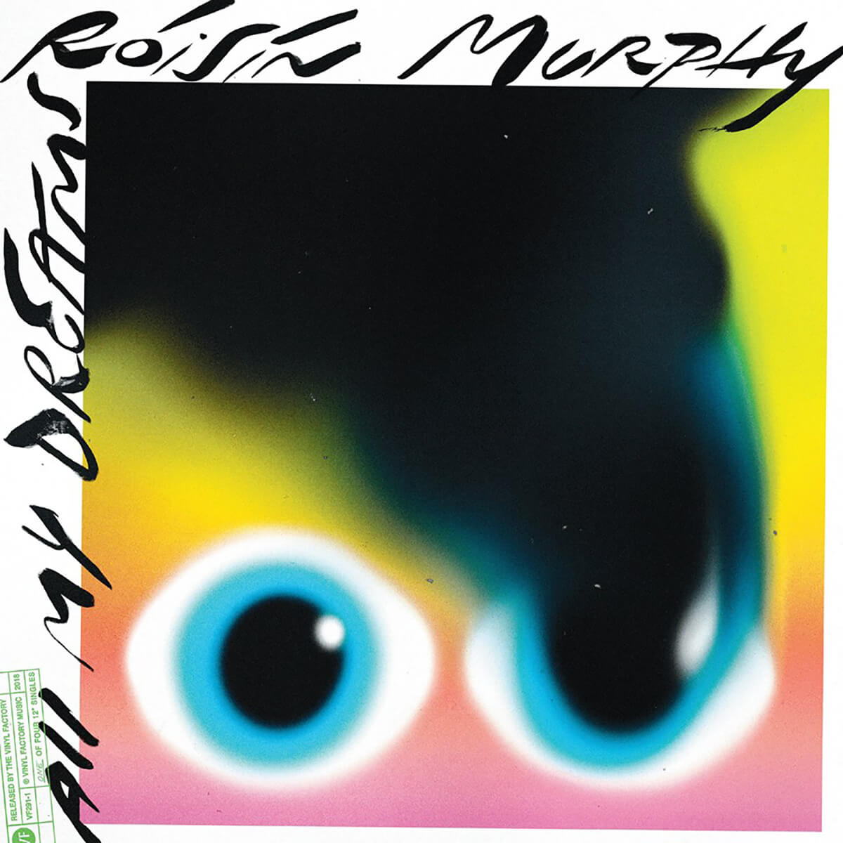

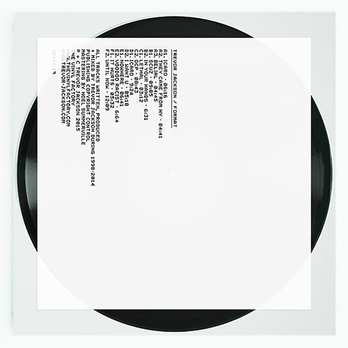
Roisin Murphy
‘All My Dreams’ / ‘Innocence’
(The Vinyl Factory)
Cover Design: Braulio Amado
It would be easy to cry foul, given the label who released this. Luckily for me this single from the former Moloko front woman is so stunning and amazing and freakishly awesome it undeniably deserves to be mentioned here. This is well on its way to being my favourite record cover of the year and is officially the standard that everything to come will be measured against.
NYC by way of Portugal wunderdesigner Braulio Amado has been crafting my favourite sleeves and gig posters of the last year and was certainly a highlight amongst highlights in my recent book Album Art: New Music Graphics, so my singing his praises shouldn’t be a surprise but HOLY GUACAMOLE is this incredible!
Amado takes the hand scrawled type he has been playing with to new heights and the airbrushed evaporating eye is so simple yet stylish, conceptual and just plain wonderful. From the colour selection to the stylization to the subtle stamping in the bottom left corner for the single series to the retro back and just… everything – this record cover is perfection. I am exhausted just writing about it. It’s that good.


iceage
Beyondless
(Matador/Escho)
Design: Nis Sigurdsson, iceage
Photography: Inger Ronnenfelt
Band Photograph: Christian Friedlander
Booklet: Axel Encke
I have been a huge fan of Denmark’s iceage and in one of those “only in the music industry” stories I actually nearly signed the band to a record deal two nights before they met up with Gerard Cosloy and slipped through my fingers. What could have been… We still had a blast sneaking beers and talking about rollercoasters. Watching their growth from brash punks slashing away at their gear to the (still brash) rock machine they have become has been like realizing how amazing The Birthday Party could have been had they been able to hold it together for a few more albums.
Part of iceage’s appeal has been their unique imagery and occasionally raw graphics. Complimenting their most broad and expansive album to date is a lovely image from Inger Ronnenfelt that reminds me heavily of the recent paintings from Michael Cina, overlaid with thick painted type, all of it bringing more colour to the party than past iceage releases.
Not to break style entirely, steady designer Nis Sigurdsson fills out the back with a wonderfully moody shot of the band courtesy of Christian Friedlander. Somehow it all speaks to the steps the band has taken musically with this record, while staying true to the roughness and volatility that already made them so great.


Beach House
7
(Sub Pop)
Design and Illustration: Nolen Strals, Kacie Mills, Bruce Willen at Post Typography
Baltimore duo Victoria Legrand and Alex Scally have always delivered on a song by song basis and have been building towards making a fully realised album, which has finally arrived in the form of the Sonic Boom-produced 7. In much the same way, they have also been taking steps towards something complete and magical with each packaging design.
Brian Roettinger’s work on Bloom was minimal and lovely, and the production turn on Depression Cherry was inventive. That same year, the band brought in Post Typography to design Thank You Lucky Stars, a relationship has continued through the new record. I have been lucky enough to watch Post Typography grow from a duo fresh from college to a full fledged studio and as designers they somehow still manage to surprise me.
“We had a long conversation at the beginning of the project with Victoria and Alex where they showed us thumbnail sketches of visual ideas, including vintage photography books they had been looking at, and played us rough cuts of the songs,” explains Nolen Strals. “We discussed the mood of the album as well as the influence of the greater cultural moment on making an album looking at the future,” he adds. The pair asked Post Typography to deliver a strictly black and white collage-based approach which, “could reflect discordance, altered reality or dream-like surreality,” Strals explains. “The punk look of the collage fit the generally dark or dystopian feel of the record,” he continues.
Designer Kacie Mills is quick to add that working on this “during three paranoid weeks in the darkest part of a long winter,” played a large part in the vibe as well. Once they had the collage together they had to tackle the special production techniques. “Having worked with a foil like this before, we knew that at some angles it only appears grey or silver, which fit the black and white guideline. At other angles the foil reflects these wild unpredictable colour spectrums, giving us the nod to the future or science fiction that the band was looking for,” Strals explains. The final effect is stunning, much like the music inside. “In the age of streaming, something surprising and beautiful like that foil stamp encourages people to buy the actual album. You can’t foil stamp Spotify!”


(Various)
Independent Project Records & Press
Cover Designs: Bruce Licher, Independent Project Press
This will very likely be the first and last time I advocate supporting a crowdfunding project here (don’t hold me to it though) but the fine folks at type foundry P22 are working with designer/musician Bruce Licher on a book capturing his incredible output entitled: Savage Impressions: The Independent Project Press Book.
Licher helped to expand my musical horizons as a member of Savage Republic, but he really helped to expand my visual horizons with his work at Independent Project Press. As a teenager this was my first look into letterpress printing and how it could be pushed to create something unique and incredible. Even when he was playing within the conventions of classic letterpress printing, like with the stamp sets done for Stereolab, Licher still created solutions that could not have come from any other designer. I didn’t know why the cover to Camper Van Beethoven’s debut looked (and even felt) so cool, I just knew that I wanted to some day be able to make something even half as cool as that.
Given the chance to help make this book happen and also celebrate a few of my favourite Independent Project Press record covers, I simply could not resist. I can’t think of anyone that I know in either music or design that would not want this book so throw some support for the campaign this way.
And a bonus entry this month…

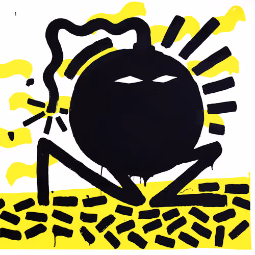
Childish Gambino
‘This Is America’
(mcDJ Recording/RCA Records)
Director: Hiro Murai
I know this is a column about packaging but it would be REALLY remiss of me if I failed to acknowledge what are the most bracing visuals in music currently.
Using a still from the video to draw you in, the viewer can’t make out whether the four figures clad in school uniforms are dancing with glee or fleeing in panic – or are they fighting with one another? The background only serves to add to the feeling of conflict as nothing seems to make sense, with a random car in the middle of some kind of complex and people moving in all directions along the edges.
Directed by Hiro Murai (someone on as much of creative hot streak as Donald Glover), the video serves as a striking comment on too many hot button issues to fully run down, with an emphasis on race, gun control, wealth, status, education, religion, violence and video games. It does it all artfully and with flair, never pulling any punches and with an intimacy that unnerves.
John Foster is the author of Album Art: New Music Graphics (Thames & Hudson), New Masters of Poster Design (Rockport) and numerous other books. As principal of his design firm Bad People Good Things he has designed hundreds of record sleeves for everyone from Teenbeat to Warner Bros.