


The story of 2 Tone Records’ radical cover art
Designer David Storey recounts how he helped create the visual identity of one of the most socially strident labels of the late ’70s and ’80s.
As art director of Chrysalis Records, one of David Storey’s first assignments was to work with The Specials’ Jerry Dammers newly minted imprint 2 Tone.
With a bold vision to unite Britain’s black and white sub-cultures in the shadow of Thatcher’s government, the 2 Tone label rapidly became synonymous with a whole genre of turbo-charged ska, bouncing a reggae back-beat head-first into the UK punk scene.
Visually, it was the label’s monochrome aesthetic that resonated most – conceived by Storey and John Sims under Dammers’ instruction – perfectly capturing the stripped back, street-smart nature of the music and influencing decades of graphic design in the process.
With a new set of poster prints celebrating his most iconic work now available, we spoke to David Storey to get the full picture.

How important was 2 Tone’s visual identity to communicating the political and social message of the label?
2 Tone’s visual identity was vital in communicating the political and social message of the label. Jerry Dammers (The Special’s keyboard player) invented what would nowadays be called the brand identity of 2 Tone and myself and my colleague John ‘Teflon’ Sims executed his ideas and produced the actual artwork. It was a direct, bold, simple ‘authentic’ graphic approach – at the time totally at odds with everything else that was going on (eg. Duran Duran and ABC). The checkerboard motif was a perfect metaphor for the integration of black and white sub-culture – although Jerry told me at the time, with typical modesty that the pattern was simply ‘lifted’ from some sticky tape on his bicycle.
The label name already suggests a colour palette of sorts – did you find this restrictive or liberating?
I found it quite difficult to start with but when I finally ‘understood’ what Jerry had in mind it became extremely exciting to work in such an alternative, direct way. The 2 Tone identity had an immediate effect on the creative landscape of that time, I remember Junior Gautier producing a collection that used the checkerboard pattern and some of our other elements as the main motifs. And advertising artists quickly adopted our approach, most notably in the GLC campaigns of the time. I took it all in my stride and I think Jerry was too preoccupied to notice.

Was there an overarching theme you wanted to convey in your sleeves for the label or was it very much a case by case basis?
The music was an infectious fusion of ska reggae and punk – dance music with a message. Generally the graphics had to complement this. Our anti-design, home spun approach with everything pared down to a minimum (i.e. no gratuitous design embellishments) seemed to complement the music perfectly and still manages to look fresh today over 30 years later – often imitated but never equalled!

What’s the story behind the Walt Jabsco logo?
Walt Jabsco was the name of the 2 Tone logo man. Jerry had bought an old American bowling shirt from a charity shop and it had the name Walt Jabsco embroidered on it and this is how the man got his name. The figure itself is based on a photograph of Peter Tosh that Jerry found.
It sounds like a lot of the dominant designs were inspired by Jerry’s found objects – be it bike tape or that bowling shirt. Did you have other major visual reference points / influences at this time?
I used to collect old design books from the ’40s, ’50s and ’60s and I was a huge fan of the design and typography of that period, it’s somehow much more direct, clean and clear, and economic in terms of colour etc. Everything was designed on a grid (Swiss Typography as it was known). Jan Tschichold was my hero.
Could you talk us through a few of your favourite designs, on 2 Tone or otherwise?

Ghost Town
I remember being very excited when I first listened to my white label copy of the record, I’d never heard anything like the doom laden chords before or since. I found the skeleton image that is the cover in a photo library off Tottenham Court Road, it was an old, vintage postcard from Kansas.
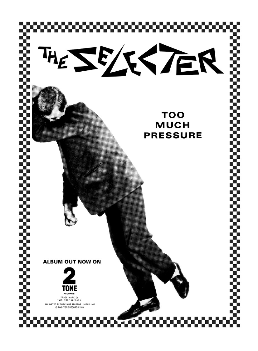
Too Much Pressure
The cover image was in a book that my old friend John ‘Teflon’ Sims owned and it just struck a cord with everyone involved with the record. We were nervous about using the actual image in case there was a copyright issue, so we had a photographer called Rick Mann recreate it for us.

Build
I was approached by The Housemartins when they were recording their first single (‘Flag Day’) as they were big fans of my 2 Tone work. Ultimately they wanted the same bold, simple, direct, approach but with a sprinkling of humour.

London 0 Hull 4
This was the Housemartin’s first album and was phenomenally successful. I remember that I had to produce the cover in double quick time for some reason, I was briefed in the morning and had to deliver the artwork that night! Somehow all the elements of the design just came together and clicked. A mixture of luck, hard graft and ultimately some sort of supernatural alchemy – or was it the alcohol?