

Non-Format and the art of Lo Recordings
The iconic design studio picks 10 highlights from twenty years of Lo Recordings.
“Resplendent in divergence”; so reads Lo Recordings’ unofficial motto. A label which for over twenty years has consistently pushed the envelope both literally and figuratively, Lo Recordings has amassed an unparalleled catalogue at the cutting edge of contemporary experimental music. It may count Aphex Twin, Four Tet, Grimes, Stereolab, Thurston Moore and Susumu Yokota among its alumni and yet has remained stubbornly phobic of hype, choosing not to lean on the reputations of past releases in ploughing its very singular furrow through the UK’s independent music scene.
Captured on recent anniversary compilation It’s Been Hell: 20 Years of Lo Recordings, founder Jon Tye picks up the story: “20 years and counting of exploratory music… So much of it and so much goodness. Starting off in a basement underneath Spitalfields Market at a time when there was no email – or at least not for me – and the fax machine was king. Thurston Moore said I could hassle him and so I did – by fax. David Thomas (Pere Ubu) would send a fax saying “WUZ UP!?” Nothing else. Aphex Twin said ‘I’ve done the mix shall I bring it over?’ And so he did with Squarepusher in tow.”
Around 150 releases later, if there’s one ever-present that ties this motley crew together its the label’s visual identity, driven by Anglo-Scandinavian design studio Non-Format, who have contributed the lion share of the artwork over the years.
To mark this (somewhat belated) anniversary, we asked Non-Format to pick their ten favourite sleeves from the last twenty years and share the stories behind their designs.


Barry 7’s
Connectors
(2001)
Barry 7, from Add N To (X), who had compiled this album of library music, submitted a scrapbook of cuttings and other ephemera from the 1960s and ’70s as inspiration for the sleeve design. We shot a photo of Barry 7 wearing his pair of vintage Lagerfeld sunglasses, and then created the illustration of him with long, wavy, circuit board hair to wrap around the gatefold sleeve. This is one of the first packaging projects we did for Lo where simplicity and complexity really seemed to balance well. This sleeve started to open doors for us too so, you know, we have a soft spot for it.


Red Snapper
Red Snapper (& Redone)
(2003)
This one was a bit of a risk. Rather than go the conventional route of designing a sleeve and delivering artwork to be printed, we asked Gavin and Jon at Lo to let us put the print budget to a slightly different use. We had a few thousand garment labels woven, with a Red Snapper logo and catalogue number, which were then stitched onto blank LP sleeves and digipaks. We asked the woman whose job it was to do all the stitching to vary the position of the label and the line of thread from sleeve to sleeve. She clearly wasn’t in the mood for free improvisation as they all came back in almost the exact same position on each one. Fair enough. For an album of remixes (Redone) we used a much larger woven label as the inlay for a clear jewelcase. The type was woven in backwards so on the legible side you see all the loose strands adding a nice bit of interference.

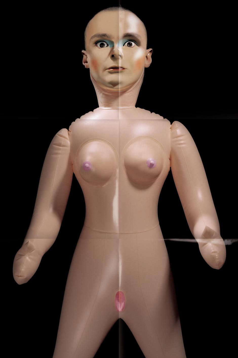
Cursor Miner
Plays God
(2004)
The first step in creating the packaging for Cursor Miner Plays God required a blow-up doll (deluxe and delightful). Once we had it inflated, all nicely lit and photographed, we then shot Cursor Miner’s face under similar lighting and then spent several days in Photoshop creating our monster. We like the way his eyes stare out at us with the look of someone trapped in some kind of a nightmare. The booklet folds out to reveal the true horror of Cursor Miner’s predicament. It’s nice when a receipt from a sex shop can used as a tax write-off.
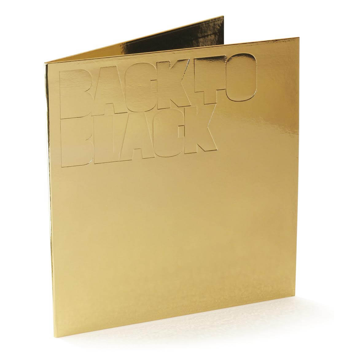

Various Artists
Back To Black
(2005)
This one was a real treat, produced in association with The Whitechapel Art Gallery in London. The production budget allowed for gold foil wrapped gatefold album sleeves, each one handmade by a London bookbinding firm. Accompanying each of the two vinyl discs was a silkscreen printed poster which showcased one of our first brutalist typefaces. It was displayed in a plexiglass box in the foyer of the gallery. In the end though they decided to sell them at a price far lower than the production costs, so the gallery made a loss on each one sold. Good call. As an added bonus we entered it into the Tokyo Type Directors Club awards which resulted in a trip to Japan to collect an award. Not bad.

Various Artists
LoAF series
(2006–07)
In 2006 Lo Recordings decided to start a new label which they called Lo Alternative Frequencies, or LoAF. They wanted the packaging to have a consistent format but which could also be a vehicle for individual expression. So, we paired each recording artist with a visual artist who created a digital print to accompany each CD. We put the CD and print into a clear plastic documents bag, stuck that onto a 12” square of humble grey pulp board and silkscreen printed the names of both artists in an almost illegible superbold typeface that we created for the project. The result was a series of more than a dozen ‘sleeves’, with a lovely mixture of variety and similarity. Several of them caught the eye of the 2005 Design & Art Directors Club judges and won us our first and only D&AD Yellow Pencil. Happy days.


Jean-Jacques Perrey & Luke Vibert
Moog Acid
(2007)
Conveying a fetishism for Moog synthesisers can all get a bit nerdy fairly quickly, so we enlisted the help of Australian artist Dan McPharlin who made and photographed a series of incredibly detailed miniature models of early synths for the Moog Acid packaging. We accompanied these with a special display typeface which riffs on the classic space age fonts Data 70 and Countdown but with a teardrop motif as a key part of the form. The result is a nice balance of expression and detail that, ultimately, won us our second Tokyo Type Directors Club award and another trip to Japan. Kanpai!


Omo
The White Album
(2009)
This one was almost a non-starter. Our first design proposal – purely typographic – was rejected by Omo but a subsequent design proposal for an Omo / The Chap split 7” single, featuring a porcelain figurine of a cherub in pain, was seen by the band and was subsequently modified to become the packaging for their debut album. Four cherubs appear on the packaging: one with earache, one with stomach ache, one with a headache and one with toothache, each hovering serenely against a white backdrop. As a contrast to this serenity and as an acknowledgement of the pain, the album text appears in a scrawl of handwriting. We had to redo the split 7”, but who cares.

The Chap
Well Done Europe
(2010)
We’ve been designing albums for The Chap since their 2003 album The Horse, for which we created a kind of Frankenstein’s monster of animal parts. We continued the animal theme on their 2005 album Ham, which featured a tiger wearing a mask, 2008’s Mega Breakfast which had a series of balloon dog images, and finally on this, their 2010 album Well Done Europe which features a fireball explosion in the shape of a teddy bear. The fact that The Chap rarely reject our ideas creates a hugely rewarding platform for experimentation and a sense of anticipation that can be a little overwhelming. Actually we did one more animal theme for their 2011 greatest hits album We Are The Best. This one featured a Diamond Dogs inspired half man, half dog image, only we switched the parts around. Pitchfork voted it one of the worst album covers of 2011. Not bad going.

The Chap
We Are Nobody
(2012)
This is the first album for The Chap that didn’t continue the animal theme. The condom idea is a pretty crude and slightly obvious representation of the album title but there’s something about transforming a condom into a rather pathetic looking figure that just seemed to work somehow, especially accompanied by that pin, just sitting there, ominously. Sometimes simplicity, and a bit of colour, works wonders.

The Chap
The Show Must Go
(2015)
The image of the man in the swimming pool started out as a sketch for a completely different project, which we can’t remember. Then it was proposed for the cover of a Japanese design magazine who rejected it because it was too soon after the trauma of the 2011 tsunami. Fair enough. We liked the mixture of David Hockney and Patrick Caulfield influences so we clung onto it, eventually showing it to The Chap who seemed quite happy to accept it as the cover for their latest album The Show Must Go. Sometimes it’s just a matter of letting an image find its way home.