The new simplicity: 10 contemporary minimalist record sleeve designs
Exploring the new wave of minimalist design in his book MIN: The New Simplicity in Graphic Design, Stuart Tolley picks out 10 striking contemporary record sleeves that cut through the noise.
Words: Stuart Tolley
In my new book I investigate the rebirth of minimal graphic design and try to dispel some of the myths associated with the style – such as it being easy to create and unimaginative.
The book features a range of formats, from packaging, editorial and branding, alongside exclusive interviews with creatives such as Erased Tapes Records, but a high proportion of examples are record sleeve design – a passion of mine.
A renewed interest in simplicity can be attributed to several things, from social change and a reaction against ornate graphic styles, but there’s no denying that a beautiful piece of simplified graphic design has the power to cut through a saturated visual landscape. This is even more pertinent today, as record sleeve design must work across a plethora of formats, from tiny digital icons to larger, more traditional, vinyl and box sets.
Here’s a run through of a few favourites from my book, in no particular order.

Amon Tobin
Dark Jovian
(Ninja Tune, Just Isn’t Music)
Dark Jovian, originally released on Record Store Day, consists of two 180g vinyl records, one side scored and the reverse features a non-playable 2D etching, which are both housed in a white silicone ‘wheel’. This release is all about the creative potential of combining innovative print production (Sean Preston) and beautiful stripped back graphic design (Alexander Brown) to reflect the musicians love of science fiction.


The Pet Shop Boys
Electric
(x2, The Vinyl Factory)
Farrow has created iconic record sleeves for the The Pet Shop Boys since the 1980s, but developments in music formats (and the changing habits of record buying public) have allowed Farrow to experiment with album identities. Electric is the most recent and features a zig-zag graphic devise, consistent throughout all cover formats, making it instantly recognisable when viewed on a mobile devise or the outrageous limited edition Electric Box.

Michael Price
Entanglement
(Erased Tapes)
I love how Erased Tapes modern classical and minimal music releases are reflected by their minimal record sleeve design, created by Feld and Supermundane. This sounds obvious, but isn’t always the case, so its great to see a label develop their musical direction in conjunction with their sleeve design.


Aphex Twin
Syro
(Warp Records)
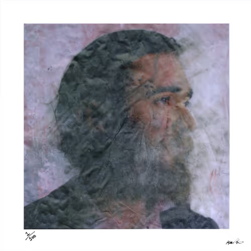
The collector’s edition of Syro, Aphex Twin’s first full album since 2001, was always going to be hotly anticipated and it certainly didn’t disappoint. The beautifully minimal design, created by long-time collaborators The Designers Republic, features the musicians recognisable (although spliced) face, which is screen printed in white onto the acrylic box cover. In typically playful style, the box features a detailed document of all items used in the production, an edition of only 200 were made available through a ballot order – making it one of the most sought after releases in the last few years.

Konrad Becker
Monotonprodukt 02
(Monotonprodukt)
The artist, musician, composer and producer, Konrad Becker, founded Monotonproduckt in 1979 to release experimental electric music works, often formed from a single note, a noisy drone, that was saturated with sub-bass. The output was very raw and inspired by the DIY ethic of the 1970’s, reflected in the design of 02, reissued by Desire Records, which features empty music stave lines that reflects the minimal music and adds to the low budget impact of this design.

Rune Grammofon
I love the creative potential of combining music with graphic design, especially in a long running creative partnership such as Aphex Twin/The Designers Republic or Radiohead/Stanley Downood. A look at the back catalogue of Rune Grammofon, the independent record label from Norway, is an excellent example with this with an array of beautiful, minimal covers designed by the artist and musician Kim Hiorthøy.


Beacon
The Ways We Separate
(Ghostly International)
This is another fantastic example of a collector’s edition release combining innovative production (Fernando Mastrangelo) with reduced graphic design, to reinterpret the original record sleeve, designed by Michael Cina. This art edition, limited to only 20, features an acronym of the album title, which is cast in sugar and set in Epoxy. I love it and I own one.

Raster-Noton
Raster-Noton release experimental electronic music and art projects that reflect the intersection between art, music and science. Full length album releases are available in standard edition, which are minimally designed in their own right, but I really like the limited edition vinyl editions, which are characterised by a minimal black cardboard outer package. Each edition is only identifiable by a debossed typographic detail on the front, created by the label co-founder Olaf Bender, and a photographic print housed on the inside.


Continuous Tone
Rural
(Open Editions)
Continuous Tone is a new sound project by London based Open Editions, founded by David Blamey, which invites twelve artists to create a new work pressed onto a 12-inch vinyl record, issued as an edition of 500 copies. Rural is the first release, designed by Julia, that reflects the minimal ethos of David Blamey’s sound pieces, which features evocative titles such as ‘Continuous Tone’ and ‘Nothing Happens’.

Jolt
EP
(A Tree in a Field Records)
The Jolt EP are recordings of live performances by A Tree in a Field artists, during the Jolt Festival, Basel. The angular, geometric, black and white record sleeve designs, created by Marco Papiro, are a perfect reflection of the jarring, experimental music captured.
Stuart Tolley is the founder of Transmission graphic design studio and author of MIN: The New Simplicity in Graphic Design and Collector’s Edition: Innovative Packaging and Graphics, both published by Thames & Hudson.
All images courtesy of Stuart Tolley


