


Judging A Cover By Its Cover: September’s best record sleeves
A sideways glance at the month’s most striking vinyl visuals.
Each month we will be hailing the joys of music packaging as we celebrate innovative and awe-inspiring sleeve design. Walking with you will be designer and author John Foster as he discusses imagery, typography, layout and finishing techniques of the finest artistic talents in the music industry. Occasional forays into classic albums and general pop culture nonsense come at no additional charge. Now, get those eyeballs at the ready as we cue up the opening number…


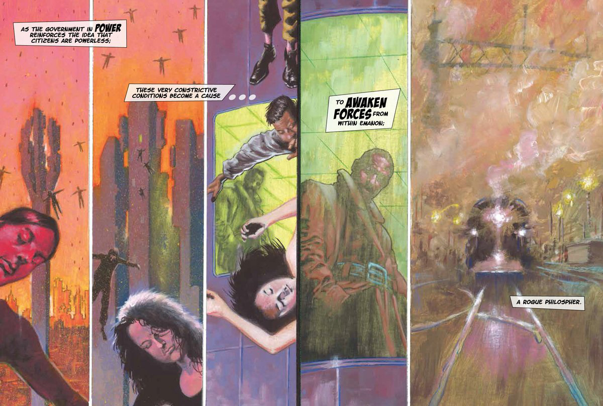


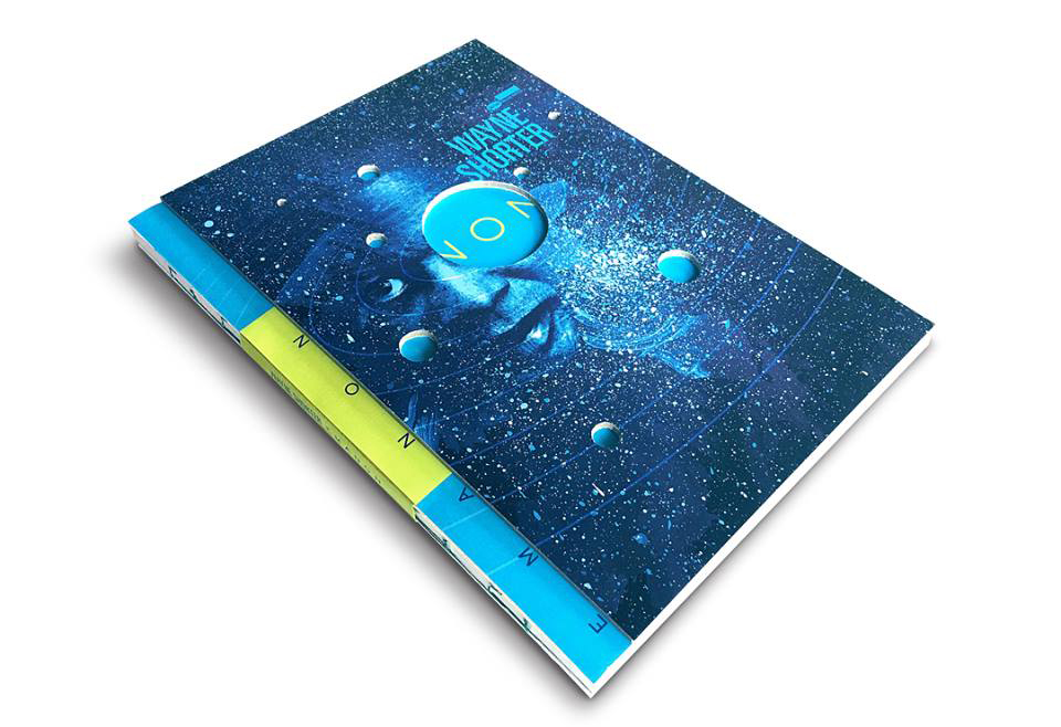
Wayne Shorter
Emanon
(Blue Note)
Art Direction, Producer: Don Was
Art Direction and Design: Todd Gallopo
Design Producer: Tory Davis
Illustrations: Randy DuBurke
Photography: Dorsay Alavi
Cover Portrait: Tomo Muscionico
When designer Todd Gallopo from Meat and Potatoes says, “this is just one of my all-time favorite projects,” I could not agree with him more. Wayne Shorter had been working on the idea of bringing together a graphic novel with this release for years, and through his work on Blue Note Review, Gallopo had already met and art directed a photo session for Shorter. Label head Don Was could see that they would be the perfect pairing to bring this difficult project to fruition.
During the brainstorming process, Gallopo remembers that, “Don said to me that he didn’t see this as just some ordinary set of CDs or LPs, and he took me on a trip to get some inspiration by walking through Hennessey + Ingalls bookstore in Los Angeles for several hours. We are both inspired by the deconstruction of an art book, or a zine, and we both love the idea of showing some of that process. It doesn’t always have to be the brightest and shiniest of bells and whistles,” he adds.
Showing that process is what makes the Emanon packaging so next level. The printing on the board, the weight of the paper, the mix of textures with soft and rough, the way that the spine is bound “or unbound”. All of it is pushing the limits of what can normally be done in music design. This is an incredibly tactile package, mixed with nine die-cuts, and housing an 84-page graphic novel. The hand work alone required to match the foil stamping on the cloth spine tape with the foil stamping on the paper below, and the perfect nesting of the tip-on sheet so that everything fits, while also having the type show through the giant centre die-cut, makes my head spin.
“There is literally nothing easy about any of this,” Gallopo laughs. “One of my favourite multi-dimensional parts, that Wayne had going on in the story, and I wanted to play upon, was set out in the production credit inside where we listed – ‘The packaging is intentionally designed to reveal its dormant possibilities as it travels between alternative realities of the multi-verse’ – which essentially means that this thing is going to ding up and it’s going to wear and it’s going to tear, and it is going to get more and more beautiful and show you things that are beautiful and become beautiful with every interaction.”


Factory Floor
Soundtrack For A Film
(H/O/D Records)
Art: Haroon Mirza
Design: Nik Void
Illustration: Sam Moore
One of my very favorite things to do is to see Fritz Lang’s silent masterpiece Metropolis performed with a live score. When I heard that Science Museum curator Chris Bell had commissioned Factory Floor to write a new score for the film to celebrate its 90th anniversary, I was intrigued. The duo tackled the 150-minute score live at the IMAX theatre at the museum, as part of the Robots exhibition, and the results were incredible. Recorded in a studio afterwards and repurposed as a 4xLP set, Gabriel Gurnsey and Nik Void deliver the soundtrack as individual pieces packaged together as the easily titled Soundtrack For A Film. For the cover image, they draw not from Lang’s dystopian future, but artist Haroon Mirza, who has collaborated with Factory Floor before (notably released by VF), as well as other musicians. His fascination with the interplay of sound is pared down to basic graphic elements thanks to illustrator Sam Moore, under Void’s guidance. It’s simple, yet incredibly effective, especially as it plays out over several changes in colour throughout the set.


Aphex Twin
Collapse
(Warp)
Artwork (Art & Craft Process): Richard D. James, The Designers Republic, Weirdcore
Richard D. James has a long history of bizarre visuals to go alongside his manic musical explorations. When Windowlicker was released, visual artist Weirdcore was only 9 years old. By 2009 the two had found one another and James knew he had the right man to take his live vision into hyperdrive. Their collaborations have constantly evolved and soon leaked into all visual areas of Aphex Twin. The two also share a love of being mischievous and secretive, as Weirdcore goes as far as to pixelate any video of himself speaking and they share a fascination with face-swapping technology. Bringing all of that together with the always brilliant vision and steady hands of longtime Warp and Aphex Twin designers The Designers Republic, the expectation is for some form of controlled madness.
So, it is with a bit of a shock that this crack crew have perhaps made their most incredible work together by being fairly literal with regard to the visual concept for this new EP. With every Aphex Twin release I find myself marvelling at the packaging produced by Ian Anderson and the studio, but here everyone is simply working around a visual collapse of information, married directly to the title, which provides a crazy window into an altered reality, as if being sucked into another dimension. The final visuals are complex and sophisticated but also simple in the thinking behind them, reminding all of us how strong a good idea can truly be.


Low
Double Negative
(Sub Pop)
Artwork/Photography: Peter Liversidge
Design: David Kramer
Someone help me please as I can’t put my finger on exactly why it is that I love this record. I have long been a fan of the band Low, having seen them at one of their earliest shows where they basically performed a concert using the empty space between notes to pummel and captivate the audience. It was intense and engaging and like nothing else I had experienced as a teenage punk rock kid at the time.
25 years later, they are completely reinventing themselves via deconstruction and manipulation. These are soundscapes and collages as much as traditional songs, yet they engage in the same way Low always has, and the sounds that are not there remain as important as the ones that you hear. Having worked with celebrated artist Peter Liversidge previously, it makes sense then that they would be drawn to a photo of one of his simple mask sculptures. Liversidge is an artist I tend to enjoy in ways that I may not always be able to explain (“I know it when I see it”) and often his executions leave me wanting a little. Not so with these masks, which boil things down in such a manner that I find them irresistible. Just two eye holes in this case to let you know what you are dealing with. In the end, it’s the perfect pairing, as Low does exactly the same thing with their music.


Steve Hauschildt
Dissolvi
(Ghostly International)
Artwork and Design: Robert Beatty
This one is a funny record to discuss. As far as the packaging is concerned, it really took its time to grow on me. Seemingly a no-brainer, with the lovely pulsating wash of Hauschildt’s tunes, and Robert Beatty on board to handle the design, it was checking all of my boxes right out of the gate. But the individual illustrations didn’t grab me right away, at least not until I got to see them up close, revealing so many wonderful details in the old school stat camera ready execution. It was the organization of elements that really started to bring me in.
The opening grid, like a table of musical elements, gives way to a more direct interplay on the back of the sleeve, and especially on the cassette case, tour poster and videos. The album’s title is a reference to cupio dissolvi, the Latin phrase meaning “I wish to be dissolved”, which can be traced to the various illustrations and the way that they manually fade, as if forced to do so by the technique more so than reality. In the end, it’s all a manufactured illusion. These have to be in black and white to work as well as they do, and it’s interesting to see Beatty pull back at a time when the bulk of his work is saturated in colour. Much like Hauschildt forcing himself to record this album in a proper studio, it’s the self-imposed limitations and restrictions around the project that ultimately end up paying huge dividends.
John Foster is the author of Album Art: New Music Graphics (Thames & Hudson), New Masters of Poster Design (Rockport) and numerous other books. As principal of his design firm Bad People Good Things he has designed hundreds of record sleeves for everyone from Teenbeat to Warner Bros.