


Judging A Cover By Its Cover: August’s best record sleeves
A sideways glance at the month’s most striking vinyl visuals.
Each month we will be hailing the joys of music packaging as we celebrate innovative and awe-inspiring sleeve design. Walking with you will be designer and author John Foster as he discusses imagery, typography, layout and finishing techniques of the finest artistic talents in the music industry. Occasional forays into classic albums and general pop culture nonsense come at no additional charge. Now, get those eyeballs at the ready as we cue up the opening number…


The Decemberists
I’ll Be Your Girl box set
(Capitol Records)
Art Direction, Design, Illustration, Lettering: Carson Ellis
Art Direction, Design: Glen Nakasako, Jeri Heiden
Signing to Capitol Records, Decemberists frontman Colin Meloy was pretty frank. He wanted to see what could happen with his songs, and The Decemberists in general, if he had all the resources he could imagine at his disposal. Illustrator Carson Ellis had also been along for the ride with the group, from working on all of the releases to marrying Meloy. The two literally go hand in hand. Seeing this gorgeous box set version of I’ll Be Your Girl, I imagine that they stare at this artefact and marvel at having arrived at the place they always dreamed about together.
The band’s discography is rich with wonderful design and illustration, and Ellis has been paired with some of the very best in the industry, but rarely has she exhibited the full range of her playfulness, or bathed in such bold bursts of colour and shape. Working with Smog Design’s Glen Nakasako and Jeri Heiden, the results are even more surprising, as Ellis seems to force the duo out of their normal instincts, which tend to produce lovely, but commercially-minded designs. Likewise, Nakasako and Heiden force her work to live in a world that is full of loose lines and funky beasts, but also very much defined by design. The box set is as fun and enjoyable as the pop-up in the book that comes with it. It will be pretty tough for anything to top this in 2018 – the colourful gauntlet has officially been thrown down.


Various Artists
1+1=X
(Erased Tapes)
Art Direction: Robert Raths
Design: Torsten Posselt at FELD
Photography: Claudia Godke
The brilliant Torsten Posselt of FELD has had a long and intensely gorgeous relationship designing for Erased Tapes and founder Robert Raths. Together, the two have done nothing less than reinvent the X as a shape, and the slipcase as a form of packaging. Celebrating ten years of the label (hence the X) with a carefully curated collection of songs, Raths clearly wanted to wrap it all together in something special.
While Posselt has designed stacks of wonderful record sleeves, he also tackles wildly different projects as part of Berlin-based FELD. The studio creates unique installations and has an inherent desire to experiment with structural aspects of everything they build. Always problem solving, Posselt relishes the kind of challenge this three LP and 72-page book box set presented. The breakthrough solution embodies the music contained within, as the 20 tracks are collaborations bringing together various artists from the label’s roster, combining their talents to make something whole from the different individual visions.
Sliding the box together to create the X die cut, you have to admire the sturdiness of the design and construction, while still being enchanted with the tight and clean form it leaves behind. The same strong, yet delicate, touch is applied to all components, whether laying out Claudia Godke’s photos of the sessions that formed the songs within, or adding a simple deboss to the case.


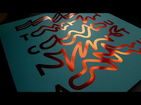
Butch
Countach
(Cocoon Recordings)
Design: Schultzschultz
One of the hardest things I have to do each month with this column is to avoid featuring five examples of the work of Schultzschultz. From their Frankfurt base, the dynamic duo of Marc Schultz and Ole Schulte have amassed one of the most jaw-dropping collections of work in the record industry. Primarily focused on the constant flow of electronic dance records passing through their office, they compliment techno bangers with inventive solutions, more often than not driven by their incredible conceptual typography.
It can look deceptively simple at times, like the dips and pulls used here for Butch. But when you realise that you can virtually feel the music just by looking at the bends and wiggles in the letters as they spell out the title from left to right, it hits you like a rush. Adding that next level production touch, the sleeve is printed in a shiny gold foil, which really brings it home.


Michael Nau & The Thread
Michael Nau & The Thread
(Relearn To Boogie/Light In The Attic/Full Time Hobby)
Art Direction and Design: Melissa Castellano
Illustration: Evan apRoberts
By now you have probably figured out that I am a sucker for a good painting, and certainly a sucker for a good collage, so this mixed-media beauty adorning the new Michael Nau & The Thread record is speaking my language. It also perfectly matches the warm and open country folk of Nau and his fellow ramblers, which should come as no surprise when you discover that the art was created by Evan apRoberts, who also happens to be the bass player in the band.
This release also continues our trend of featuring couples this month as apRoberts is married to designer Melissa Castellano, who takes on the layout duties here. apRoberts has a portfolio rich in busy little drawings of landscapes and buildings, which he develops with paintings that can sometimes feel like studies rather than finished products. When he deconstructs and disassembles other pieces to create panels and layers that add depth and sophistication, his work is elevated to an amazing plane, something that is definitely the case with Rancho Palos Verde, the piece used for this cover.


Michael Abels
Get Out OST
(Waxwork Records)
Illustration: Leslie Herman
While I am sure fans will be excited about the soundtrack to the hit horror movie, enjoy reading Jordan Peele’s liner notes, and maybe even nerd out on the splatter green vinyl, but for me this is all about the joys of Leslie Herman’s manic artwork. Every little detail is wildly perfect – from the woman peering out the window in the ‘O’ of the title, to each devilish expression staring down on the couple, and the desperate fear of the emotionally exhausted embrace between Chris and Rose.
These motifs continues on the back with spirits emanating from the estate, to form a bloody set of deer antlers that embrace the track listing. Once you dig in you get wonderful little details like the cereal bowl disc labels and the bold gatefold, harking back to classic suspense posters, like a rough take on Saul Bass’s work for Alfred Hitchcock. Herman first jumped on to the illustration scene via her incredible gig poster work, and it has been a delight to watch her rapid progression, accelerated while working under Sterling Hundley and emerging with a unique voice and quality of line. Typography has always been one of the strongest aspects of her drawings, and in this assignment, she brings all of her talents together to absolutely nail it.
John Foster is the author of Album Art: New Music Graphics (Thames & Hudson), New Masters of Poster Design (Rockport) and numerous other books. As principal of his design firm Bad People Good Things he has designed hundreds of record sleeves for everyone from Teenbeat to Warner Bros.


