Published on
April 20, 2017
Category
Features
The Baltimore trio open up about designing their new album The Far Field.
“We really drove ourselves crazy trying to figure out the album art,” remembers Future Islands’ William Cashion. With a history at art college and now assuming the role of the trio’s unofficial visual consultant, Cashion is particularly sensitive to the packaging of each record.
Five albums in and the band have faced down the daunting task of following up the extraordinary success of 2014’s Singles with something a little more enigmatic. “We were looking at a lot of different art trying to figure out what we were going to do, what this album looked like,” Cashion recalls, noting that Singles was the first time the band had used images of themselves in the packaging. Interesting then that both covers hint at human figures whose faces have been either hidden or omitted completely.

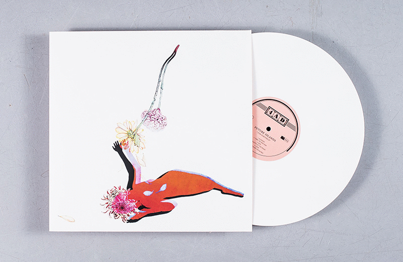
For The Far Field, Future Islands returned to working with artist Kymia Nawabi, a college friend who contributed the cover artwork to the band’s first two LPs. “The first album we sent her the album and she just painted the cover and literally mailed me a piece of wood with the front on one side and the back on the other,” Cashion remembers.
This time round, the process was a little more digital. Looking through Nawabi’s older work, the band identified a piece that would end up as the cover, with one small difference: the original featured a snake, whose tongue became the flowers. “I wasn’t feeling the snake so much, and I took it out in photoshop and sent it to her and she was into it,” Cushion says. One hi-res scan later and the piece ended up as the cover: “We thought, this looks like The Far Field, we can see that working together.”
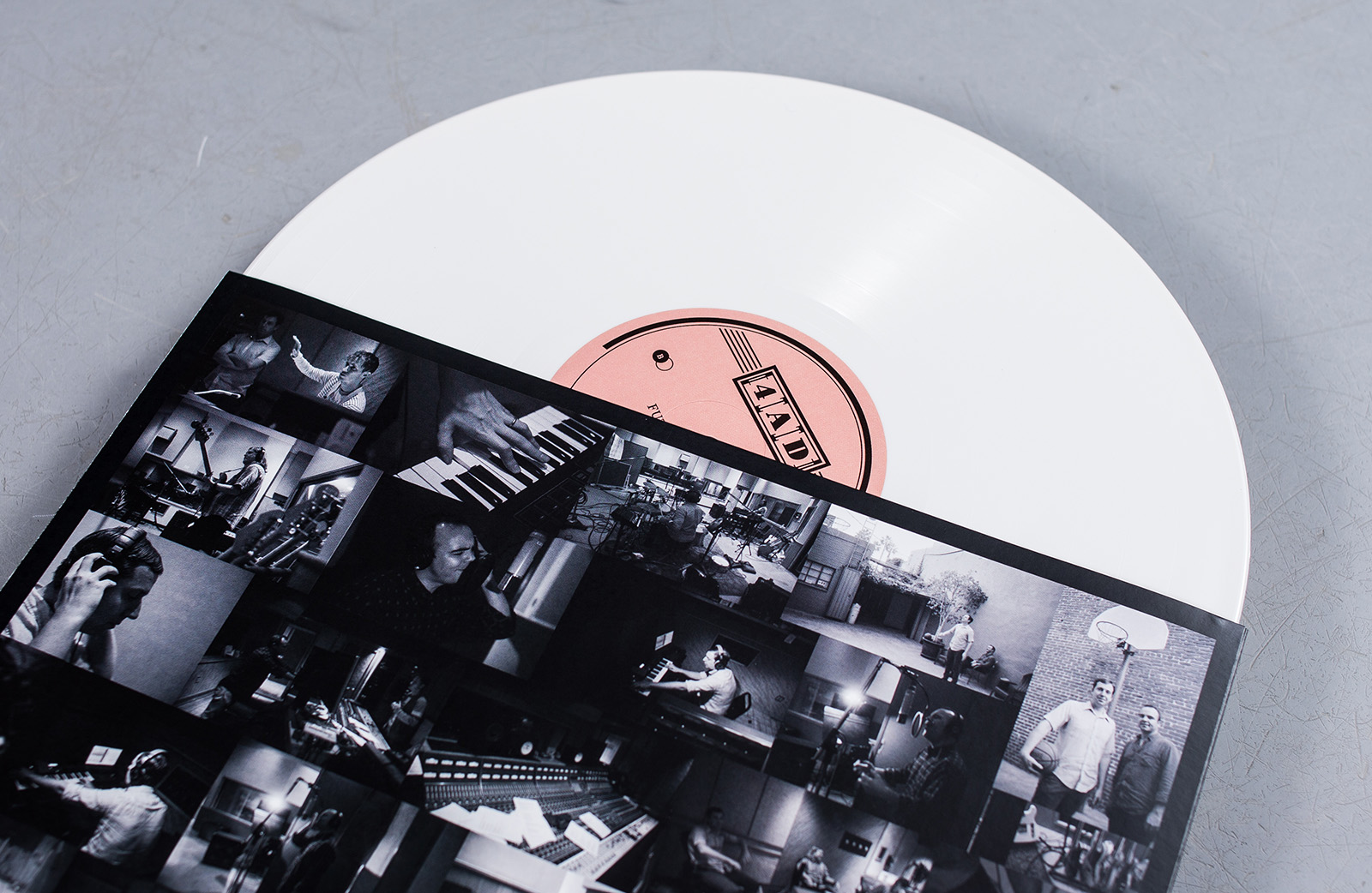
As well as photographs of the band in ths studio, the inner sleeves also contain two stills from a documentary called Road Dogs made by friend of the band Jay Buim. “A lot of themes on this record are about travelling, the things that you find on the road, the things you leave behind,” Cashion says. “It deals with the romance of the road.”
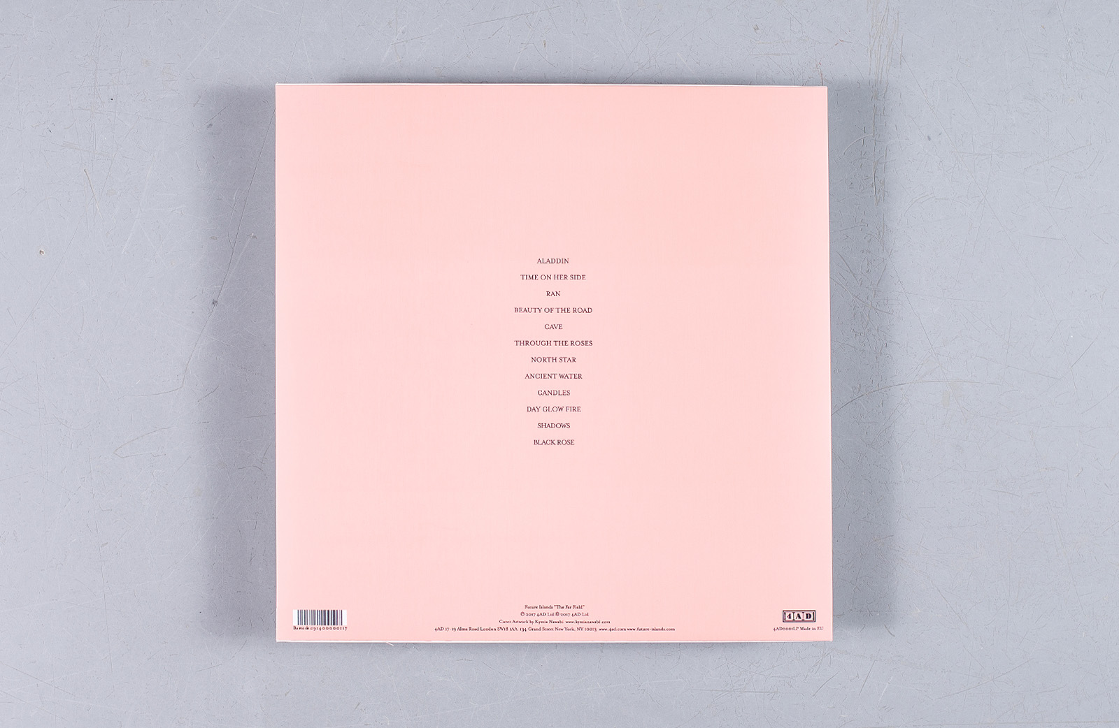
The attention to detail, and the extent of Cashion and the band’s involvement in the records they produce is startling. “I love seeing the decisions that different bands have made with packaging and information,” Cashion admits. Even the block colour back of the sleeve has a process behind it, inspired first by David Bowie’s Low and then by an obscure ’80s Ray Lynch new age album Deep Breakfast.
Cashion traces this interest in the physical product to an early age. “I remember when I was in high school, getting singles from Smashing Pumpkins or The Cure, because you can only get the b-sides on the singles. And I remember how excited I was about that. I was one of those kinds who still bought records in the late ‘90s and early 2000s when not many people were still making records, and we want to keep that discovery alive and keep that experience for people.”
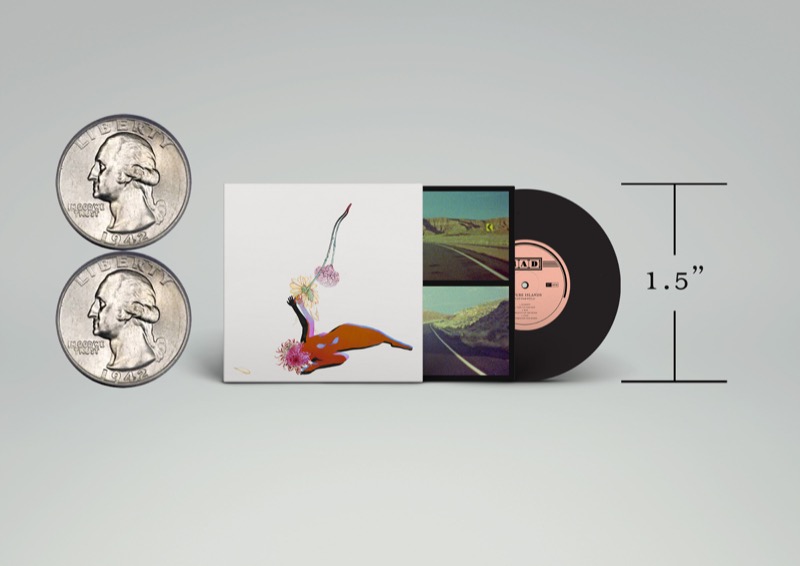
One final experience packed into The Far Field is the inclusion of a 1.5″ replica of the album available with the limited edition. The size of the hole in a jukebox 45, it is an identical miniature in every sense, although there’s no music pressed to it. “More and more people are buying digital now and not having a physical object, so it’s about finding creative ways to market the music,” Cashion says. “There’s a lot of different things they can zone out on while they’re listening to the record. It’s just another layer of our art.”
The Far Field is out now on standard and limited white vinyl via 4AD.

Sign up to our weekly newsletter
Never miss a thing
