


How Paris label Antinote is redesigning electronic music
With a new compilation celebrating 5 years of business on the way, we get under the covers with Parisian label Antinote.
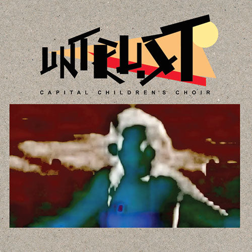
From the moment Antinote Records emerged in 2012, Zaltan’s Paris-based label has attracted favourable attention from listeners, DJs and critics alike. While it was originally intended as a vessel for unreleased ’90s machine jams from the tape archive of Iueke (aka Gwen Jamois), it very quickly grew into a richly diverse concern sporting all manner of oddball house, synth pop and other more esoteric fare from lesser-known producers and forgotten flea market finds.
While it may be hard to predict the sound of Antinote from one record to the next, the label has that uniquely consistent quality that makes every release alluring, and while the eclectic sound alone can draw you in, it’s the sleeves that make the physical pressing so desirable. As varied as the music it clothes, the Antinote artwork still somehow hangs together as a cohesive body of work, putting the appropriate finish on one of the most highly-rated labels around.
The design is the work of Check Morris, a Paris-based agency comprised of Nico Motte and Mathias Pol. The pair met in a most traditional of ways, while studying together on a graphics design course. After going into business together in 2003, they were designing movie posters including the classic rock documentary Dig! A clear division of labour exists between Nico and Mathias, the former drawn to typography and art direction and the latter a keen illustrator.
Having been friends with Gwen Jamois for many years, when the concept for the first Iueke release was taking shape Nico was quick to offer Check Morris’ services and so a symbiotic relationship with the fledgling Antinote was born. To date there is only one sleeve that Check Morris have not designed, the second Antinote record by Syracuse.
“I was on vacation with my girlfriend and didn’t have time,” Nico admits with a grimace. “It was the second record… I was caring about doing good designs for the label but I couldn’t imagine that in five years we would have done 34 records!”
Working in close conversation with the musician responsible for each release, the designs can veer from the bold typography-led impact of Leonardo Martelli’s Menti Singole to the op-art dazzle of Panoptique’s Boiler Broom. While Nico acknowledges that the designs can vary in their completion time from five minutes to a whole week or more, no challenge is as great as when he has to design a sleeve for one of his own records. To date he has released the Rheologia 12” and an album, Life Goes On If You Are Lucky, and he hints that further releases are in the works.
One thing that shines through with the Antinote artwork is the themes that link certain sleeves together, so in the spirit of celebrating the many different shades to the Check Morris designs, we picked five such styles to explore in detail.


Albinos
Ritual House Vol. 1 / Ritual House Vol. 2
“Albinos is also an illustrator, so he came to me with an old book of exotic images and we saw the tiger we used for volume one, and the little indian boy we used for volume two. He gave us the pictures and we did the rest.
“Because the Albinos sound has a wild, exotic feeling, it was really important to have an exotic feeling in the image as well, but I always like to twist things up so we designed the typography on the record as a really ‘techno’ font.
“We also wanted to play with the old-school quality of the pictures we chose and do something more subversive. We could have put the pictures in black and white, but we used some bold, bright colours instead. The only thing we want to do on the label is have fun. We always have lots of subtle references in our work, but everything for the label is designed and drawn by us.”


Geena
Surowych Utworow / Mental DJ’s Land EP / On The Top Of A Deep Hearted Fern / Pure Ground Research / Peace Love Earth
“Geena has done five records on the label. He’s a really important artist for us. When we started to do the artwork I was really into screen-printing, so we did all the Iueke and Geena sleeves ourselves. The first two Geena records are hand silk-screened by us. I wanted to do a disco bag design because Geena’s music is really house music, so I wanted to make a reference to the old guys from Chicago.
“Our policy on Antinote is that every artist has their own graphic design variation. With Geena it was the idea of doing a disco bag but with a complex typography and some special optical graphics. At the beginning I thought we would do all the stuff in red and blue. I wanted to make a vibration with the colours. But already by the third release I wanted to change the colours!
“The funny thing is that if you know Geena in real life, he is really humble, he is not really talkative. Giving him images of acid music, cannabis stuff, was really funny because he’s not like that at all. It was just a joke. He was really happy when he saw that, and it’s the same for the last release Peace Love Earth. We decided to do something really trippy.
“At first the peace and love sign was designed for D.K., but he didn’t want it so I said, ‘OK, Geena’s going to have it.’ He was up for it, but he showed me the cover of his friends The Pilotwings album Les Portes Du Brionnais and said that I had to design something that would piss all over it! I’m always happy to have fun with my work. For me graphic design must not be exhibited. I know lots of graphic designers that are taking themselves too seriously, and they are not my friends at all. “


D.K.
Drop / Love On Delivery / Island Of Dreams
“Mathias was more involved for the D.K. stuff because he also does his own painting outside of the normal graphic design. D.K. asked us to do something post-internet, more colourful and with a really radioactive design. I don’t know how we went to this type of illustration, but we did everything by hand on the design. Mathias is doing the job, and I am doing the art direction, finding some imagery, standing next to him saying, ‘This is good, this is really nice, this is not good…’
“D.K. has got a really strong style, and we wanted to find a good direction to go with his music. It’s like cocaine music. You’ve got lots of money, a big house with a swimming pool, a nice view. Everything’s clean. The base of the work for the second record is a picture that I found of a house from the 1930s in Los Angeles. You can’t imagine how beautiful the house is, and the price that you need to pay to get it.
“For the first record it’s more of a composition, and lots of references that we have. I don’t want to talk too much about the references because I prefer leaving it to the spectator, but the influence is there. It’s California for sure.”


Paki Visnadi – Imaginary Choreography
Nico Motte – Rheologia
“For the Paki Visnadi, Gwen’s ex-girlfriend first found their tape in a flea market, and the design was just like it is on our release. It was classic op-art stuff, so I decided to do exactly the same but to adapt the design of the tape on to a vinyl because, as it is a repress in a way, I love reissues that work as an authentic reproduction of the original. It’s quite simple, but I re-drew everything on [Adobe] Illustrator and designed everything. Because the tape was handmade like that, I decided to respect it.
“For my record Rheologia, I’m really into Vasarely’s stuff, and the cover is an adaptation of his work. His piece was much more simple, like only ten lines, so I decided to do thirty lines and make it more complex. It’s more Mathias who did it in a way, because I was looking for an idea for six months. The record was done, but it took me six months to find a resolution for the cover. I was really desperate and I wanted to have something scientific, really clean.
“First of all I wanted to feel movement on the cover, because rheologia means a material movement with an external force, so for example if you blow on some sand and the sand is moving, and the act of doing that is called rheology. In a way the whole record is about that, the way the sound is moving in the air, but it is quite serious. I think it’s the only serious record sleeve on the label, because it was my first record. It’s like I was naked. I worked for 15 years for others, and this time it was for me so it was really strange.”


Iueke
Tapes / Alecot / Tape 4 / Tape 5
“Gwen is a really good friend of mine, and when he decided to do the label with Quentin, I said I wanted to be part of the adventure. For Gwen I wanted to do something really art deco, really graphic, and like the Geena sleeves base it around the disco bag, with no front and back. I wanted to have some crazy graphic design construction, and we did the silk screen because it was a good thing to have some different material on the record. It’s beautiful when it’s not quite perfect and some parts of the record are not well printed.
“It’s a very different design to the others. The personality and music of Gwen is much more baroque… he is different! He changed my life this guy. I wanted to do something like a beautiful jewel – it was a gift for him. I’m not a pretentious guy and I try to be really humble but this time for Gwen I tried to do something really impactful.”