Published on
April 2, 2015
Category
Features

In advance of his conversation with Cover Club next week, we sit down with accomplished cover artist Lewis Heriz.
Occupying a unique corner of music design, Heriz’ beguiling artwork has enriched a wealth of respected labels including Sofrito: Tropical Discoqtheque, Now Again, Strut and Stones Throw. But nowhere has his influence been felt more strongly than at Soundway, where his glowing designs have played a strong hand in carving out the label’s identity.
You’ve designed countless sleeves for Soundway Records, what’s the connection there?
The first time I contacted Soundway was after the first release – Ghana Soundz Vol 1 – in 2003. After listening to it, I emailed Miles to say that it was the best music I’ve ever heard, and I really hope there’s more to come. Luckily there was! I never really do that sort of thing, but Soundway became a buy-on-sight label, and every so often I’d email Miles to say thanks.
A few years later I started a blog for my drawings and occasional posters (which became the website I have now), and after another one of my Soundway fanboy emails – in response to the Cumbia En Do Menor 45 – Miles came back and said he really liked my illustration work and asked if I’d like to do some work for him in the future. I was made up. That was the groundwork, I guess. The actual label work started a year or more after that, by which time I had already started doing record covers, and design work for Sofrito. So there you go – if you like what someone’s doing, let them know. It’s a good thing to do and you may even end up working with them.
Do you try to pinpoint the essence of the music in your artwork design?
That’s the core aim, yes. But there are always other factors that need to be included, or that alter it in some way, so it’s all about trying to keep hold of that essence while fulfilling whatever brief I’ve been given. I will listen to the album whenever I’m working on the sleeve, though, right to the end, which means that sometimes – when a job’s gone on for some weeks – I will listen to it hundreds of times.
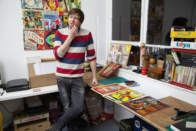
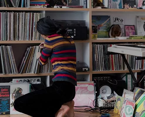
Lewis Heriz in his workspace. Photo: Takafumi Miki for Colectivo Futuro
Can you talk us through your process, step-by-step?
It always depends on the job, but there are a few stages that are always the same:
1) Listen to the record from start to finish without doing anything else. Just listen. Repeat. Repeat again.
2) Find out as much as I possibly can about the context of the record, who the musicians are or were, where they come from, what they’re saying, what their influences are, in what way their music connects with their culture or other cultures, in what way they’re interacting with the past, present, or future. I try to get as much of a grasp of the universe inhabited by the album. Is it rooted in a universe we know? Or a different one? My task is to complete that universe, or help make it real, or at least construct a door to it through which the listener will step. That’s how I tend to see it.
3) Keep listening to the album, and play. Playing – like a child does, just pushing around colour and shapes and seeing what happens – is the most important stage I think, as it’s this step that I often find a compositional & colour system that somehow resonates with the music. It’s a bit mysterious and I prefer not to think about it too hard. Sometimes my translation of the music into something visual is quite different to the band’s or the label’s, in which case we have some graft ahead. Which is fine, but it’s always a great feeling when this process pays off and everyone says it looks like the music sounds.
The rest is always more specific to the concept or the desires/needs of the musicians or label. There’s often a level of compromise involved, so it’s quite rare I send the cover I really wanted to, but the right cover is the one that everyone is happy with. That’s the way it should be.

Would you say there’s a design aesthetic that runs through your artwork?
People say there is, but that always slightly rankles as I try to approach each record afresh, and don’t like the idea of imposing a personal style on the release. It’s not about my style, it’s about the music, after all. But as a lot of the music I worked with for some years was from the middle 4 decades of the 20th century, much of what I have done reflects the common aesthetics of those decades.
I hate the idea of being retro, I really hate it, because retro stuff is clichéd and outmoded, while I want my work to actually resonate with a modern audience. And often, when I try something new, the client guides me back to where I left off because – of course – that’s why they commissioned me in the first place. My love of block colours, abstracted shapes, low-precision printing techniques and technology, hand-drawn typography, warmth and character (impersonal, precise graphic design that strives for ‘invisibility’ feels alien to me) makes up my aesthetic, I think. But I will happily tread away from the trodden path, if the people who are paying will let me.
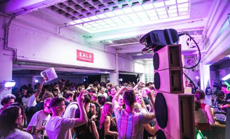
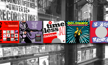
We picked out 10 sleeve designs that captured our imagination and asked Lewis to talk us through the story behind each one:

Ibibio Sound Machine
Ibibio Sound Machine
(Soundway, 2014)
This one was a lot of fun to do. The band is fronted by Eno Williams, whose character is so strong on stage and on camera that we knew a photo of her would make for a great sleeve. It was then just a case of working out how to also use the design to communicate the album’s unique sound. The image was already strong, but I wanted to make it more than that. Iconic, if possible – we wanted it to feel classic but new.
Taking out all the colour was the first step, as turning something black and white automatically removes it from our everyday reality, and then I treated it to give it an unreal, almost robotic feel, to enhance her already-unusual pose. I then worked with Miles to decide on a pared-down colour scheme, and worked those colours back into her clothes and a simple frame to fix it together.
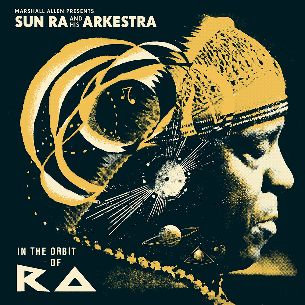
Marshall Allen Presents Sun Ra And His Arkestra
In The Orbit Of Ra
(Strut, 2014)
A lot of Sun Ra’s covers look like automatic drawing, or the kind of subconscious/stream of consciousness drawing you do when not trying to think too much. A kind of cosmic doodling. This is my preferred way of working – improvised and unrefined – but it’s not often I know I’m allowed to go for it.
I worked as spontaneously as I possibly could, and once I had the abstract elements in my sketchbook that I felt I needed, I photographed them and transferred to digital to integrate it into one of the photos I’d been sent by the label to use. I chose this one because he has his eyes closed, he is listening (in the original photo he’s at the recording desk, listening back to a take). Music was Sun Ra’s life and his primary connection to the universe, so it was important the image reflected that. This is one of the rare examples of a rough being approved and sent to production without any edits. I’m very, very proud of this one.
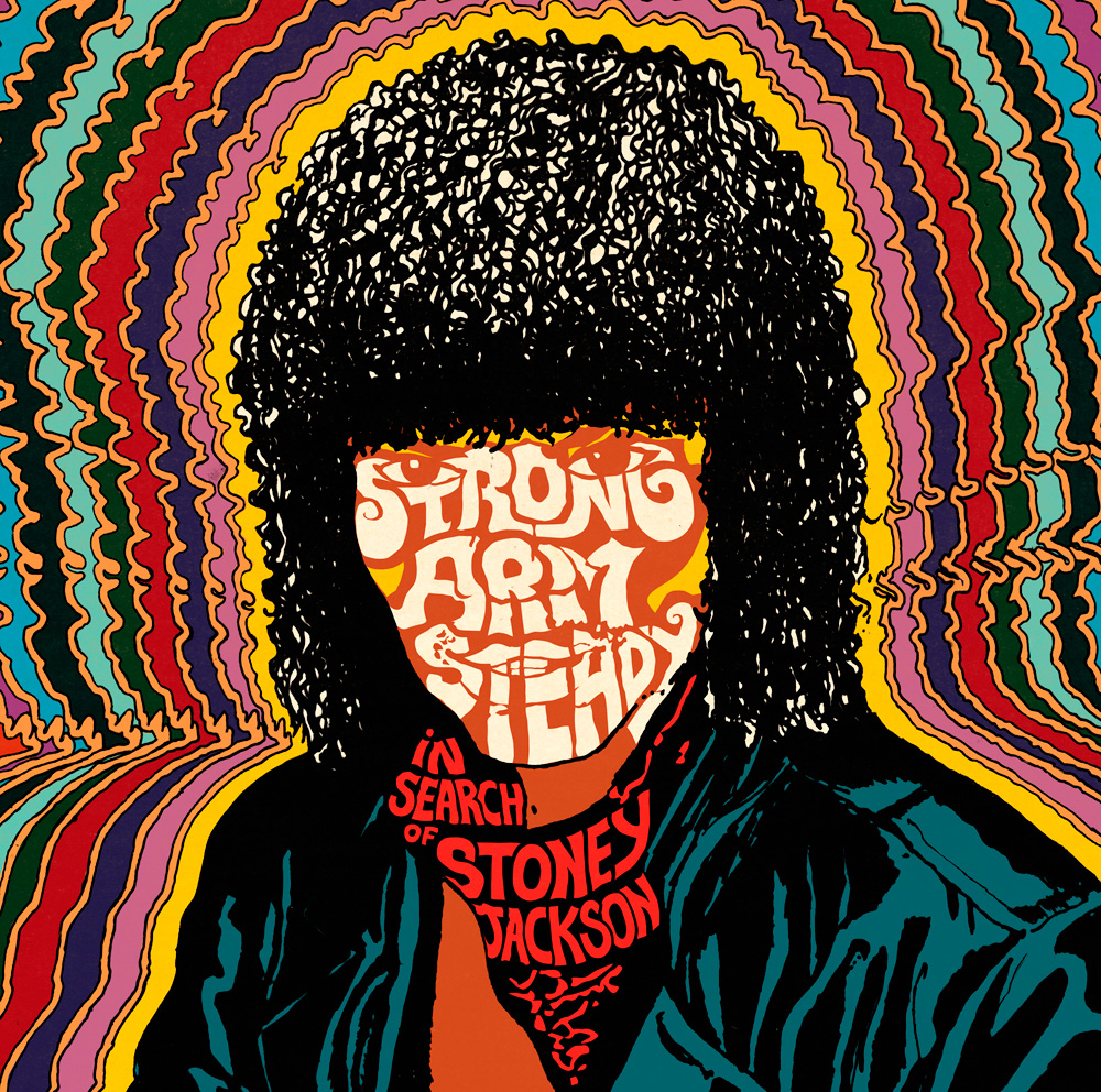
Strong Arm Steady
In Search Of Stoney Jackson
(Stones Throw)
This cover went through some very interesting twists and turns. It’ll take too long to explain them here, but it started as a celebration of the Jheri Curl, or more generally a short period in recent African-American history that was epitomised in the Soul Glo guy from Coming to America, or Lionel Richie.
Strong Arm Steady wanted me to turn one of the icons of this style and era – Stoney Jackson – into a cartoon, in a similar way that was done with Mr T. Though this isn’t about Stoney Jackson, but the concept of ‘Stoney Jackson’, the icon. Hence the face eludes us and the image is reduced to its main cultural signifiers. Also – like the Soul Glo adverts – while it’s funny, there’s something very cool about it, which is why we gave the three main members of the group Jheri Curls for the Instrumental album sleeve…
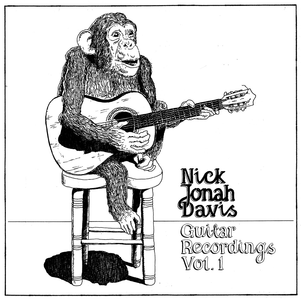
Nick Jonah Davis
Guitar Recordings Vol 1
(Self-Released, 2009)
I love that you picked this one out, as it was a very early one and in a style that’s totally different from anything I’ve done since. Before I started designing I used to draw mainly cartoons and pen and ink illustrations for no other reason than that I loved doing it.
Nick, whose instrumental solo guitar pieces I still really love, approached me to do the cover for his first album which was self-released. You can probably guess what the brief was: he asked for a monkey playing a guitar. But he said he liked Robert Crumb, whose work I also admire, so I just did it in pen and ink and that was it. There is a simplicity to the album, and maybe the image is quite self-deprecating on the part of Davis, or maybe the monkey represents the animal within all of us. Or something else. Either way, on his next album there’s a track called ‘Death and the Monkey’, so make of that what you will…
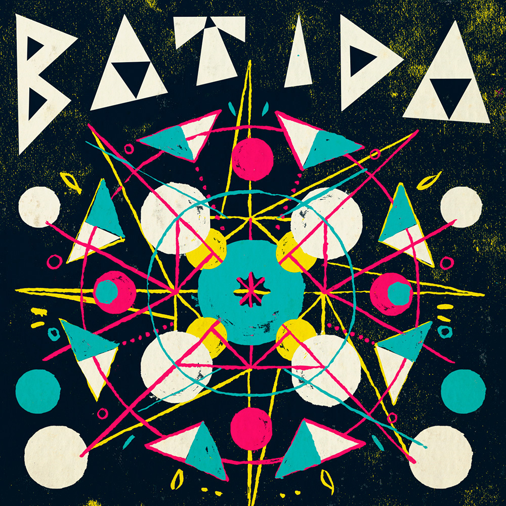
Batida
Batida
(Soundway, 2012)
If you search for ‘Batida Alegria’ on Youtube, you’ll see the video they’d already produced before we started working on the album artwork. It was the kaleidoscopic patterns that Miles and I decided to focus on, and as it was to be abstract I spent most of the time in stage 3 – playing with shape and colour until something settled. This was drawn in ink separations and recomposed digitally. Batida’s music has very strong historical, political and anti-colonial threads running through it but to reference that in a way that isn’t reductive or didactic in a single image is very hard, so I’m glad we went for an abstract design that lets that side of the music speak for itself.
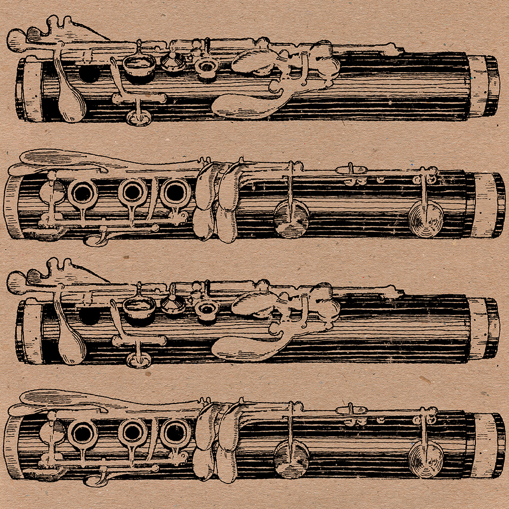
Lucho Bermudez Y Su Orquesta
Lucho Bermudez Y Su Orquesta
(Soundway, 2011)
With you choosing this and Nick Davis, you’ve reminded me that I’d love to do more pen and ink stuff. My first job for Soundway was actually restoring and treating an old Colombian record cover illustration of a french horn, for the Dejala Corre 45. When Miles decided on a 45 set as the format for the Colombian singles Soundway were to put out around the time of Cartagena! and before the huge Original Sound of Cumbia release, it made sense to revisit that illustrative style. This time though I wasn’t using old designs but creating new ones. The cumber of Lucho Bermudez is clarinet-led, so that was the natural choice for the illustration.
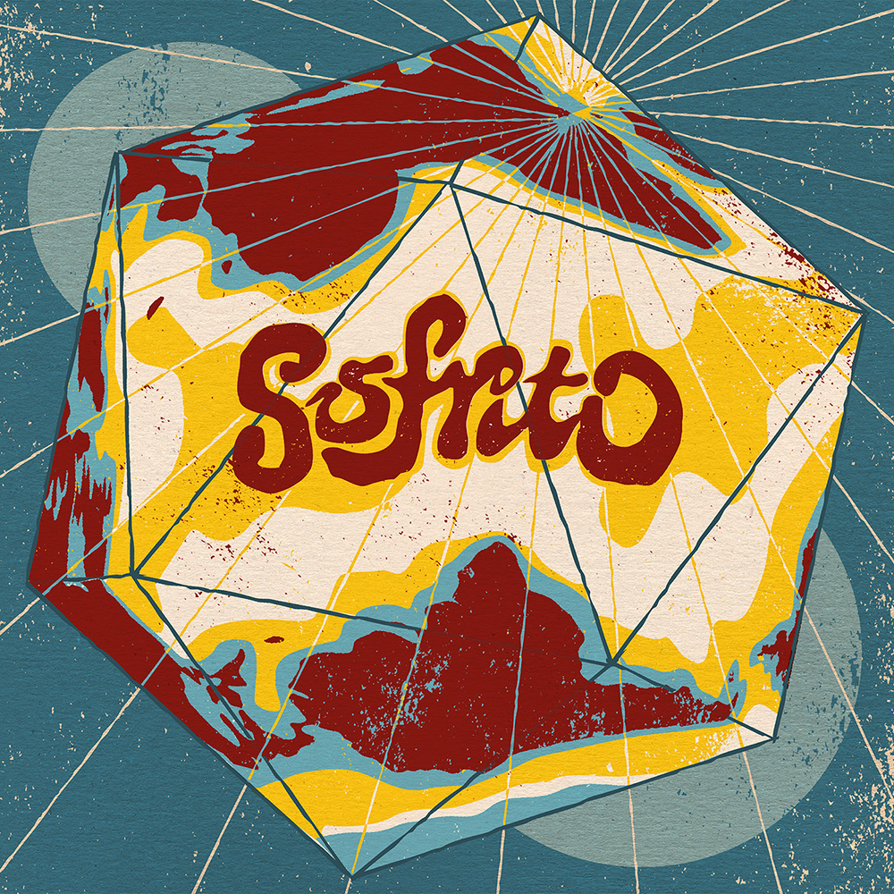
Various
Sofrito: International Soundclash
(Strut, 2012)
This one was us trying to step away from the problem of categorising the diverse music we’re promoting by using the Buckminster-Fuller Dymaxion AirOcean World (look it up if it’s new to you!) concept that every continent is connected, and that our boundaries are not just often arbitrary but damaging to understanding the fluid nature of human culture.
Also, that the Mercator projection we still use distorts the West’s view of the rest of the world – it’s literally an imperial view of the globe, with the so-called ‘Third World’ shrunk to a lesser size than it actually is in relation to Europe and North America. That was what was underpinning this idea, which is why we included a diagram showing how to make the globe from a flat map which presented the land masses with the north pole in the centre – meaning that no one viewpoint is preferred over another. We didn’t want to ram the message home though, so it was just presented without comment and I just had to make it look nice. I hope some people got it.

DrumTalk
DrumTalk
(Huntleys + Palmers, 2015)
This is the latest release from DrumTalk, whose releases I’ve done all the physical artwork for so far. I’m going to talk about this in more detail when I get a chance because a lot went into it, but the Brutalist structures are 3D renderings of ‘architectural’ blueprints built from elements relating to each of the four tracks on the record. I broke each one down using rhythm, acoustics, overall composition, spectrum analysis, waveforms etc and tried to use them as building blocks and plans for concrete forms. The blueprints are on the reverse of the sleeve.
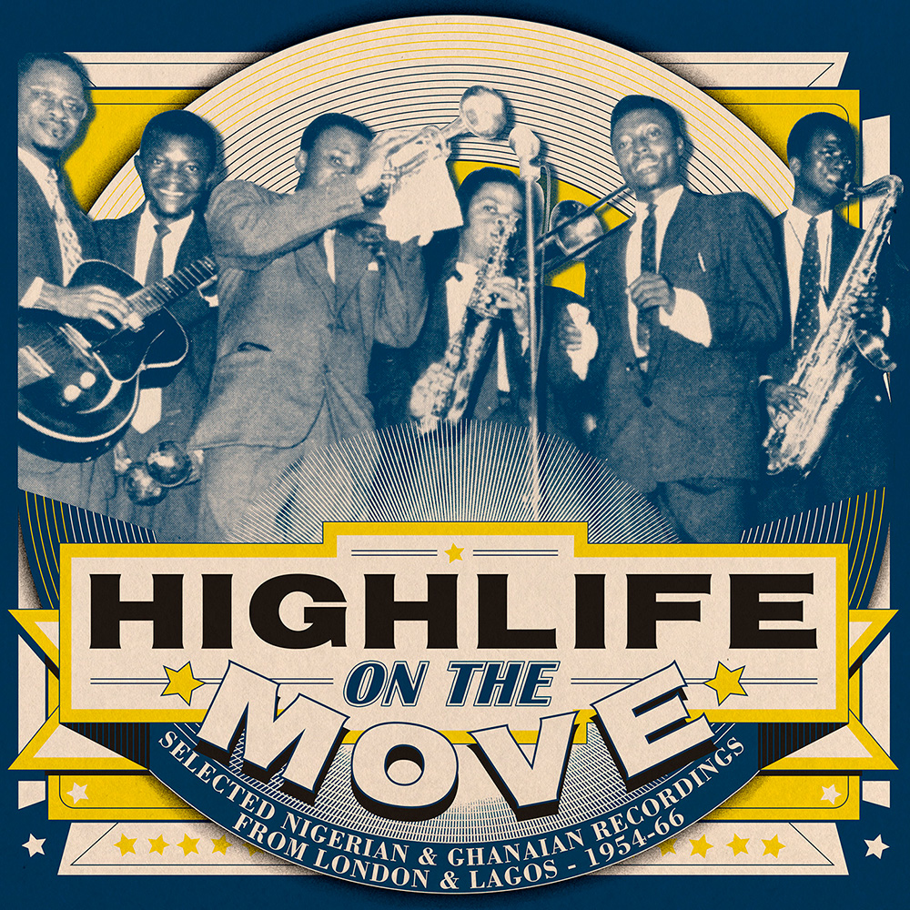
Various
Highlife On The Move
(Soundway, 2015)
Released on Soundway this week, a huge collection & overview of Ghanaian and Nigerian recordings from ’50s and ’60s, and acts as a sort of prequel to the label’s Nigeria and Ghana Special comps, the latter of which was one of the first designs I did for them. It was a joy to be able to work with the more rigid design style of the 1950s that you find on 78rpm sleeves – whenever I do a design I see it as continuing within a design tradition of sorts, a celebration of formal style that maybe gets neglected for reasons of being old fashioned. And the same goes for the music. This is all amazing stuff, but it got left behind, and didn’t deserve to be. Hopefully this release will redress that.
You can catch Lewis Heriz next week at Cover Club, a free event that celebrates the most creative record covers and the people behind them. The event takes place on Thursday April 9 at Ace Hotel, London – click here for more info.
Sign up to our weekly newsletter
Never miss a thing